July 11, 2014
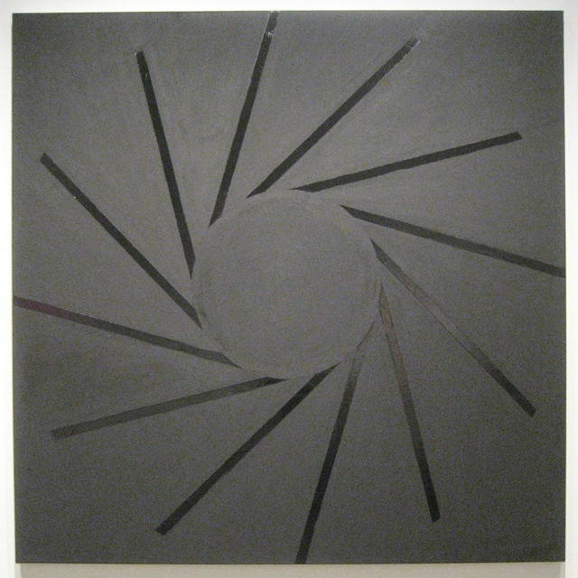
Paul Morgensen, “No Title” (2013), acrylic and oil on canvas
With much of the art population out of town for the summer, the city’s galleries are understandably disinclined to mount thoughtful shows. Gleanings from the back room will usually suffice for the sparse summer clientele ducking in from overheated sidewalks. But there are always exceptions. For instance, director Miles Manning at Elizabeth Harris has gathered five painters in a show this month that reveals how artists no longer serve that grave, near-religious mysticism that geometry brought to early modernism. These painters use geometry as a freeform language, applied in novel and expressive modes, effortlessly morphing the linear with the organic.
There is no trace of that reverence toward geometry that characterized the Dorothea Rockburne exhibition earlier this year at the Museum of Modern Art. Like most of us, artists have now grown accustomed to thinking of geometry as vanquished, or at least sublimated to the level of one’s awareness of their own blood circulation. We may need computers to do the actual math, but we have grown used to the commonality of very complex systems.
Sarah Walker’s small square panels contain a near-celestial space, built as they are on interconnected pathways that seem to meld like layers into one another. The small and almost square “Offset Transition” has the viewer peering down into a partially undone pentagon, while the upper right corner is filled with a cloud resembling the emerging cross-section of an MRI. Depth is nearly impossible to fix yet difficult to ignore.
Gary Petersen’s more traditional-looking geometric canvases nevertheless do their utmost to break down any sense of coherence. Subtle adjustments to knife-edge planes and irregular trapezoids embrace chaos rather than seek resolution. And yet Day Tripper, the most visually compelling of his work in the show, finds a convincing balance between the internecine belligerence of his shapes and the harmony of his color.
Rick Klauber’s irregularly formed cedar shims add a note of conceptual wit to the show. Not only do they taper like brushstrokes, but shims represent (as any contractor knows) a crucial liaison between the perfectly fabricated and the often imperfect installation site — a fitting metaphor illustrating geometry’s fall from cultural grace. “Editor,” the smallest yet most impressive of Klauber’s entries, is a richly dense composition of grays and blacks that produces a stately pictorial image, surprising for a piece of such modest dimensions.
Paul Mogensen addresses geometry head-on. In two notable canvases, one of a thinned magenta wash, the other combining gloss and matte black, a centered circle anchors linear spokes flailing out toward the frame. More than the other painters in the show, Morgensen’s inter-reaction between artist and image is front and center. Varieties of paint mediums are employed to enhance a purposefully limited palette.
The intimate scale of the work is yet another indication of geometry’s loss of grandeur, which is particularly noticeable in Joanne Mattera’s work. Compositions built of interlocking symmetrical triangles — rendered asymmetrical by simply adjusting each triangle’s base — are defined in color modulations that echo warm and cool variants of middle tones. Applied with the copious density of an encaustic medium, the masked edges produce a gentle relief, emphasizing the relative independence of each shape, while their limited color range maintains a surface tranquility that seems counterintuitive in the presence of each panel’s saw-tooth structure.
What’s most intriguing about this variety of attitudes toward what was once considered a rather sober subject matter is how it speaks to our relationship to technology without any single artist addressing that particular topic directly. It is a reminder that there may be a positive side to pluralism — that there are changes taking place in painting without a conscious effort on the part of any one individual or group to steer things in what they perceive to be an advantageous direction.
