June 21, 2023
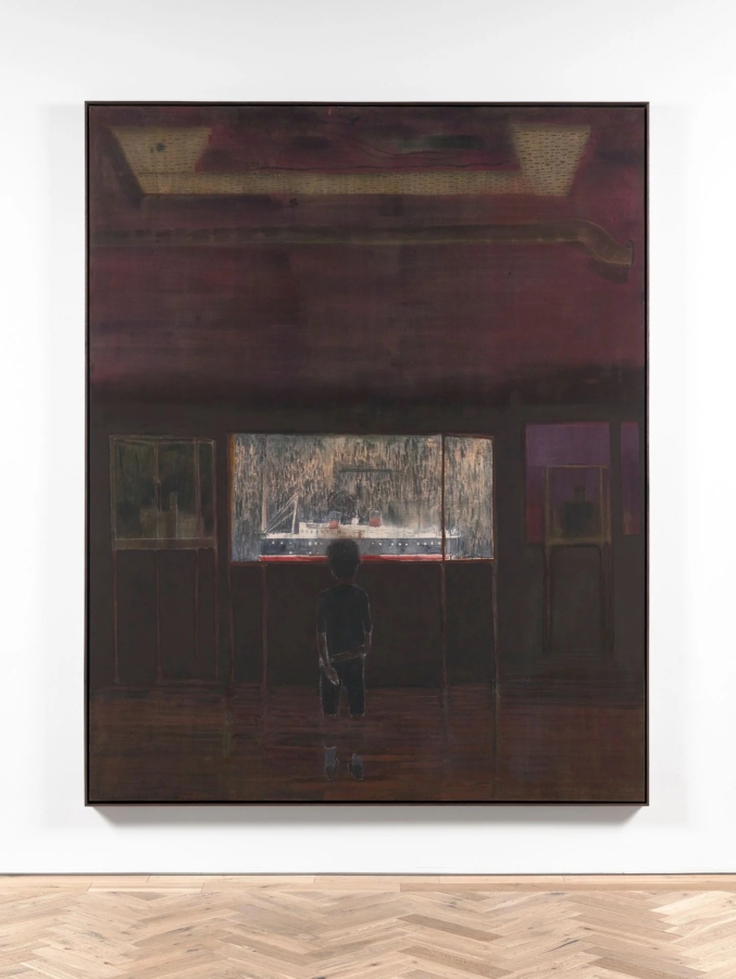
Andrew Cranston, Questions of travel (2023). Distemper and oil on canvas. 253.5 × 203.2 cm (framed). Courtesy the artist and Ingleby, Edinburgh. Photo: John McKenzie.
Informed by the wild landscapes of his homeland, his memory, and his observations of life, Scottish artist Andrew Cranston makes paintings that delight the eyes.
Rendered in rich colours, Cranston’s paintings are an ode to process. He manipulates his material, layering and re-working imagery to create mysterious stories intricately mapped out on the linen-bound covers of old books.
Cranston sits down with Ocula Advisor Rory Mitchell to discuss the inspirations, themes, and techniques of his latest body of work. The paintings are now on view at Ingleby, Edinburgh in the exhibition Never a joiner (17 June–16 September 2023).
What does a day in the studio look like for you?
I live locally and simply. I do the same thing most days. I like French novelist Gustave Flaubert’s (1821–1880) advice, to ‘be regular and orderly in your life, so you may be violent and original in your work’, though I don’t claim to be that.
After dropping my son off at school, I go to a cafe close to my studio and do some writing. When I get to my studio, it takes me a while to start painting. I tend to work on smaller paintings first, adding, taking away, and moving things around. I look through books and sketchbooks. It brings to mind when dogs do all that sniffing around, circling their territory. I eventually get going after about an hour.
You have to do a few hours before being properly immersed and sometimes there are only a couple of hours, if that, of fully productive work. You need those seemingly lost hours to lead up to those productive periods.
For Never a joiner, there’s been quite a bit of task-driven repetitive patterning. It’s quite useful to have different kinds of paintings to work on to suit different moods.
Do you usually approach a show with a cohesive idea as a whole or do you make paintings and then figure out the exhibition when you have enough material?
In some ways, there’s no end or beginning with painting. I have work ongoing all the time, and some of the paintings for the Ingleby show have been around for a few years.
Generally, I work without a clear overall plan. At different points, I start to think about it as a whole and even thematically. It never really holds together though, and if I am getting too led by some coherent concept it starts to feel like the tail wagging the dog.
Your paintings on book covers are unique and magical. What inspired you to paint on books?
The first person I saw using book covers as a support was the London-based painter Paul Housley, who did a show of them in his garden around 1996.
Ten years later, during an artists exchange residency in Düsseldorf, I started working on book covers. It was by accident really, one day I’d run out of things to paint on and found some old books in a drawer.
Books instantly struck me as full of potential. On the one hand, they are just a support to paint on, a convenient board (and often canvas covered), but on the other, it feels significant that it’s a book, what with the hallowed status of books in our culture.
Using book covers gave my work an explicit connection to storytelling. It put me in a position of having to respond to what the nature of the book was—physically, its shape, size, colour and surface, as well as its contents, and its title.
Rather than working on a blank canvas, working on a found object triggered reactions in me. It suited me, appealing to a kind of punk iconoclasm in me, to make something by partly destroying another thing.
Recently you’ve made more work on larger canvases. How did you find the jump in scale, and do you approach the paintings in the same way?
I’ve always made larger works, although it’s true there were a few years when smaller works were to the fore.
American writer Clement Greenberg (1909–1994) once said, ‘if you want to change your art, change your habits’ and this proved true for me. In 2016, I started working with distemper—pigment and a binder, usually rabbit skin glue—whereas previously I had worked only with oil paint. It led me to work with one colour at a time, encouraging me to let a single colour lead a painting. As a result, the two formats—small hardback book paintings and large canvases—have moved closer.
Scale and size are different things for a painter. A painting might be small but have an inner scale which is huge. Intimacy is strongly related to the small scale of the work due to the sense that you have to peer into it.
Paradoxically perhaps, I work more intensely on small paintings. They often take longer and are more densely composed. They are more detailed even though I have less room. Sometimes they can be claustrophobic.
The larger paintings open up space and lightness for me. Lightness is hard to do well, and for someone like me who was schooled in hard-won painting, it has taken a long time to accept and allow myself that space.
Much of your work features specific places in Scotland where you live but it’s often ambiguous whether the scenes depicted are real or imagined.
Were Rangers players actually running up the dunes with Bass Rock in the background or was it just an idea for a great painting?
Landscape with Rangers players (2021) is based on true events. In the 1970s and 1980s when Jock Wallace Jr. was the Rangers manager he made the players run up and down sand dunes at Gullane and Girvan beach until they threw up to improve fitness levels. Putting the Rangers players into a landscape felt like the perfect way of undermining the inherent romanticism of such an image.
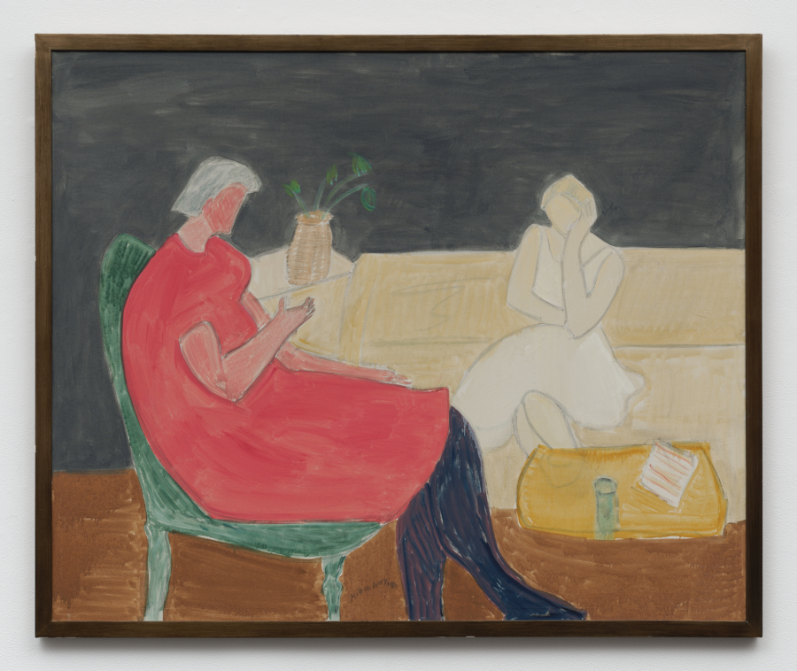
Still life subjects or domestic scenes appear regularly throughout your oeuvre, often reminding us of a wide range of historical artists, including Pierre Bonnard and Henri Matisse or, more locally, Anne Redpath. Why do you think you enjoy painting these domestic scenes so much?
Regarding domesticity, I think of paintings themselves—their format, their condition—as a kind of interior space.
Putting aside ideas of painting in an ‘expanded field’, paintings are generally rectangular or square spaces. They are an activity within a frame, spatial boxes in a way, like a room. We can only really be in one room at a time, and this has useful limitations.
My work moved indoors when I became a father in 1999. I began spending more time indoors, seeing the outside framed from the inside and noticing opportunities to use the domestic realm as a subject. I enjoy using the domestic as a sort of anti-heroic subject. It is the heroism of everyday ordinary life which often strikes you as extraordinary, miraculous even, that there is anything there at all.
You mention Anne Redpath, whose work was very present in Hawick, Scotland where I grew up and much of her best work was made in her house on Beaconsfield terrace, a street I used to walk down every day going to school.
When you look through your most comprehensive monograph, the range of colour is startling and often so surprising in a way that reminds me of Peter Doig. Have you always embraced the full spectrum of colour, or have you harnessed it over time?
As an undergraduate in the early 1990s, I used strong, flat blocks of colour. Eventually, I drifted towards working almost monochromatically and adopting a very low-key, muted palette. It was only around 2010 that I returned to colour.
Working on book covers helped, and in their raw untouched state, they act like swatches of colour. They are easy to butt against one another, overlay, discover, and test the different relationships of colour.
There is colour seen in the world all around, then there is the pleasure of the colour of paint itself.
Peter’s work has been a lasting influence on me and so many others. He’s led by example. He’s a terrific colourist who is always surprising and he takes risks with colour. He has that ability to be subtle and brutal. When his paintings first appeared he brought a new focus and energy to all the things painting can do, not least the sheer pleasurable power of colour to seduce and subvert. Colour has a whole meaning in itself.
There’s often an implied narrative within your images. Does this emerge from an interest in literature?
There is definitely an influence from literature. Particularly from short stories and poems which I gravitate towards for their compactness.
British writer Daljit Nagra calls poetry ‘an espresso shot of thought’. Each show often has a particular writer colouring my thoughts.
With the 2018 show I did for Ingleby, But the dream had no Sound (27 October–21 December 2018), it was Scottish poet William Sydney Graham (1918–1986), and for my current show, I’d say it’s American poet Elizabeth Bishop (1911–1979) and English writer D.H. Lawrence (1885–1930), specifically his poems.
Most of all, narrative elements come from my own experience and things I am told—oral literature if you like.
The titles of your work are often very poetic. Can you tell me about your writing?
I find it harder to paint in the morning so I use that time to write instead. It’s a time for words. Maybe it’s something to do with the reordering that happens during sleep. As the day goes on, words fail me. They begin to dissolve, while visual thinking takes over.
I enjoy writing, but I’ve no idea what I’m doing. I don’t know the rules of writing so I feel quite free in it. I collect titles as I go and have them written on my phone. Sometimes they are direct, but often they are lateral to the image, not explaining or describing what we see but bringing another train of thought to the work. —[O]
