October 12, 2021
Download as PDF
View on Smithsonian Magazine
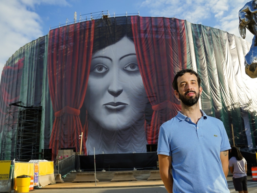
“As an artist and an art lover,” says the artist Nicolas Party, his site-specific, 829-foot work, Draw the Curtain, “is a way to pay homage” to the many art museums located in Washington, D.C. The Hirshhorn invited Party to help to disguise construction scaffolding as it undergoes a lengthy renovation. Hirshhorn Museum and Sculpture Garden, © Tony Powell
When the Smithsonian’s Hirshhorn Museum and Sculpture Garden decided to embark in its first extensive exterior renovation in its more than five-decade history, the plan was to dress up a construction site that would be up for at least eight months.
Museum officials turned to Swiss artist Nicolas Party to envision a site-specific 84-foot-tall work that would wrap a whopping 829 feet completely around the distinctive drum-shaped building designed by Gordon Bunshaft, the leading proponent of modern architecture. The resulting Draw the Curtain, a pastel painting digitally collaged and printed onto a scrim that measures the length of two football fields, is at once the biggest single work ever seen at the Hirshhorn and certainly the largest from Party, who already had a history with the museum.
In 2017 he painted a wall mural, sunrise, sunset, that wound all the way around the third-floor interior hall of the museum. “I am excited to welcome Nicolas Party back to the Hirshhorn to this time use the exterior of the building as his canvas,” says Melissa Chiu, director of the museum. During the pandemic, the Hirshhorn remained closed longer than the other Smithsonian museums because of its construction. “We are in the wake of a year that has challenged us to discover new potential in the outdoors as spaces for joy and connection,” Chiu says of the strategies the museum has crafted to connect with its audiences, including events held in the sculpture garden and a robust schedule of online programs.
The Hirshhorn hasn’t used the gray expanse of Bunshaft’s monochromatic brutalist exterior as a canvas since 2012 when artist Doug Aitkin’s acclaimed Song 1 made its debut. In Party’s playful vision, black and white faces peek out from a series of realistic, but familiar-looking curtains copied from art history. They include drapes from Vermeer’s Girl Reading a Letter at an Open Window and Fragonard’s The Bolt to a trompe l’oeil still life from Adriaen van der Spelt.
The work succeeds in hiding the construction going on behind it, but also making a statement about the peek-a-boo world of hiding and exposure that is all too familiar in the surrounding government buildings of the nation’s capital.
Smithsonian magazine spoke with Party the day after he first saw the installed work on the National Mall just a short walk from Capitol Hill. It was a pragmatic solution to hide the scaffolding, he says, but the effort was an overwhelming experience, because the project was “so visible on that iconic building, and very heavy in terms of the meaning of this city.”
The following interview has been edited for clarity and length.
Draw the Curtain shares similarities to your last big exhibition at the Hirshhorn in that you embraced the building’s whole circular space in each. But this is also different because here you use pastel instead of paint.
Yes. I used pastel to do all the original artwork. The final medium is a digital print on synthetic fabric. But the original artwork that we used to do the collage is pastel.
The first one was more site-specific. I was there for months in the space, walking and painting on the wall. That was very good actually for this commission because I did spend months at the Hirshhorn walking around inside and on the National Mall. Not coming from Washington, but also not coming from the U.S., it was important for me doing this commission years later to have an understanding of this place and how I felt about that particular location.
At that time, were you thinking about the possibilities of the museum exterior?
No. It is a very interesting outside surface. It’s very rare to have a building that has almost no windows.
Did the building’s surroundings play into your design?
Yes, I was fortunate enough that I did spend a lot of time during my previous show there. I was eating outside every day, and I think it made me understand especially the nature outside, such as the trees, a few other buildings around but also the sculptures and their colors. There are all these greens, and the sky is very important. And the red building next to it [the Smithsonian’s Arts and Industries Building], and the big red sculpture [by Mark di Suvero]. And obviously all the trees and the grass on the Mall—there’s all this green. So yes, I was thinking about it when I chose the colors of the curtains to have all these greens and blues mostly, and a few of them are bright red, which kind of popped. And then the faces being all black and white, can symbolize or mean different things, but in terms of pictorial aspect, they almost mimic the architecture and the grayish nature of buildings in general.
We worked on it for two years, so there were very different ideas. One of the difficult things was actually the colors. I was struggling a lot with that when I was doing the mockup with the model. It was too colorful; it was not right at all. It was either too visible in the space and physically making the entire building too aggressive or too visible, or you couldn’t see anything. This was one of the difficult parts, to choose the right amount of color, and which colors, so it feels like it belongs there.
It does seem to make the building hide among its surroundings.
I wanted that. And that was part of the theme of hiding and revealing. Also, the nature of the commission was to hide the scaffolding. I wanted it to have the effect of saying: “Oh, Is there anything behind those curtains?”
Even at night, it was interesting to see. It’s lit and very film noir, it looks very much like a spy movie, all those faces, like a Hitchcock movie, all coming out of the curtains and lit up. I think the Mall at night has an interesting dynamic.
It feels very empty somehow. There’s not much of a presence there. You can walk around and it feels like you’re by yourself in this insane, gigantic space and you have all those faces peeking out, trying to hide at night.
What were some of the earlier ideas?
My first idea was the theme of the river. It was really playing on the circularity of the building, like the river would go around it, but obviously the location in Washington, and the specific history the U.S. has with the river and how the colonization of the country by Europeans really started with rivers. Interaction with Native Americans was about rivers, and business centered around rivers. But also, as of today, the river and the lack of water in rivers in many areas in the U.S.
I also thought the flow was interesting. I did a lot of sketches, and read a bunch of books. But I think visually it was not working. I started to switch to ruins. Because a lot of those scaffolding screens very often physically recall the building behind it. Especially, a historical building, an important, beautiful facade, I was looking at some pictures that I found pretty fascinating, And I thought what would it be like if there’s darkness in the air, what if the entire Mall was surrounded by ruins and there were interesting themes about nature coming back from the ruins. But it would also pick up on all the neoclassical architecture of the Mall—all those columns and everything. But again, it was not working visually.
Then the curtain and the faces came and I did sketches and very quickly I did a mockup, and a model and I thought: This is what’s going to work. I worked another few months and submitted the imagery and everything, and saw everything was going to work out.
The ruins idea sounds like it had more to do with your earlier work depicting architectural scenes; this one is quite different for its use of faces.
Yes, portraiture is one of the motifs I use a lot in my practice. The thing that was very new for this commission was the curtains. But the faces were very common. The only thing I changed was the black and white, I never do purely black and white for portraits. They look similar to the type of portrait I do. But it’s true, the first two ideas were more related to landscape and architecture.
The interior and exterior thing are quite interesting with curtains. Obviously, you use curtains inside to hide things from the outside, but also on the outside to hide things that are inside. Every time I was thinking about it or looking at it, it was always, oh, it’s definitely working for these contexts. Now that I see it, the different interpretations of the themes and the faces are working well with this very charged context.
I accepted it because the nature of it was so pragmatic. We need to hide the scaffolding. I can see myself working on something very practical. But it’s so visible on that iconic building, and very heavy in terms of the meaning of this city. It was very overwhelming for me to work on it. I often thought: Why am I doing this? Am I the right person? I’m a white male from Switzerland, am I the right person to do this? But somebody told me, maybe, it’s because you’re not from here. Maybe that’s correct. The fact that I’m not from the U.S., I have less visceral, emotional reaction of what happened over the last few years. I was able to have a bit of distance, and do a work that, of course, engages a lot of questions in the current climate.
Certainly, there is cloaking that goes on in Washington, was that your intent to reflect some of that?
Exactly. The title, Draw the Curtain, means physically pulling the curtains, so there’s this whole game of hiding and revealing and the curtain itself is almost the object of that dynamic. Especially in a city like Washington, because architecture-wise, you have buildings that are really loudly visible about what they want to say. You have these monuments that have a very simple message of power and strength to build a very clear history or narrative. And next to those, you have buildings like the Pentagon, that seem by the nature of design literally walls after walls after walls to hide what is inside. And you have that visually when you walk in the city.
The nature of politics and the game of its theatrics—you have to be this person who is playing this role, that speaks in a certain way, and says certain things, and have those hidden meetings where we don’t know what they’re talking about, like that line, “in the room where it happens.” Those dynamics are so present in the conscience of people, and the narrative of the city, and the environment.
The faces don’t represent any particular people or paintings?
My own faces are all not based on anybody, or an age group, or a race. You will identify them probably as Westerner, as I am, but they are kind of genderless. So they kind of fit that character of the spy, who can be all those different characters at the same time, and in black and white. Anything that can make you think this is definitely a racial group, or a minority group, or a political party will completely diminish the whole purpose of those faces. Hopefully anybody can look at them and recognize either someone they like or dislike, or a group of people in them somehow. That was the attempt of the portraits on some level.
Talk about the curtains.
The curtains are very directly referring to a classic western art history. Of course, the connection there is that this is on a museum, so it’s like a homage to the history of this amazing group of museums that have remarkable artworks available to everybody who comes to Washington. As an artist and an art lover, it’s a way to pay homage, to share the love that all those different art works of the past can be seen, reused, and almost advertise the fact that inside those buildings, there are fantastic artworks on view.
The Rembrandt is Holy Family with a Curtain. That is not a super famous painting. It’s a strange painting. It is like a mother and a child, and it’s a Rembrandt so it’s from the 1600s, and they are in this room and it’s almost like they’re on a theater stage—and then there’s a red curtain. The Caravaggio is Death of the Virgin. You can imagine that it’s very dramatic. A lot of pain there.
I did two from Cornelis Norbertus Gijsbrechts. He’s a Flemish trompe l’oeil painter from the 1600s. Those I would say are not super famous. They are famous in the trompe l’oeil artistry that I love and look at, but less than Rembrandt or Caravaggio. You may recognize some of the names but you don’t recognize the fragments directly. When you see the paintings, maybe you’ll be like, oh, that’s fun, and now you see them in this new way. And, of course, I repainted them all with pastels. Super interesting for me because I’ve been doing that for a while, sometimes copying parts of other paintings. It was very interesting to look very closely at those different artists and spending quite a few hours, reproducing them in pastels, was a great moment in the project.
When the wind ripples the screen, it seems to ripple the curtains.
It’s funny. That’s something that’s very obvious now, but I didn’t think about it when I was doing it. When I saw it, it was pretty amazing, because it’s really mimicking what’s happening on the painting. I felt it would be very tight, no of course, it has to be a bit loose for the wind to do its job.
I presume your next project will be something smaller than the length of two football fields.
Before coming to the opening, I was doing woodcuts—small, little things that are labor intensive, doing small, little marks, I like going back and forth. It’s a very different medium and scale, for sure.
