March 5, 2021
Download as PDF
View on The New Criterion

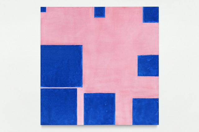
Paul Mogensen, no title (cobalt blue and dilute carmine, eight square progression around the edges), 2019, Cobalt blue stand oil and dilute carmine ink on panel. Photo: © Paul Mogensen, Courtesy of the artist, Blum & Poe, Los Angeles/New York/Tokyo, and Karma, New York.
For gallery-goers, as for everyone else, 2020 was a strange year. Brick-and-mortar spaces were forced into hibernation and physical interactions with artworks were replaced by virtual “viewing rooms.” Exhibition openings and artist talks gave way to a plethora of Zoom events of varying quality. Scandals and controversies (most having to do with the ideological shifts of the last six months) dominated the conversation to an unusual extent, making issues du jour a requisite filter through which all art was now to be seen. No matter how myopic the outcome, the conjectured sociopolitical proclivities of a given artist became the fulcrum of curatorial decisions. The postponement/re-postponement of the “Philip Guston Now” retrospective was just one example. Others were enumerated in James Panero’s comprehensive analysis in The New Criterion of last December. It is hardly a surprise that in such a climate only a handful of critics and writers continued to concentrate on art proper. Luckily, in Los Angeles the task has finally been made easier with the recent limited return to in-person viewing.
I chose the four gallery shows on my itinerary on the principle that each represented a different facet of abstraction. The first stop was the Paul Mogensen exhibition at Blum & Poe. Until a few years ago, Mogensen, who was born in Los Angeles in 1941, was best known for his early arrangements of square and rectangular canvases whose size and shape were pre-determined by arithmetical formulas. Prior to his move to New York in 1966 he studied the hard sciences, arriving at a method of painting that excluded any personal or narrative references. Most of Mogensen’s early works were untitled and undated, sparing the viewer of any contextual distractions. Their shapes were based on number progressions and classical ratios, and their colors—phthalo blue, cadmium red, ivory black, pyrrole orange—came straight from the tube, unmixed. In these multi-panel works, everything, including the use of negative space, was a given, eradicating any danger that the artist, or the viewer, would lose themselves in aesthetic arbitrariness.
Yet Mogensen has had little interest in the label of Minimalism. Nor did he see his old canvases and drawings as abstractions of reality. Mogensen was inspired by Vladimir Tatlin and Alexander Rodchenko—the two utopian visionaries of Russian Constructivism who substituted production and scientific determinism for individuality and chance in the 1920s. That early ambition of absolute neutrality held steady in Mogensen’s seemingly touchless works from the 1960s, but the ones made after 2017 tell a different story. To me, new works like no title (cobalt blue and dilute carmine, eight square progression around the edges) (2019) look more akin to Kazimir Malevich’s suprematist canvases that originated with the famous Black Square (1915), which Malevich poetically and lovingly christened a “living regal infant.” In these later works, made over the last five years, Mogensen moves away from his early obfuscation of painterly touch, revealing chunky, animated brushstrokes within the fields of unmodulated color.
On the opposite end of the spectrum from Mogensen’s strictly defined parameters is Gerhard Richter’s exhibition at Gagosian in Beverly Hills. In addition to his six monumental Cage paintings, named after the American composer John Cage and made at Richter’s studio in Cologne in 2006, the show features a suite of graphite drawings from eight days in July 2020. The Cage paintings are chance-based, owing to the unpredictability of the scrape technique that Richter employs, and the resulting layering of paint creates the effect of striae. The drawings, however, have an open, transparent quality, with only occasional interruptions of frottage and smudging. There is something of the surrealist method of automatism in these works, though their gentle dreaminess is the reverse of the surrealists’ aggressive irrationality. Even the thin, straight, vaguely topographical lines in the foreground underscore their gentle smoothness. These drawings are the silk lining to the velvet outer layer of the Cage paintings.
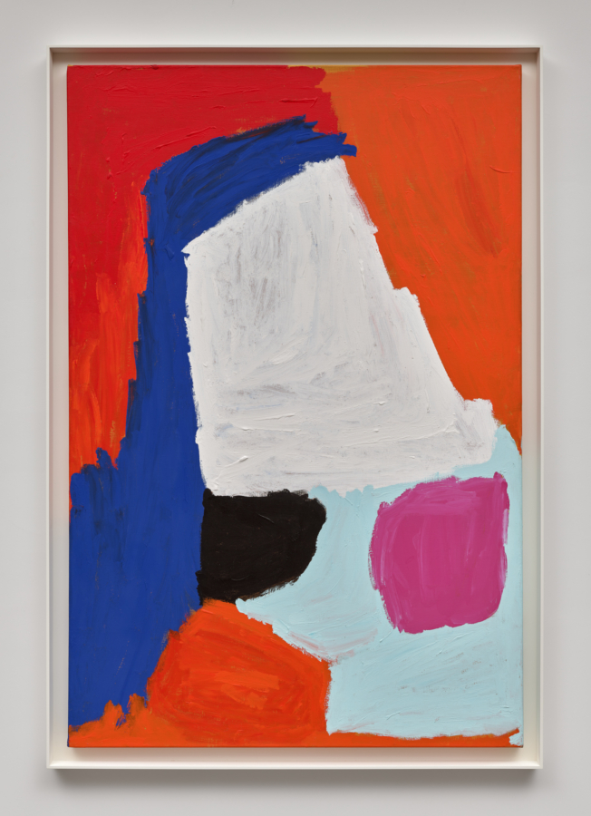
Stanley Whitney’s eleven canvases at Matthew Marks resonate with both Richter’s exploration of the incidental and the interconnected structures that characterize the more recent phase of Mogensen’s career. The 2020 oil on linen How Black is That Blue, which lent its title to the show, is a good illustration of a simile Whitney uses to explain his work: “I think about it . . . as stacking color, almost like I’m a bricklayer.” His “bricks” are color blocks of squares and rectangles, varying in size and separated by horizontal stripes of color. These stripes manifest the idea of variation by way of a painterly encroachment between neighboring color blocks.
The rhythm of Whitney’s colors is a rhythm of chance. A near-contemporary of Mogensen, Whitney uses his color blocks in a way not unlike Mogensen’s later works. But where Mogensen is serious, Whitney is playful: his canvases reuse nearly the same palette, creating vastly different paintings through fairly minute changes of the weight and color of the forms. Whitney once observed that it is the 2–3 percent difference between otherwise identical human individuals that makes them interesting.
Whitney’s paintings channel effortless immediacy. His virtuoso act of appearing to relinquish control provides quite a contrast with Jim Isermann’s “Hypercube” exhibition at Praz-Delavallade.4 Isermann, who at sixty-six is the youngest of the four artists discussed here, presents nine variants of the “hypercube,” which are splayed out in acrylic paintings on nine canvases stretched over honeycomb aluminum panels. Just as Mogensen did in his 1960s paintings based on the N+1 progressions, Isermann engages mathematics and ratios, positioning two, four, and eight stripes on the opposite sides of each painting’s depicted cube as an attempt to visualize a hypercube—an n-dimensional analogue of the square (as the cube is to the square, the hypercube is to the cube). Using something like what Dave Hickey once termed the “LifeSavers palette” of green, red, yellow, and orange, Isermann explores variations of numbered stripes, sequencing them from the simplest Untitled (2, 2, 2) to the most complex Untitled (8, 8, 8) across nine pieces in the show. His brand of abstraction is humble and historically aware: it is the progeny of Russian Constructivism, though liberated from that utopian movement’s ideological baggage by Pop Art and Op Art.
Despite Mogensen’s reluctance to be seen as an abstract painter, his work, as well as that of Isermann, Richter, and Whitney, underscores the character of abstraction as an essay in finding the right balance between space and color, aided by rhythm. Their paintings are visual manifestations of ideas or feelings, but the works’ fundamental meaning lies in aesthetic qualities. And although this particular gallery outing happened to center on abstract painting, I believe that any art worth its salt can hold its own without sociological footnotes appended. So, then, let’s hope that being able to see actual artwork in the flesh once more will bring about a much-welcome return to seeing paintings for what they are—aesthetic objects that use color and space to generate pleasure and to stimulate thought.


