Robert Grosvenor, published by Karma, New York, 2020.
Download as PDF
Robert Grosvenor is available here.
Robert Grosvenor’s sculpture represents itself. It is what it is—and hasn’t it always been? Looking back at what he’s done over the past fifty or so years, while we can identify certain turning points in an otherwise unhurried evolution, this is an artist who has consistently constructed and placed objects in space, first for himself, then for our consideration—if and when it’s sent out into the world. Grosvenor sees more fully what he’s done when his work comes into wider view, from the studio to the gallery, sometimes after an extended interval. A long exhibiting history is a very broad view, both for him and, in terms of what he’s accomplished, for us. But the occasion for these thoughts, rather than retrospective, is the appearance of three new sculptures. They are related yet different enough from one another that each has its own distinct personality, sharing that of Grosvenor’s as well. Unlike any number of artists who came to attention in the ’60s and ’70s, whether working in two or three dimensions, Grosvenor never produced in series, never relied on seriality or progression. His progress has been measured, slow and steady. You get the feeling that he surprises us just as, to some extent, he must surprise himself. Reason enough for longevity. As is true for any artist consistently engaged with what’s at hand, Grosvenor is most interested in what’s before him in the present. Still, to address these more recently exhibited works, we can’t help but recall where his curiosity has taken him along the way. Life, the life of the artist, the life of the mind: all come to bear on the art as equally physical and cerebral.
Whether set firmly on the ground or suspended in midair, which they once were, Grosvenor’s sculpture inhabits and animates a field of vision. As with traditional object-making, he has engaged form, mass, material, color, and scale—from monumental to what may be thought of as vernacular, from weighted to lighter than air—in unexpected ways that ultimately take perception elsewhere. When there’s a familiarity, we bring our own associations to an object (often diverging from those of the artist), needing to make sense of what we see, not always with certainty. In this, an experience of an object and its situation allows us to regard ourselves in relation to whatever is there, above or below, at times with those earlier works of Grosvenor’s traversing the space in between. When viewers come to the fore—others may be present upon entering the gallery, or we’re looking at an installation view reproduced in a book— we are reminded of a pictorial convention, painting and its figure/ground, even as we encounter no direct representation and no figures in Grosvenor’s body of work. There’s us. Feet on the floor, eyes in the air. In real time and space. Moving around an object or an arrangement of elements, hovering, as sometimes the works themselves do, we wonder, how to define life-size? Of the same size as the person or thing represented. Proportions are one-to-one. And at all times? Even a Persian miniature, a painted scene best viewed with a magnifying glass, is life-size. So, too, is a Grosvenor sculpture forty feet wide that descends some twenty feet from the ceiling at a forty-five-degree angle, suspended a few feet above the floor. This is only seen in its entirety, in its breadth and triangulation, for the space around it articulates its profile, linearity, and presence, when we have distance. If we ask, what is our commonality with Grosvenor’s work?, we would have to say, simply enough, that he and his work are in the world and so are we. This, as for many artists who take us elsewhere, is a point of departure.
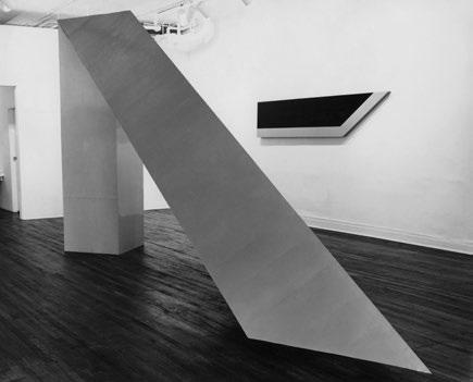
Robert Grosvenor, Topanga, 1965
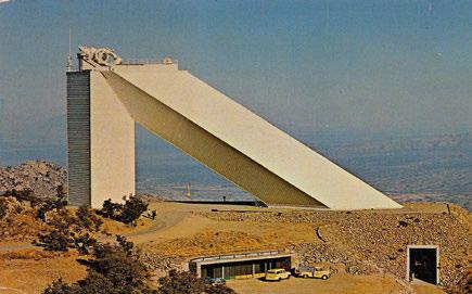
Solar Telescope on Kitt Peak, AZ. Photo: Ray Manley Commercial Photography
In 1965, Grosvenor built Topanga, known primarily from the black-and-white photographs that have been reproduced in catalogs, the pictures reinforcing a relation to Minimalism which is tenuous at best. Even as the sculpture appears lightly gray in the photo, it is—or was, since the work no longer exists—yellow on its inward sides and silver on those facing outward. Yellow and silver! This makes an enormous difference in our reading of it. 1 The color differentiates the work’s facets and planes, its bend or fold from vertical to diagonal. Chromatically, it’s not unlike something he might have done much later or recently. The form, while relating to what might have been identified in the mid- ’60s as a primary structure, has an eccentricity—an elongated, cantilevered “space invader” of sorts—having little to do with blocks, cubes, columns, and planks transformed from the everyday into art. And yet Grosvenor came upon his initial idea after he saw a picture of a structure that does, in fact, exist: a massive solar telescope in Arizona’s Sonoran desert, the largest in the world, built three years prior. The scientific apparatus is set atop what appears to be a thirty-story tower, with a long angled “ramp” easily one and a half times its size. Grosvenor has said he was impressed by the point where they met, and “wanted to see if I could end the diagonal before it reached the ground.”2 Possible in a structure built with lightweight material (plywood and Masonite) at room-sized scale. Grosvenor was able to engineer the work so that its furthest extended point ended a few inches above the floor: its vertical seemingly solid, its diagonal appearing weightless. A small suspension of disbelief. And yet there’s nothing particularly illusionistic about it. The object is what it is and, fully present, it’s somehow right there. But what is it, exactly? We may ask this of many things he’s done over the years, though pleasurably.
Imagine the viewer’s encounter with Topanga in 1965 when it was exhibited (and only on that occasion) at Park Place Gallery in New York. In that moment, other artists were making reductive painting and sculpture that seemed to partake of common esthetics and concerns, to the degree that you might mistake the work of one artist for another. Grosvenor’s art, in contrast, was expansive, in its descent from the ceiling, balanced and buoyant. You wouldn’t confuse it with anything else being done at the time. His were not specific objects precisely because they were, like UFOs, unidentifiable floating objects, the largest of which was Untitled, Black,1968. This was made to be shown in a museum with a very high ceiling, in a room with great volume, built on-site.3 Here, another photo documenting an original installation gives a sense of Grosvenor’s matter-of-fact sleight of hand, his understanding of and response to architecture. What he’s referred to as an inverted T comes down at an extended angle from above, its horizontal hovering a few feet above the floor. In the photo we can grasp the scale of it because a woman and two children are in the foreground, standing right alongside.4 Had they ever seen anything like this before? This would first and foremost have been an experience, and one not easily forgotten. Fifty-some years later, have they? And where are they now? For us they still inhabit that photograph, each child about half an inch high, and, we can imagine, their eyes open wide in wonder.
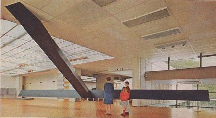
Robert Grosvenor, Untitled (Black), 1968. Photo: Eric Schaal
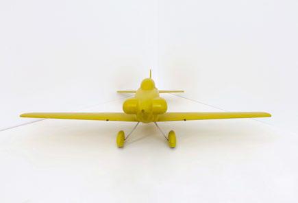
Detail from Untitled, 2020
3 RECENT WORKS
Sheet metal, auto body filler, spray paint. This is the material description for an untitled sculpture from 2019, a triangular, rounded form about 5 feet tall at its highest point, 28 inches across, 41 long. With Grosvenor’s collection of models in mind—the aircraft, in particular—this object can be related to the nose of an airplane or the visor/hood of a cockpit. At the same time, with its smooth, gently curving edges, tapered to the front, it appears, despite overall proportions, as if it could be held in the palm of one’s hand. This suggests the sort of small stone we might pick up on a beach, formed in the ocean, polished over time, washed ashore, requiring closer inspection. Gemlike, the color is reminiscent of jade faded to sun-pale lime, a hard candy soft to the touch. From behind, however, with its dimpled lip, there is an industrial though handmade feel, from nature but indirectly—in near proximity. The “auto body shop” of the artist’s studio is not far from the sea, and of course artists—as we all do—carry various locations around with them in their heads, a mental landscape that transcends space and time.
The object before us in the gallery is a sculpture, clearly. What else can it be? The nose cone of a rocket? From all lower sides it floats above, not visibly touching the floor. This object, with all its integrity as such, does what the extended length of Topanga offered fifty-five years prior, but in its entirety, with great subtlety, what we might call matter-of-fact magic. The color has a lot to do with this, its cool temperature, as does the coloration and finish of the floor it’s set upon. Here is a matter, again, of Grosvenor’s attention to an object and its placement, the room where it will live, briefly to be encountered by others. This work is neither an engineering problem solved nor an object-type trompe-l’oeil. It’s what this artist has always done, and seemingly effortlessly, encompassed in all the decisions taken, taking everything into consideration. Look at the work from the side. The back is not perfectly vertical. The sculpture tilts forward at maybe a ten-degree angle, having come to rest gracefully on the floor over which it seems barely to hover, as if it had only just been placed there.
The same materials were used to make a wholly different sculpture in the same year, also untitled, though conveying a more associative response, relating to the car models the artist has collected, as well as to cars he photographed on the Bonneville Salt Flats in Utah. This sculpture, a stealth vehicle of sorts, has a low profile, about 3 feet high to an expanse of 11 feet long, the curved front and back of the “chassis” accentuating a slight elevation over the floor, Grosvenor balancing mass and lift. This is also achieved chromatically. Painted brown and blue, the matte, dark rubber feel of its main brown block has a rubbed quality, in contrast to the glossy blue with which he has articulated the front and rear ends, closer to a car’s lustrous finish. Seen from an angle lengthwise, the extended side panel looks somewhat like a surfboard. The sculpture has the scale of a subcompact car, although the dense compression of its visual weight and its low profile make it appear impenetrable, unmovable. Even as you can’t imagine being able to get inside to operate this vehicle, it suggests aerodynamic potential. This body, which we may think of as being both at rest and in motion, embodies a pervading sense of mystery and, despite its resolute stillness, velocity. It holds the room as a car being driven holds the road, anchored to itself. This brings to mind the solid mass works Grosvenor made between ’76 and ’81, constructed of wood beams and finished with creosote, paint, and, in one sculpture, grease. In 2019, the artist continues to engage with proportion and mass in unexpected ways. With this new work he has streamlined weight and lightness with fleet solidity.
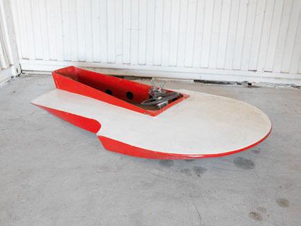
The third work recently exhibited, dated 2015–19, has had a longer route to the finish line yet still seems inevitable in the sense that what was arrived at makes sense from every angle, from the curve of its broad bow to its beveled stern. In this respect we are reminded that what we see as a resolved object in a gallery setting is, more often than not, the result of unseen thought and effort and all the unexpected detours a work may take in the studio, sometimes put on hold and returned to at a later point in time. Was this sculpture five years in the making? Built with aluminum and painted in lacquer, a silver/aluminum, it seems to have sailed into the gallery without any of the “usual snarl.” This was Grosvenor’s off-the-cuff response to a friend’s having asked how things were going one day with a small boat dockside, and how it came to be named.5 Any boater will tell you that things inevitably get tangled—lines, an anchor’s chain— and that weather can shift precipitously. Out on the water, as in the studio, the best-laid plans can meet all sorts of predicaments that are unpredictable.
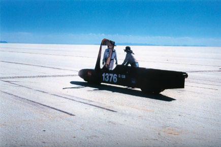
Photograph by Robert Grosvenor
An artwork has to be fully resolved to the artist’s satisfaction, and may take considerably longer than the time involved for fabrication, especially when we factor in not only conception but how memory aligns with the present. This work was in fact more than five years in the making. An earlier, near-identical sculpture in plywood was based, Grosvenor has noted, on “a father/son project from 1948 … a hydroplane designed to go fast, a 3-point hydroplane, 3 points touching the water,” which he “modified … somewhat,” and was “built just to race.”6 The blue boat poised atop a small white pedestal has the buoyant feel of a small hovercraft that can glide across any surface, even that of a gallery. Looking at it, we might imagine a mast and sail. It doesn’t need them, not even in the mind’s eye. It’s an idea, really, like all of Grosvenor’s work, built to be seen, his sensibility reasserting itself, articulated anew.
Robert Grosvenor’s studio
Notes
1. In the mid-’60s, as it would continue into the ’80s, photos of artworks in books, catalogs, newspapers, and magazines were often reproduced in black and white. This evening out of tones, especially in installation photos, created an equivalence between what might be very different sensibilities. In the photos of the Green Gallery show in 1965, taken by Rudy Burckhardt (an artist in his own right, a well-regarded photographer and filmmaker), it’s the forms that come through, so Grosvenor’s works appear to have an affinity with the minimal shaped canvases in the background. That same year, he had been included in the landmark exhibition Primary Structures at the Jewish Museum, where pictures may have created false impressions—Grosvenor’s work, even as it was suspended from the ceiling down, was seemingly part of a Minimal look, comparable to the pared-down forms of a Robert Morris or an Anne Truitt, when it was not. The development of his art in the ’70s (the broken wood pieces) into the ’80s (the visceral physicality of the wood and creosote works) and onward would clearly reveal that he had been associated with, but was not of, this earlier “movement.”
2. Robert Grosvenor, in conversation with Ulrich Loock, as quoted in Robert Grosvenor (Porto: Museu Serralves, 2005), 46.
3. The exhibition Minimal Art, organized by Enno Develing, was held at the Gemeentemuseum, The Hague, Netherlands, in 1968. The first presentation of American Minimal art in Europe, nine of the ten participating artists had been included in Primary Structures at the Jewish Museum. One wonders: if Grosvenor was to be shown to an audience as a Minimal artist, with the ambitious Untitled, Black, 1968, he would display his sculpture to maximal effect.
4. The photo, reproduced in the Serralves catalog, first appeared in Newsweek magazine.
5. Robert Grosvenor, conversation with author, during installation of Robert Grosvenor at Karma, New York, January 6, 2020.
6. Robert Grosvenor, email to author, March 5, 2020.
