Shelf Life, published by Karma, New York, 2018.
Download as PDF
Shelf Life is available here
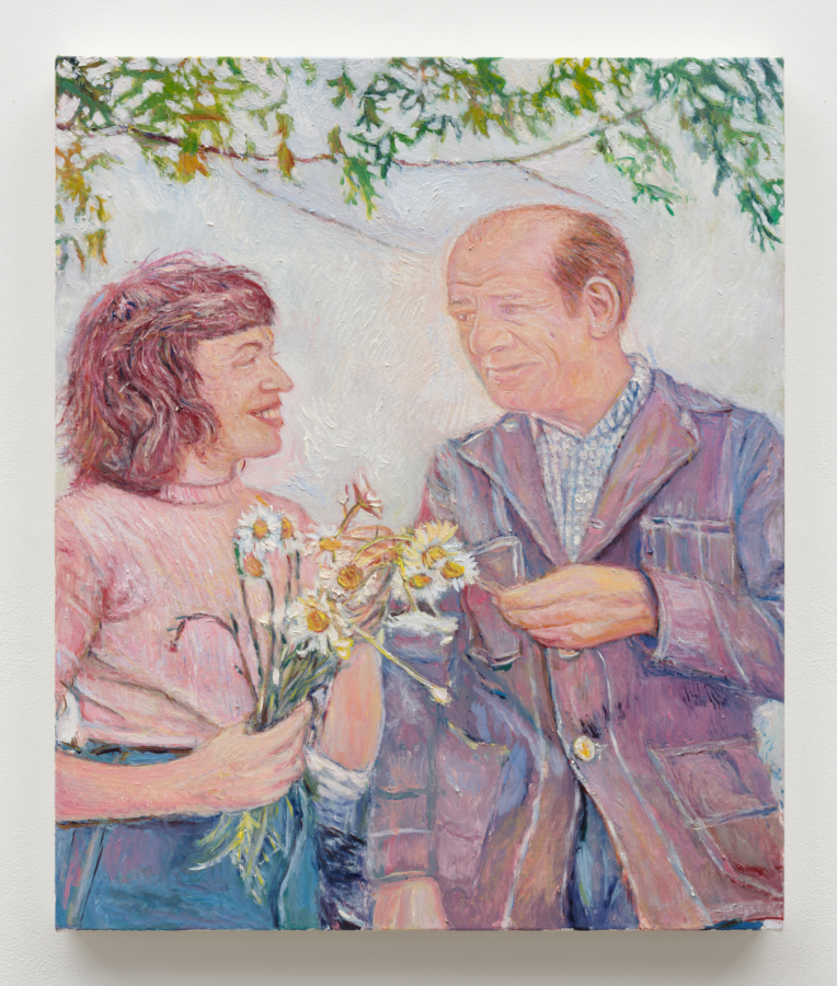
During Mathew Cerletty’s undergraduate years at Boston University, representational painting was encouraged, abstraction was not. He began making portraits, of friends and of models found in magazines. Toward the end of college, he discovered the work of Lisa Yuskavage, John Currin, and Richard Phillips. Their semi-fantastical depictions of figures who read more like characters in a story than formal sitters inspired Cerletty to inject a sense of the ridiculous into his own work: color, patterning, and a cartoonish tone supported a whiff of narrative in his portraits. But in New York, just after college, he was exposed to the diversity of artmaking in gallery shows and through peers from other art schools, and his feelings about portraiture were upended.
The painting Teeth, made in 2004, two years after Cerletty left Boston University, shows the artist in flux—looking both for a way to change portraiture, he has said, and for a way out of it. The painting depicts a man, arms folded, in three-quarters view. He gazes into the corner of the canvas and would appear aloof were it not for the prosthetic teeth Cerletty glued to the man’s mouth, obscuring most of his upper lip and producing a macabre grimace. Assorted brushy strokes of grays and white appear on the man’s shirt (or, as Cerletty puts it, “Jasper Johns on his turtleneck”), and the background contains scattered nests of gray- and flesh-toned marks. The man’s visible fingernails are each painted a different color: red, blue, yellow, and black, a nod to the foundations of color theory. “When representational painters start gluing things to the surface,” Cerletty says, “they’re trying not to do the thing they’ve been doing, but they can’t quite figure out how not to do it.” With these small transgressions against traditional portraiture, the painting feels quietly rebellious, reveling in its subtle breaches of propriety.
In the 2002 drawing Wishing I Had a Twin Sister he has drawn a topless model, found in a magazine, but has replaced her face with his own. The next year, he drew Le Saucier, in which another glass bowl in one hand, the fingers of her other hand pressed to her lips. Again, her face is Cerletty’s. The reflection of a woman in silhouette appears in a mirror on the left side of the canvas; it is the woman from Wishing. Given the angle of her reflection, the woman of Le Saucier might not be looking out at the viewer but across the room at her “twin.” Cerletty has said that he was imagining himself in different roles, different lives. A series of rooms appears seductively just at the right edge of the canvas, and a black cat rounds the corner of the doorway, exiting, almost invisibly in shadow. Each successive room is ornamented with similarly elaborate floral wallpaper, like a funhouse mirror where each reflection bears some subtle mark of difference.
Over the next few years, Cerletty experimented with paintings of text, company logos, and patterns. The text paintings are stylistically diverse: the carefully penciled “typewritten” words of Lust , from 2008; the playful, homemade-sign aesthetic of I Love Exercise, from 2006; the faux-modernist graphic quality of Thank You, from 2008. In his pattern paintings, Cerletty seems to test the relationships between repeating objects and designs, making a show of an item’s unexceptionalism when displayed again and again alongside its mirror image. With brand logos, his subjects become more ambiguous. In the drawing, Dial, from 2008, he reproduces the three-dimensional incised lettering from a bar of Dial soap, maintaining the shallowly carved texture of the source but setting it adrift in the blank space of the canvas—almost as a riff on Ed Ruscha’s “liquid word” paintings of the late 1960s. In other works from this period, the logos of Diet Coke, the North Face, and Kohler are similarly pulled out of their original contexts and left to stand on their own. He depicts them in red, say, and then in black, as though turning them over in his mind, or “feeling” them visually. These familiar designs become graphically banal, and yet their deadpan presentation is undeniably intriguing.
Within this interstitial period, Cerletty produced Yoplait: a container of the titular yogurt, strawberry flavor, drawn on a neutral background. The next year, he made a silkscreen print of another Yoplait container, now blueberry. Cerletty’s interest in text, the familiar graphics of branding, and repetition comes to fruition in the depiction of a commercial object and its variant. In a move, he throws off the mantle of portrait artist and becomes, as de Kooning once dubbed Jasper Johns, “a sign painter”—that is, a painter whose work doesn’t bear the weight of an academic tradition but presents its subject straightforwardly. Cerletty’s Yoplaits are not unlike Johns’s pair of Ballantine Ale cans cast in bronze: ordinary objects (both comestibles, at that) writ in the medium of high art. Central to Johns’s practice was the notion that the object, once reconstituted in the guise of art, becomes “something other than what it is.” He was interested not only in the before and after of that transformation but also in the process of “becoming.”
As Cerletty’s more recent object paintings attest, he, too, is invested not in depicting a familiar object in an unfamiliar medium but in facilitating an ongoing relationship between that object and the viewer. His aim in the object paintings, he says, is to find a way “to make the paintings self-aware.” He selects objects—items of clothing, home printers, mailboxes, space heaters, and so on—with which viewers are likely to have intimate relationships. Certain objects, such as shirts, jackets, and chairs, are directly related to the body and serve as stand-ins for human subjects. With other, more banal objects, like the yogurt containers, the viewer seemingly has a more limited set of associations. And yet the object, alone on the canvas, can only interact with the viewer. House, from 2014, shows the side of a brick house—a peaked roof and two windows, each flanked by a set of shutters. The wall is flat, depicted two-dimensionally, and the windows look unblinkingly forward, like eyes addressing the viewer on the other side of the picture plane. A house is more readily a face than, say, a yogurt container, but even these unanthropomorphic objects seem to be aware of the viewer. In two recent works, Wedding Dressand Mut(u)ate; (Un)ity, Cerletty depicts the same space heater, one white and one red. The glass front of the heater shows a glowing cluster of wood pieces giving life to a small but healthy fire. The flame effect, however, has nothing to do with the heater’s output; it’s an illusion. Still, that illusion gives a sense of life to the object, visible through its glass “face.” The heater may not be alive, may not be as humanly relatable, say, as a shirt, but the manner in which Cerletty has chosen to situate it—in three-quarters view, “looking” askance at the viewer—mimics his positioning of human models. The viewer is implicated, has a role to play in giving meaning to the objects. And the objects, Cerletty says, stare back.
Cerletty, in fact, never stopped making portraits. He simply substituted objects for humans and found a way to give the viewer a more profound role in investing the work with meaning. The way he invokes the human body and human participation aligns him with Robert Gober. As Gober’s elaborately constructed sculptures mimic real manufactured items, so Cerletty’s detailed depictions of everyday objects draw attention to themselves, conflating the real and the reproduction and forcing the viewer to reconcile the differences. He also invokes the readymade simulacrum of Gober’s sculptures in a series of interior-decorating paintings made over the past five years. Each shows a scene of domestic design: a bedside table and lamp; a room, ostensibly a bedroom (the only clue is a wooden armoire), about to be repainted; an entryway setup, with narrow cabinet, key hooks, and cheaply produced art. Cerletty sought out existing scenes, like IKEA showrooms, rather than collaging elements from various sources. His aim was to make them appear seamless. “I feel like the pictures lose a lot of their autonomy if my authorship is a huge presence,” he says. “I want them to feel much more like I found them.”
It’s tempting to ascribe a Duchampian readymade context to Cerletty’s preexisting, commonplace subjects. But where Duchamp upends the question of an object’s usefulness by transforming it into sculpture, eliding its functionality, Cerletty reverses the play, offering a two-dimensional rendering of an ordinary object and putting it to the viewer to determine its role. Duchamp abstracts and negates his bicycle wheel and stool, his bottle rack; Cerletty extracts his North Face jackets and Fruit of the Loom hoodies from their usual settings, only to reintroduce them anew. (Curiously, Duchamp’s work could not escape the desire for a figurative connection: as one might perceive a face in Cerletty’s painting of a house, Alfred Stieglitz felt that Duchamp’s urinal “has an oriental look about it—a cross between a Buddha and a Veiled Woman.”) As portraits, Cerletty’s works function as visual stimulants, people objects with whom the viewer must engage directly.
In other recent work, this idea manifests in tricks of perspective. Just Married, from 2016, shows two identical mailboxes—doors open, flags up—in the rain. The mailboxes are mirror images of one another, yet the subtle irregularity of the uniform raindrops (falling almost in a pattern, but not quite) disturbs the harmony between the duplicated mailboxes and induces an unsettling vibration in the painting. In Girlfriend, from 2013, a woman is shown from the front in the yoga pose utkatasana: her upper body leans precipitously toward the viewer, as though she will at any moment tumble out of the painting into real space; the viewer must grapple with this tentative arrangement.
“I’m trying to create a picture you can keep looking at and stay interested in over a long period of time,” Cerletty says. He determines the suitability of a potential subject—a phrase, a pattern, an object—by whether he himself remains intrigued by it, by whether it sticks in his mind over time. If these subjects come out of Cerletty’s own intimate relationships with them, can his paintings be seen not just as portraits but self-portraits? And if the viewer must activate the “self-aware” work through a feeling of recognition, do the works become self-portraits, in a sense, of the viewer, too? Like the woman in Le Saucier, looking out from the drawing at her double, reflected in the mirror, also within the drawing. Shelf Life, from 2015, depicts the blue cube of a fish tank. The surface of the water reflects the tank’s contents back on itself, and the plane of the canvas stands in for the tank’s literal fourth wall and the painting’s figurative one. The distance between the contents of the work and the world of the viewer shrinks. In another moment, they will be indistinguishable from one another.
Published on the occasion of
Shelf Life
Mathew Cerletty
May 5–June 17, 2018
Karma
188 E. 2nd Street
New York, NY 10009
Edition of 1,000