March 2020
Online Viewing Room
March 25—April 12, 2020
Gertrude Abercrombie, Henni Alftan, Dike Blair, Will Boone, Mathew Cerletty, Andrew Cranston, Ann Craven, Alex Da Corte, Louise Fishman, Mark Flood, Marley Freeman, Ruth Ige, Paul Mogensen, Cady Noland, Woody De Othello, Steven Parrino, Nicolas Party, Mungo Thomson, Jonas Wood
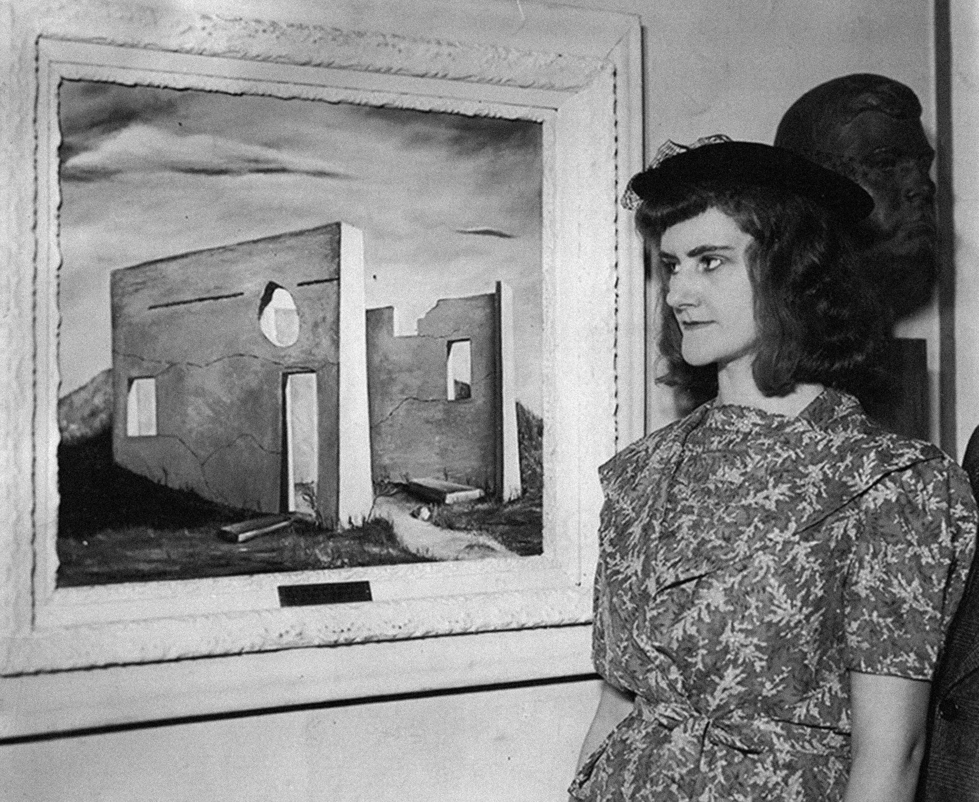
Gertrude Abercrombie in front of Slaughterhouse Ruins at Aledo, c. 1937
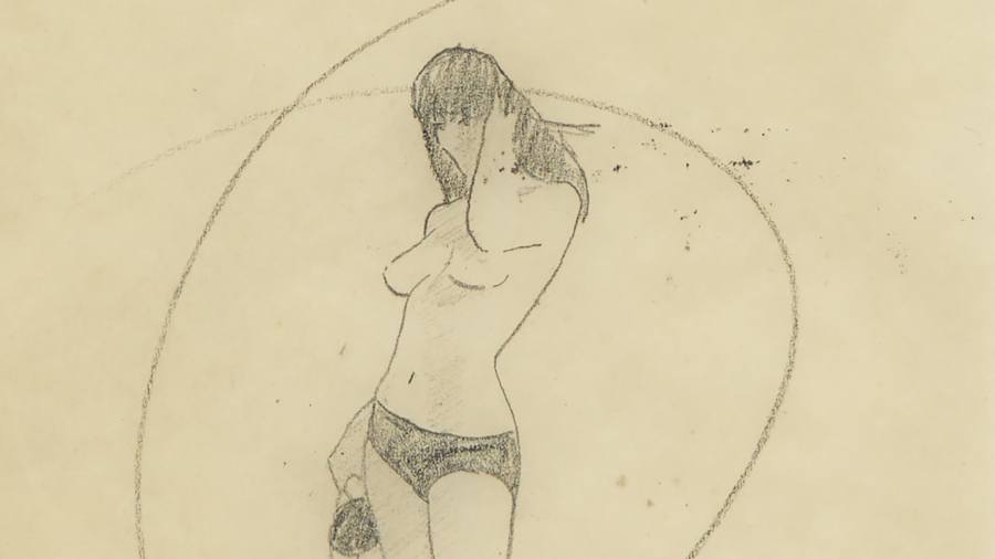
Abercrombie naturally found bebop’s underlying philosophy of freedom, improvisation and odd juxtapositions of tone and timbre analogous to Surrealism. It is the underlying pulse beneath these serial compositions and links Abercrombie’s practice with jazz. Gillespie recognized this and remarked, “Gertrude Abercrombie … has taken the essence of our music and transported it into another form.” They shared the feeling that “Art is just an extension of the artist … you have to seek the truth in yourself and not what anyone else says about it and you just keep going and time will take care of it.” Abercrombie explained how she viewed her relationship to bebop in a conversation with Gillespie that suggests how much she internalized improvisation and the striving for feeling. “What you do is you look and look and look, with artists, and that’s what I did,” she said. “Then I just decided to do it my way, my own direction, it’s a little offbeat, a little dreamy, and mysterious, yes, mysterious, just like the music; nobody knows what’s happening, I know what’s happening.”
– Robert Cozzolino, “The Sorceress in the Center of Everything,” 2018
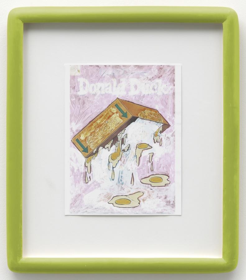
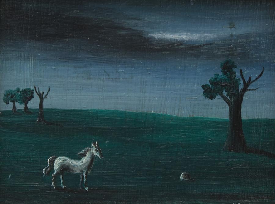
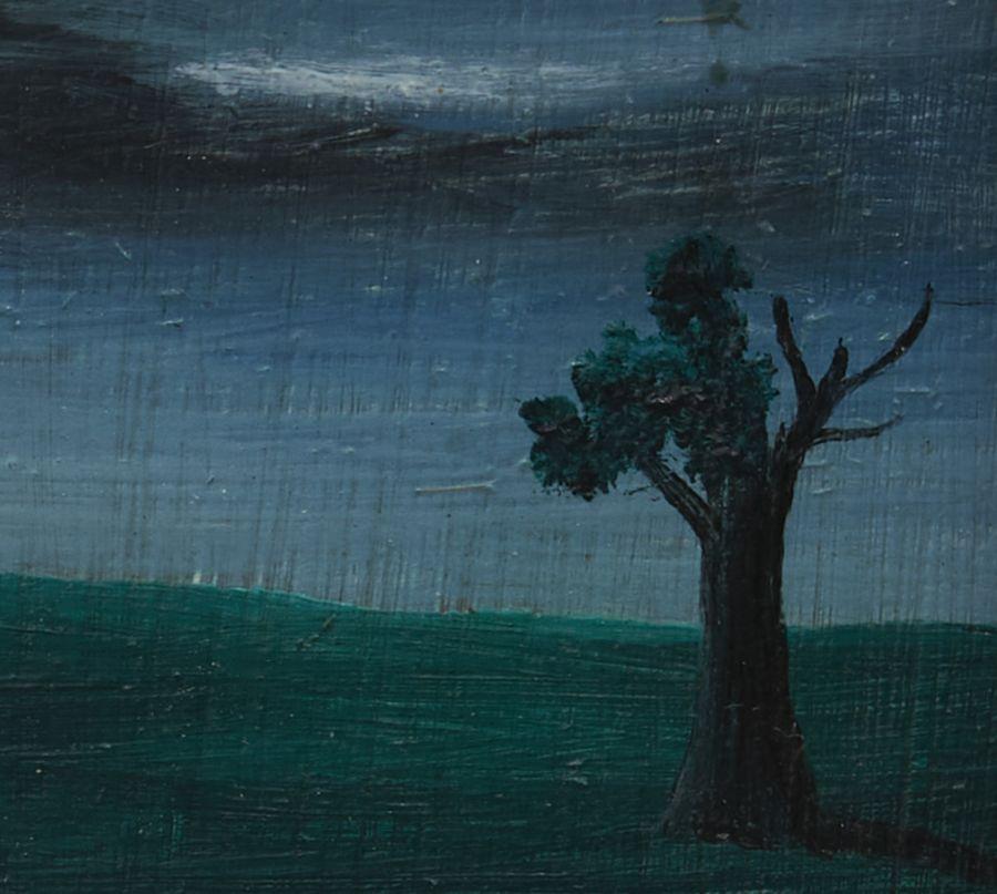
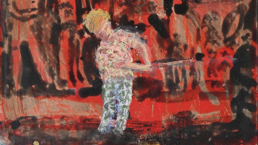
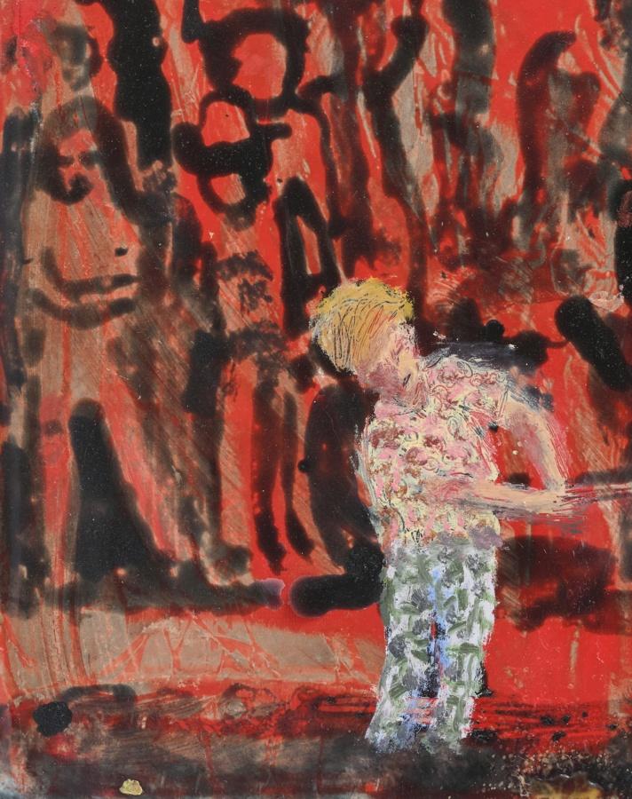
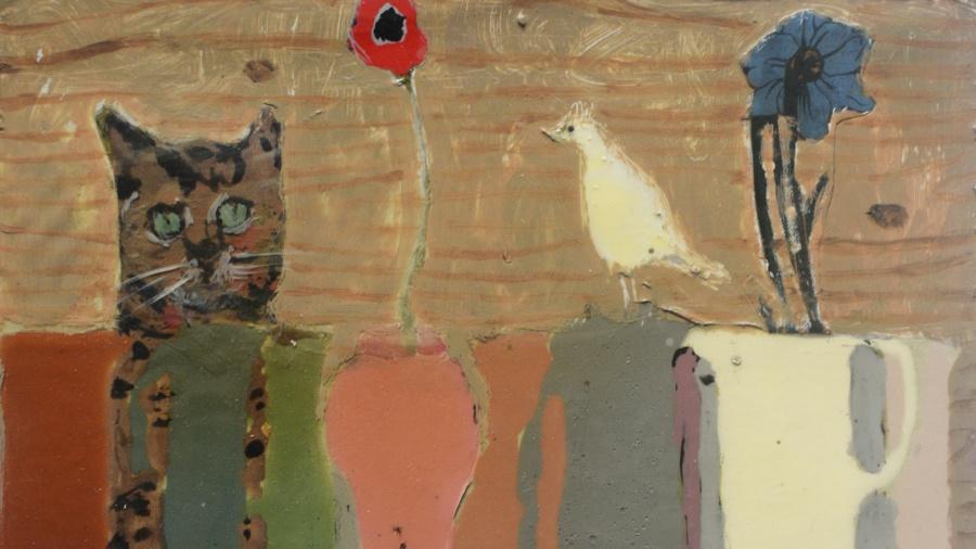
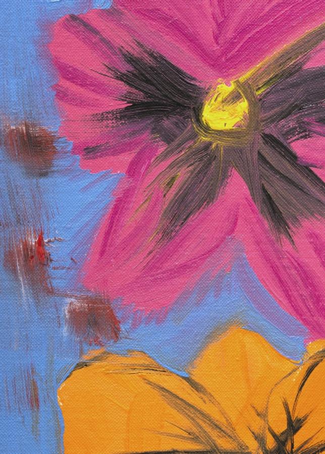
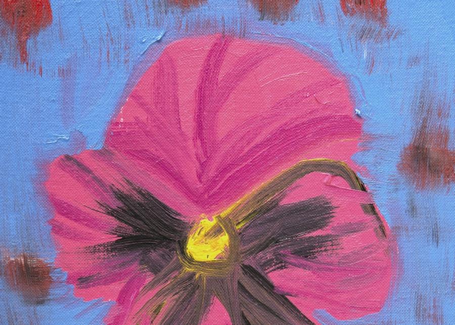
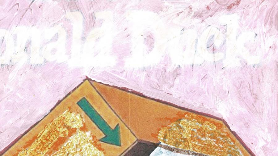
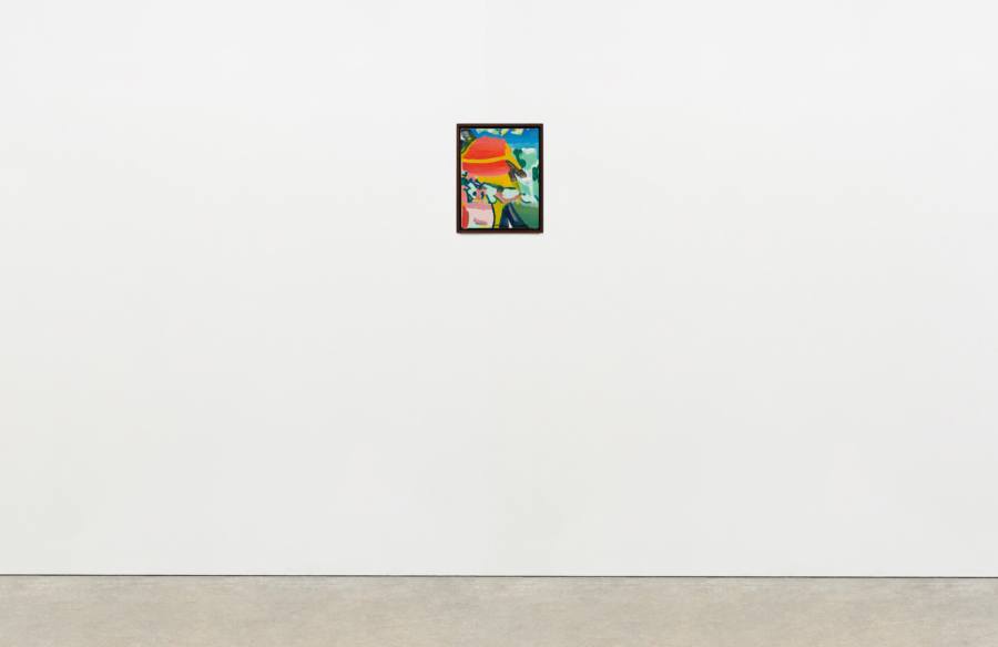
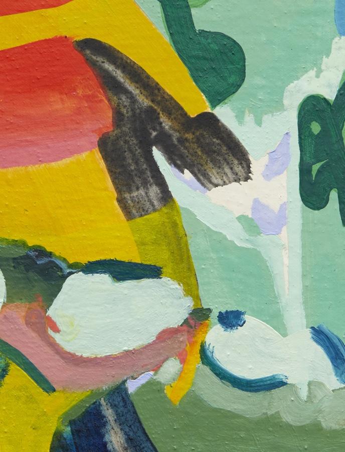
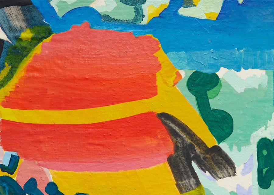
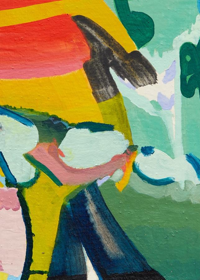
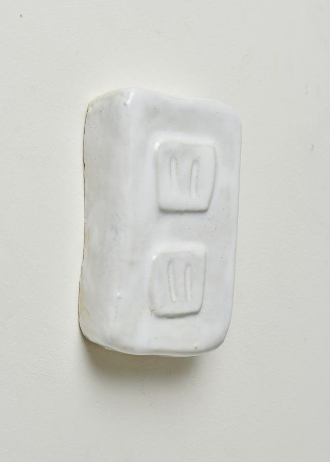
Gertrude Abercrombie
Untitled, c. 1939
Oil on masonite
3 3⁄8 × 2 1⁄2 inches; 8 1⁄2 × 6 cm (unframed)
8 5⁄8 × 8 inches; 22 × 20 cm (framed)
GA-ND-008
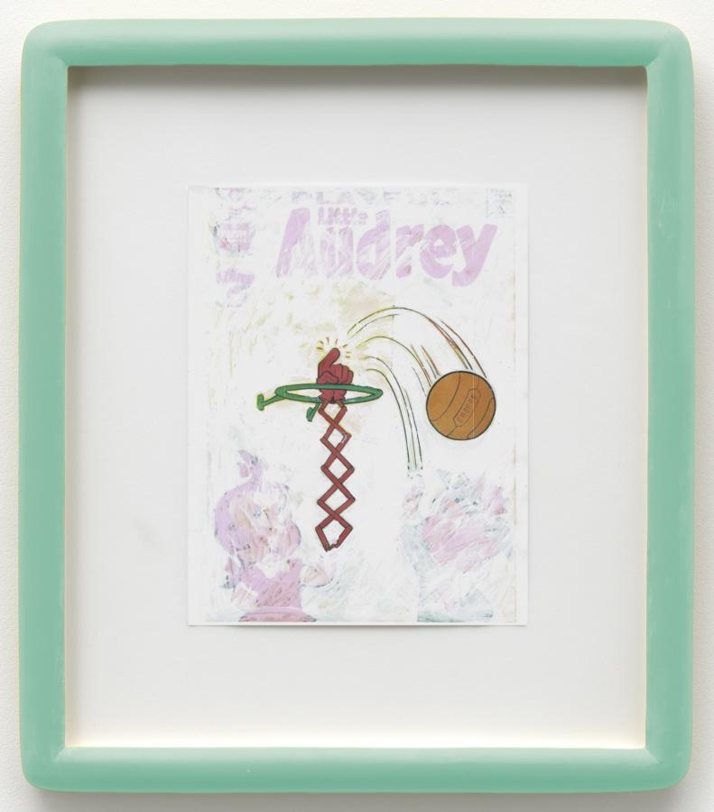
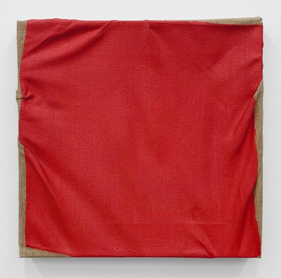
Gertrude Abercrombie
Untitled, c. 1939
Oil on masonite
3 3⁄8 × 2 1⁄2 inches; 8 1⁄2 × 6 cm (unframed)
8 5⁄8 × 8 inches; 22 × 20 cm (framed)
GA-ND-008
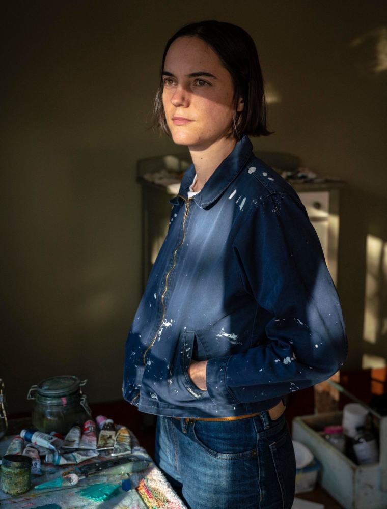
Henni Alftan in her studio, Paris. Photo: Marwen Farhat
Alftan has been developing a form of painting that puts perception to the test. “I paint pictures,” she says. Nothing is ever given to us in its totality. The narrative and temporal dimension of painting escapes us. Hot air, chit chat is excluded. Alftan works on questions of frame and framing from her daily observations. In her notebooks she draws details as well as the main outlines of the images she retains. From a specific scene she captures a look, a hand, an object, a silhouette, a shadow, the detail of a garment, a gesture, a pattern, a color. By endeavoring to reproduce in painting the almost invisible elements of the everyday, the common, Alftan invites us to reflect on what we see, the visible world and its modes of representation. In this sense, her works lead us to think about the image through the painting as an object, its history, its timeliness, its legitimacy, its materiality and its conceptual dimension.
– Julie Crenn, Art Press, 2019
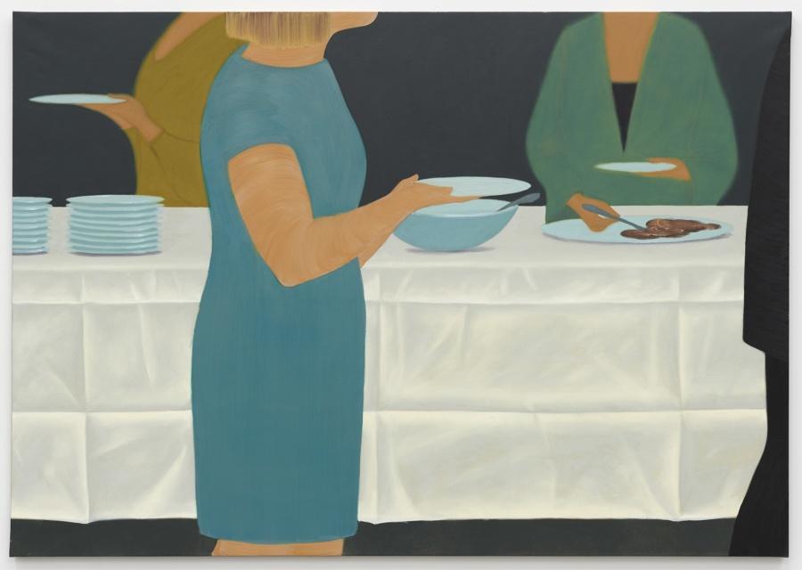
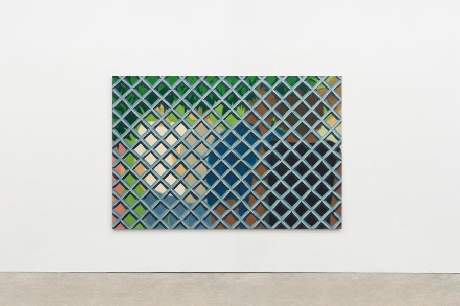
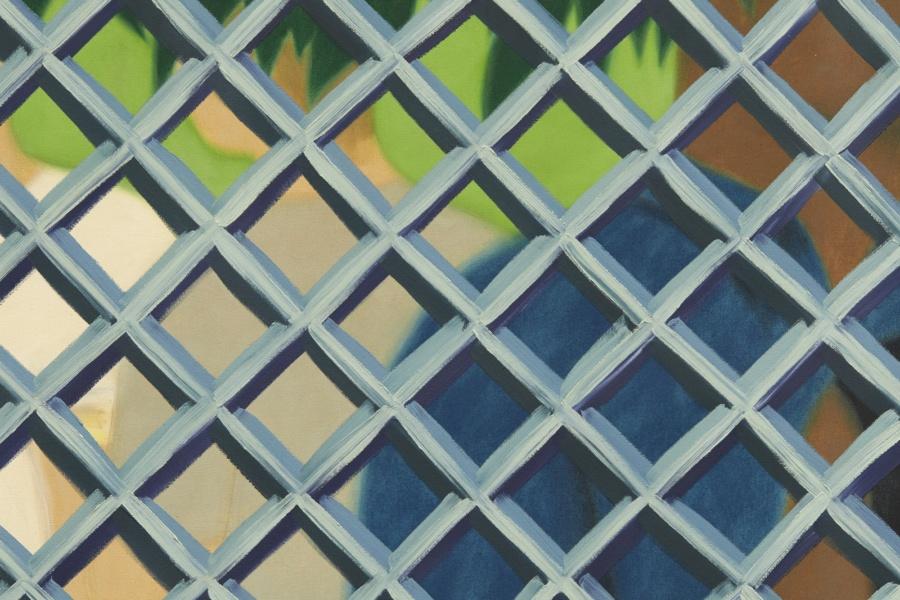
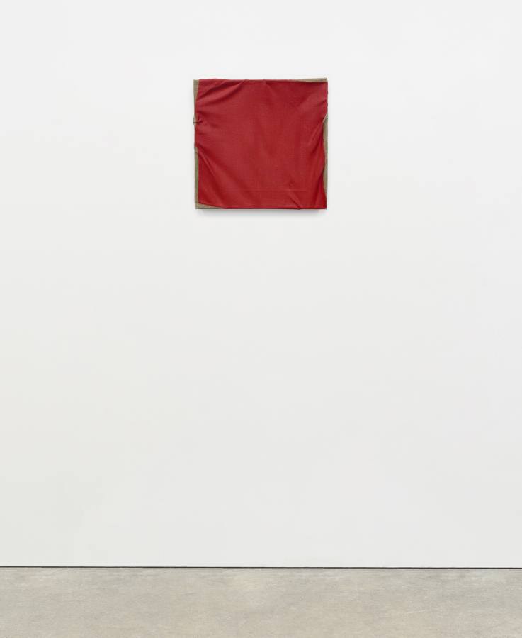
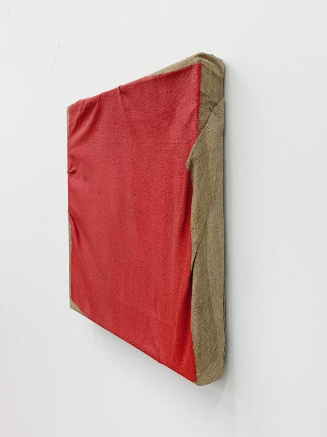
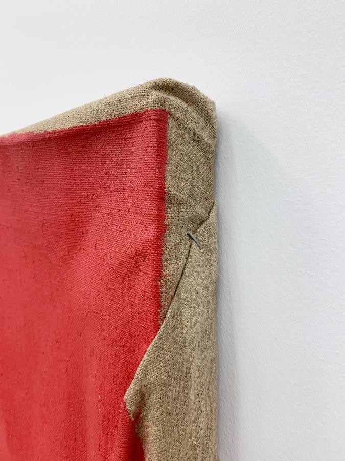
Henni Alftan
Garden Party, 2017
Oil on canvas
51 1⁄8 × 76 3⁄4 inches; 130 × 195 cm
HA-17-017
Henni Alftan
Garden Party, 2017
Oil on canvas
51 1⁄8 × 76 3⁄4 inches; 130 × 195 cm
HA-17-017
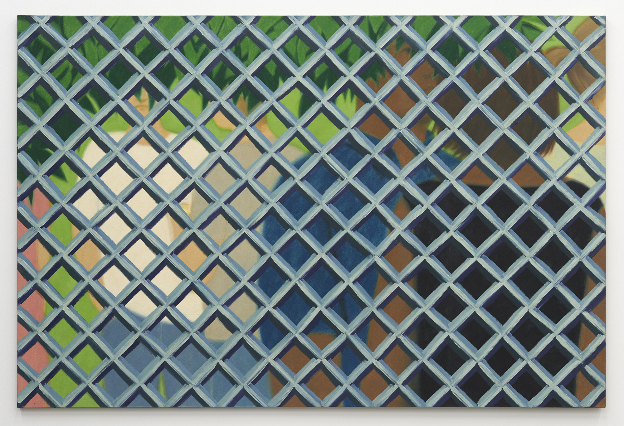
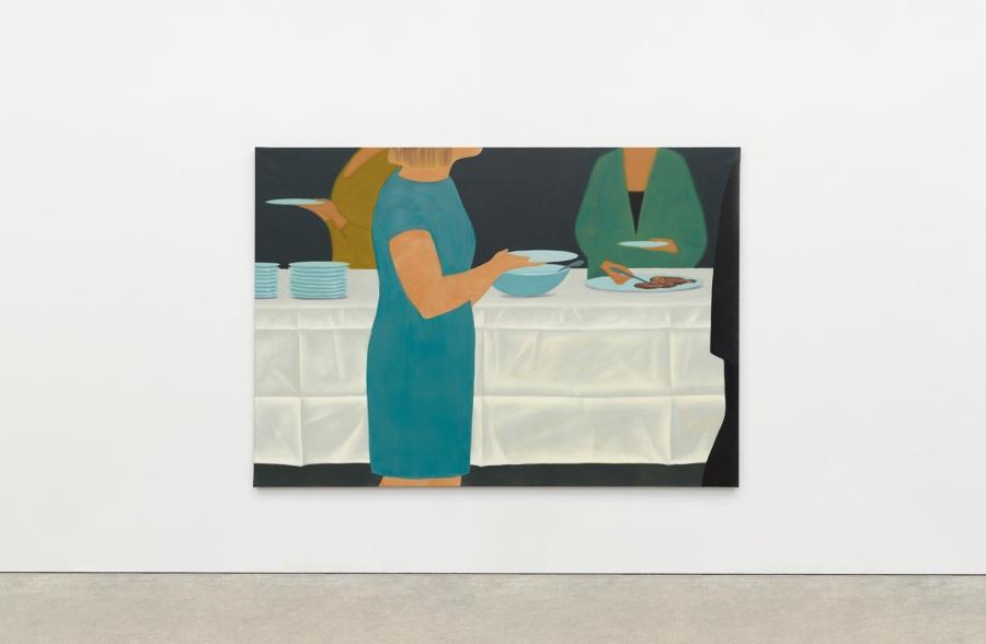
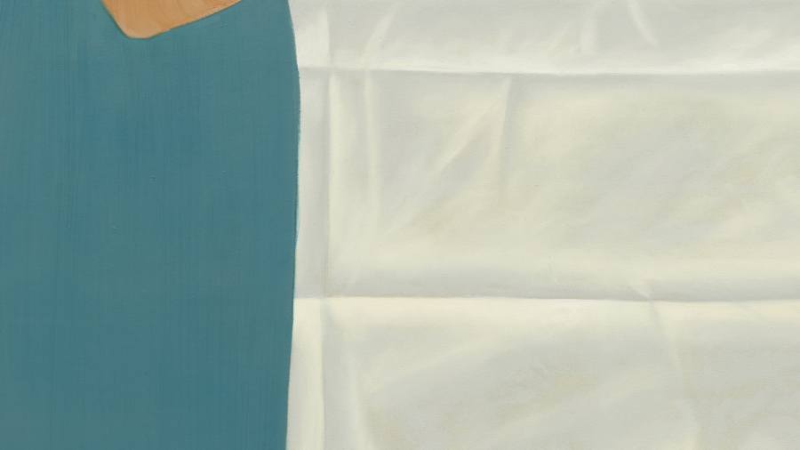
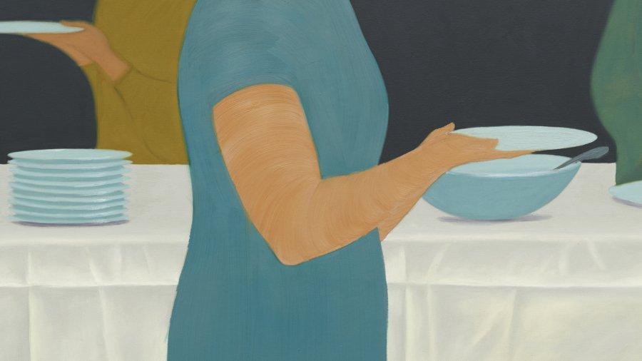
Henni Alftan
Buffet, 2018
Oil on canvas
55 1⁄8 × 78 3⁄4 inches; 140 × 200 cm
HA-18-007
Henni Alftan
Buffet, 2018
Oil on canvas
55 1⁄8 × 78 3⁄4 inches; 140 × 200 cm
HA-18-007
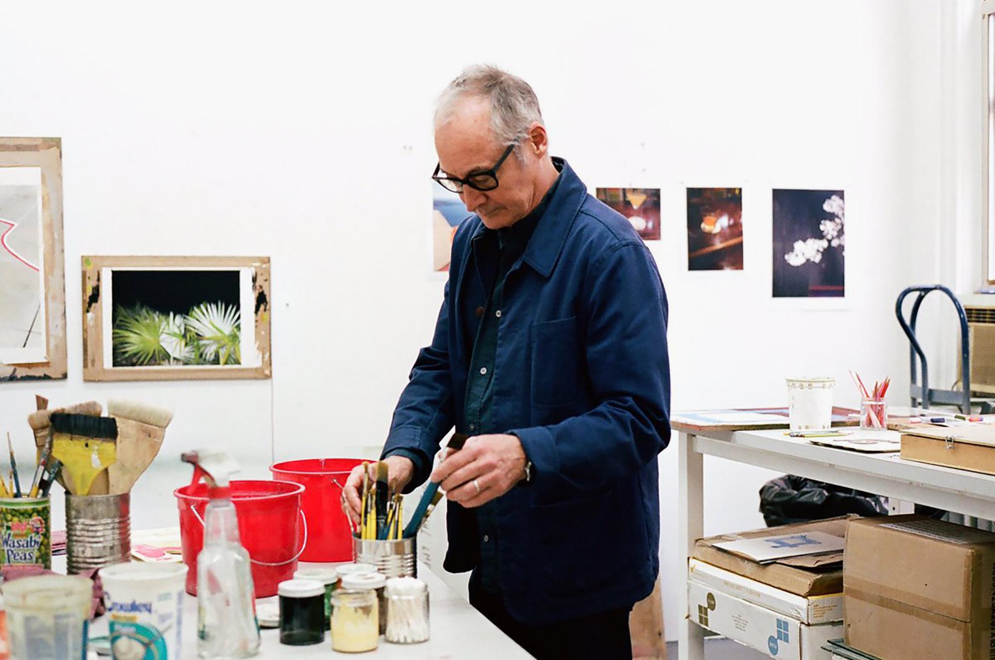
Dike Blair in his studio, New York. Photo: Études Studio
This toggling between oneself and others is, for me, the hallmark of Blair’s work. Both the psychic heft and the existential truth of his picture’s loneliness—their production and registration of this most human of affects—emanates from his unsentimental depiction of how habit allows us to navigate the ongoing logic of the generic and the specific. Every scene he paints—the waiting areas of airports; bars; the too harsh incandescent light on the outdoor plants at night; the blue sky out of a plane window; the seams of windows that frame the view from the bed, leaving us just a glimpse of the tree tops; the bare fluorescent bulbs on the ceiling, is generic. There is nothing here we haven’t already seen. Novelty is not what is at stake, familiarity is. And yet each image is rendered with a degree of specificity that is undeniable: that door, that hotel bar, that flight. In Blair’s hands life is as much in the details as it is in the main event.
– Helen Molesworth, “Hook & Eye,” 2018
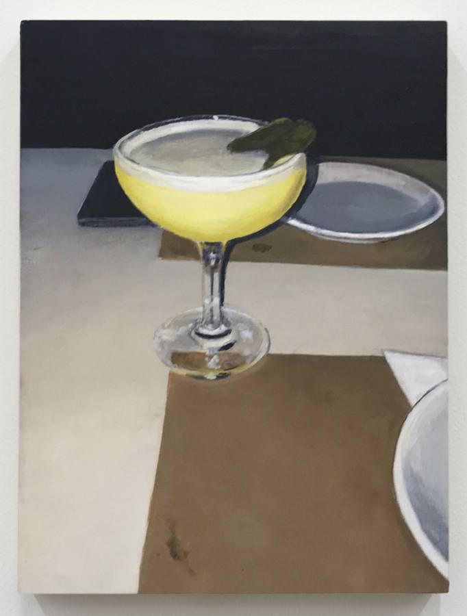
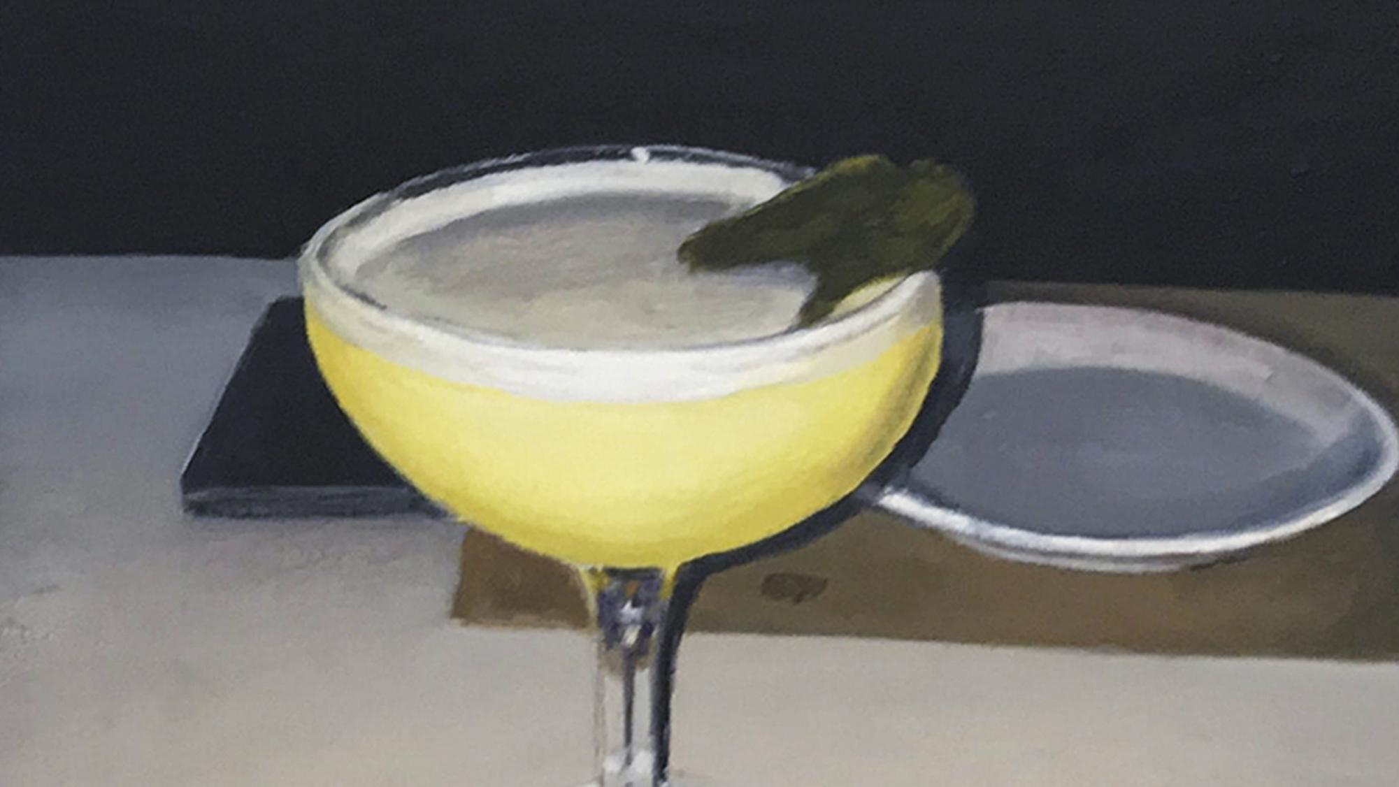
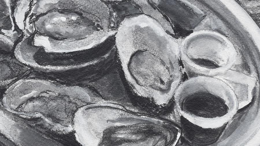
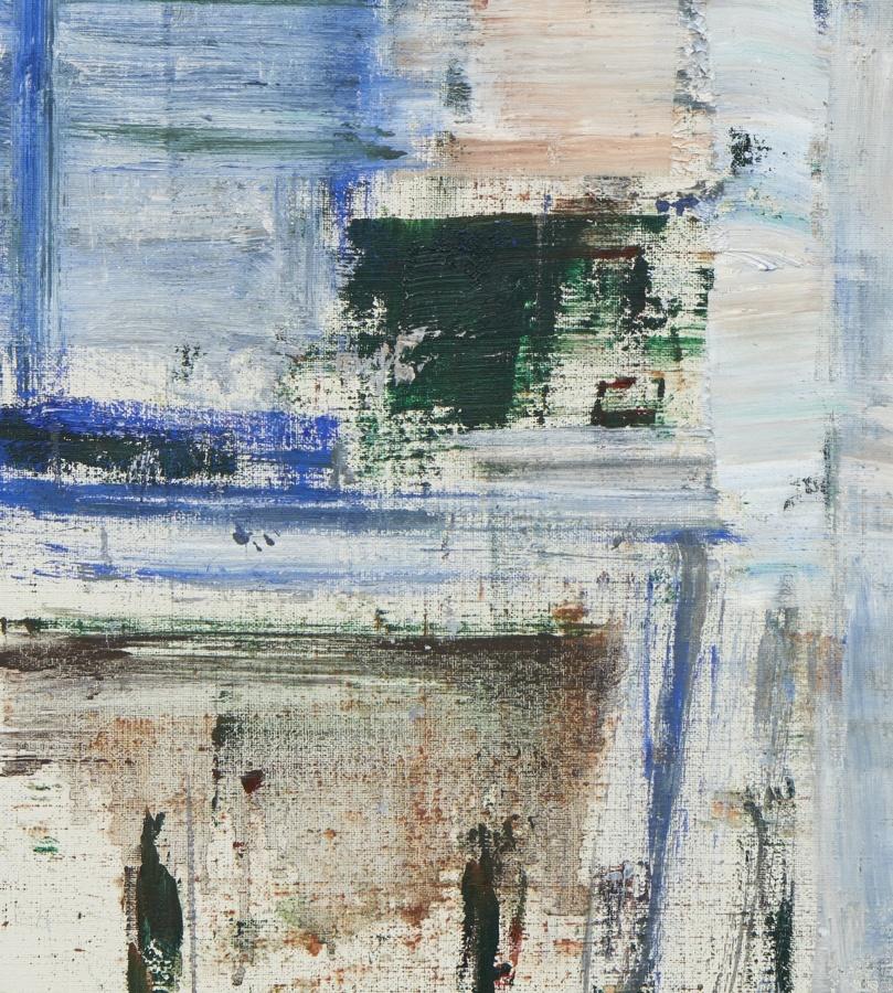
Dike Blair
Untitled, 2020
Oil on aluminum
12 × 9 inches; 30 1⁄2 × 23 cm
DB-20-009
Dike Blair
Untitled, 2020
Oil on aluminum
12 × 9 inches; 30 1⁄2 × 23 cm
DB-20-009
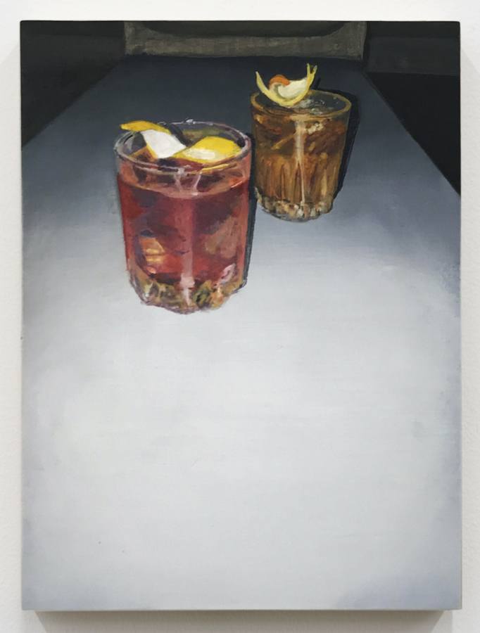
Dike Blair
Untitled, 2020
Oil on aluminum
12 × 9 inches; 30 1⁄2 × 23 cm
DB-20-008
Dike Blair
Untitled, 2020
Oil on aluminum
12 × 9 inches; 30 1⁄2 × 23 cm
DB-20-008
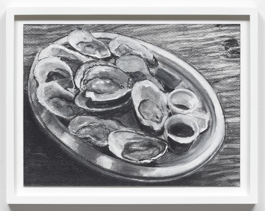
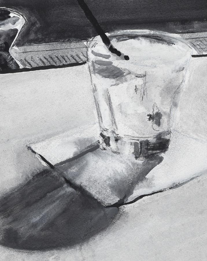
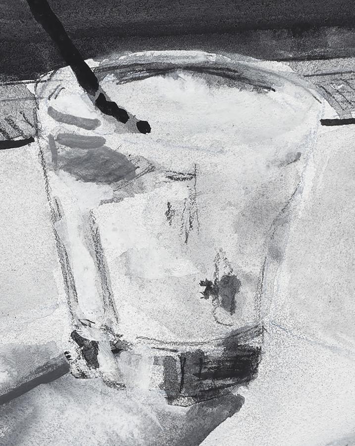
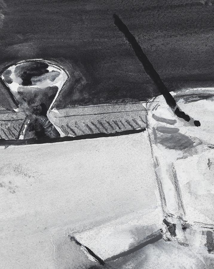
Dike Blair
Untitled, 2019
Charcoal, gouache and gesso on paper
10 1⁄2 × 14 inches; 27 × 35 1⁄2 cm (unframed)
11 5⁄8 × 15 1⁄8 inches; 29 1⁄2 × 38 cm (framed)
DB-19-060
Dike Blair
Untitled, 2019
Charcoal, gouache and gesso on paper
10 1⁄2 × 14 inches; 27 × 35 1⁄2 cm (unframed)
11 5⁄8 × 15 1⁄8 inches; 29 1⁄2 × 38 cm (framed)
DB-19-060
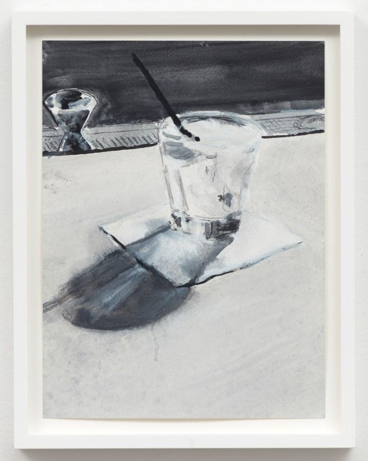
Dike Blair
Untitled, 2018
Charcoal and pencil on paper
10 × 7 1⁄2 inches; 25 × 19 cm (unframed)
11 1⁄2 × 9 inches; 29 × 23 cm (framed)
DB-18-005
Dike Blair
Untitled, 2018
Charcoal and pencil on paper
10 × 7 1⁄2 inches; 25 × 19 cm (unframed)
11 1⁄2 × 9 inches; 29 × 23 cm (framed)
DB-18-005
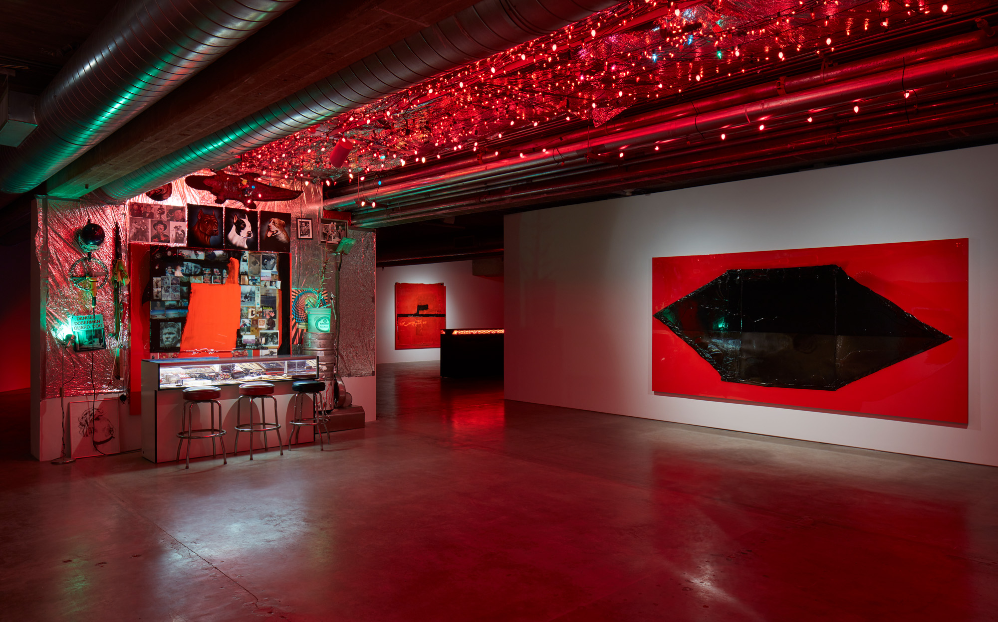
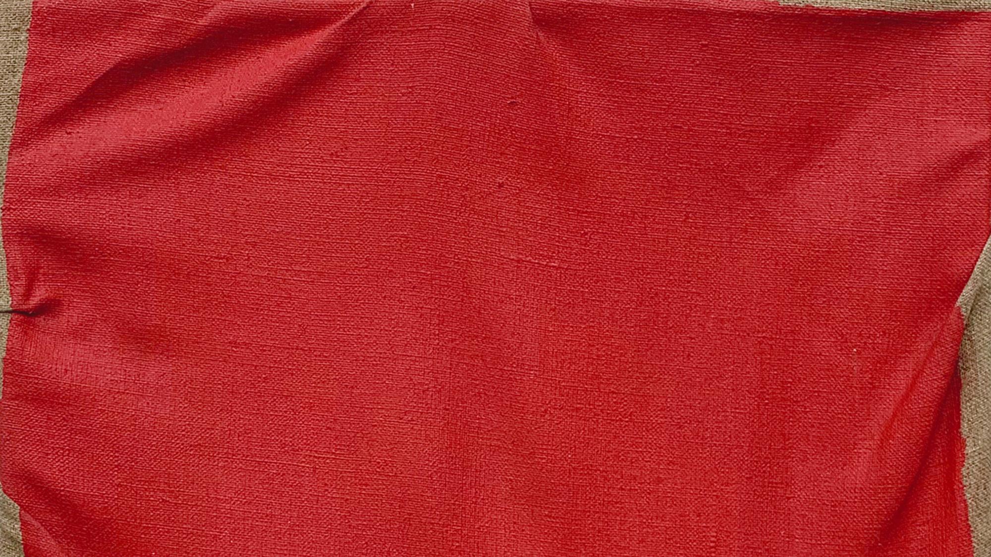
Installation view of Will Boone, The Highway Hex, Contemporary Arts Museum Houston, 2020
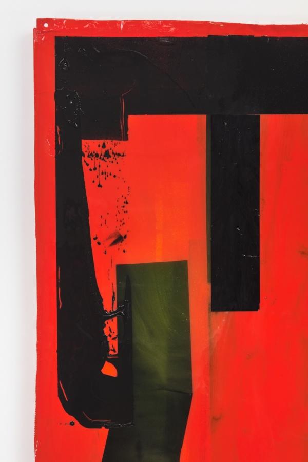
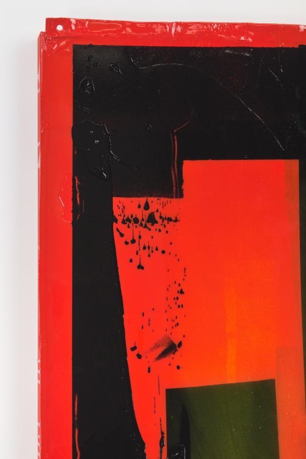
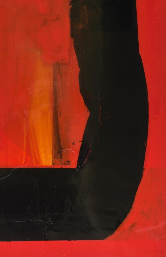
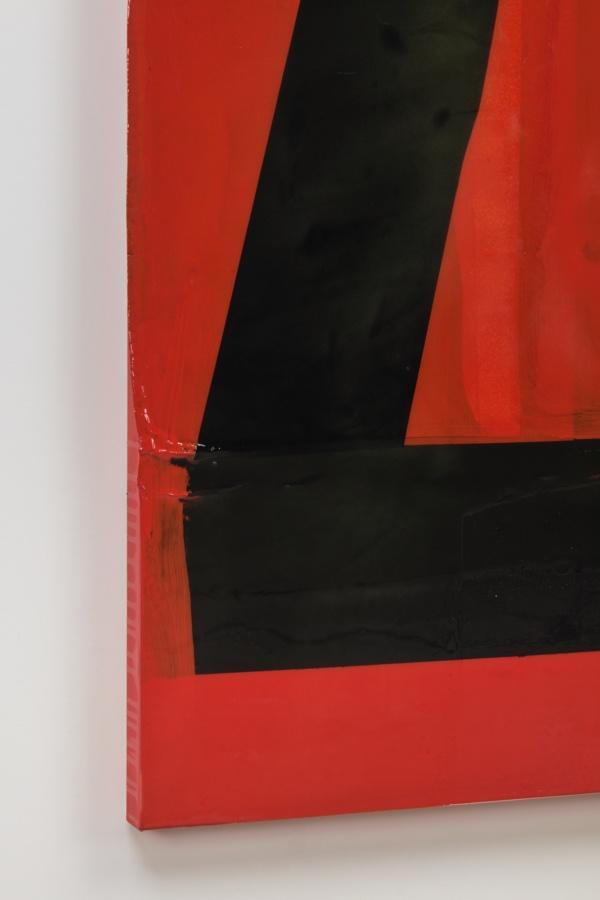
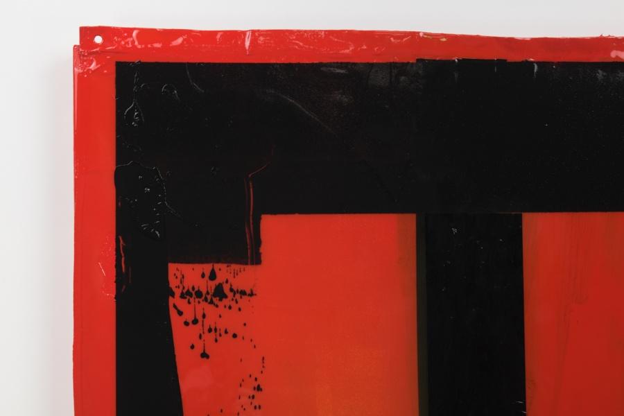
Boone refers to these works as “Arterials” given the term’s dual reference to the highway and to the color of stage blood used in horror films: “I was thinking about how it often looks more like hot rod car paint than something that would come from a person … Why would they choose to use that over something more realistic? It’s about the intensity of that color.” The artist has a longstanding investment in color messaging, particularly the story of this decadent and stylized red, which he has called “the color of driving at night.” Many artists have been struck by the same sinister red: Jack Goldstein believed that its vibrancy way a key contributor to the intensity of an experience in his video work and installations, and Rauschenberg embraced it in his Red Paintings (1953–54), following a challenge presented by Josef Albers, his teacher at Black Mountain College. Cadmium red was also employed to great extent by the sculptor Donald Judd, whose work is now synonymous with the sprawling West Texas desert of his adopted hometown of Marfa. Importantly for Boone, William Eggleston also favored extreme colors, notably the intensity of red. In response to his photograph Greenwood, Mississippi (1973), depicting the intersection of white cables on a red ceiling and printed with his famous dye-transfer process, Eggleston noted, “When you look at the dye, it is like red blood that’s wet on the wall.”
– Patricia Restrepo, “Exposition, Serenade, Myth, Violence, Horizon,” 2020
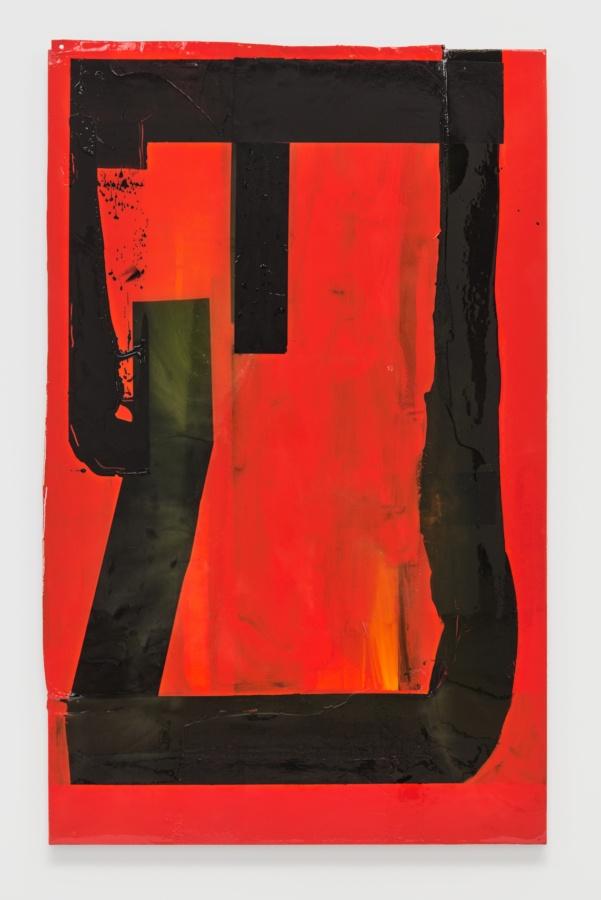
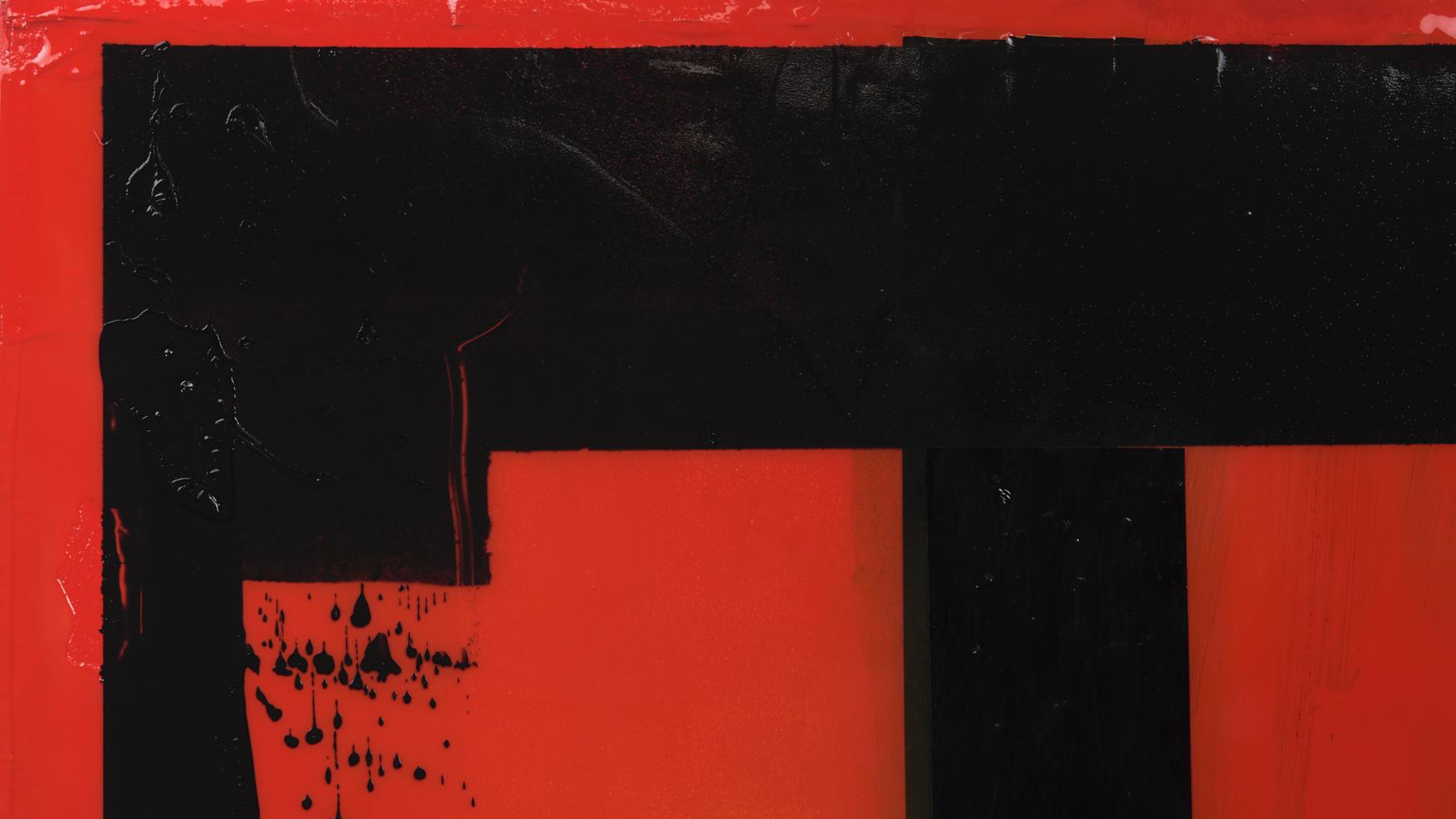
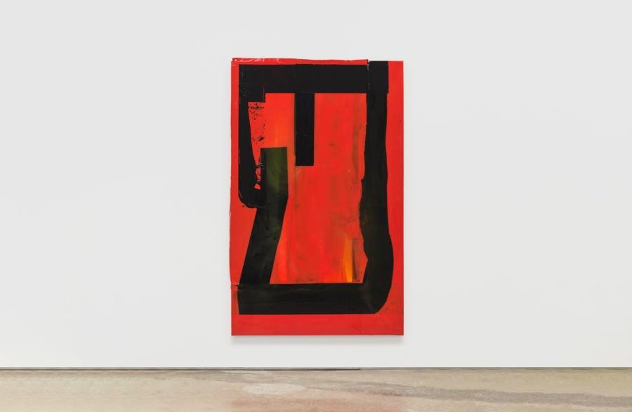
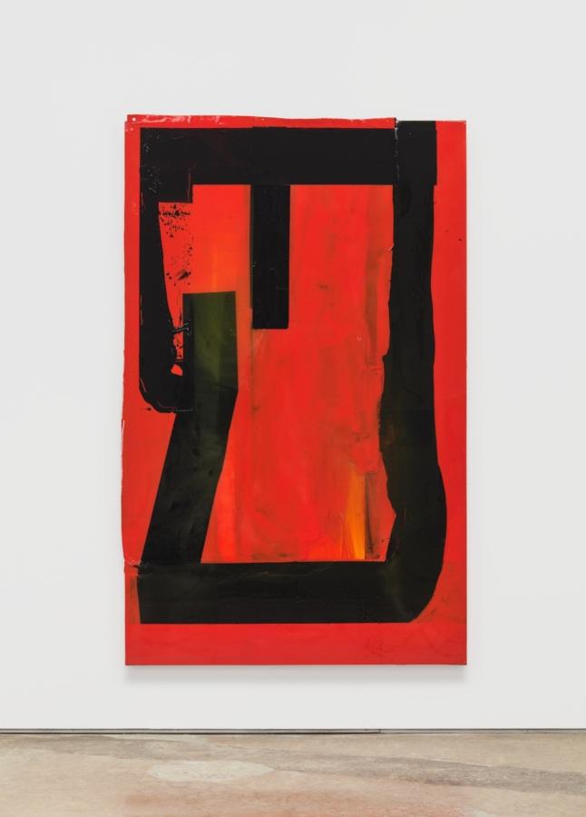
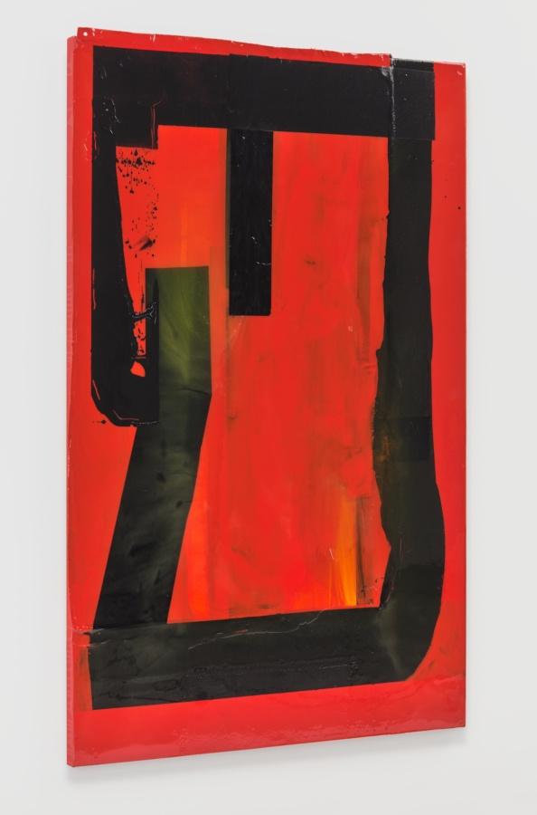
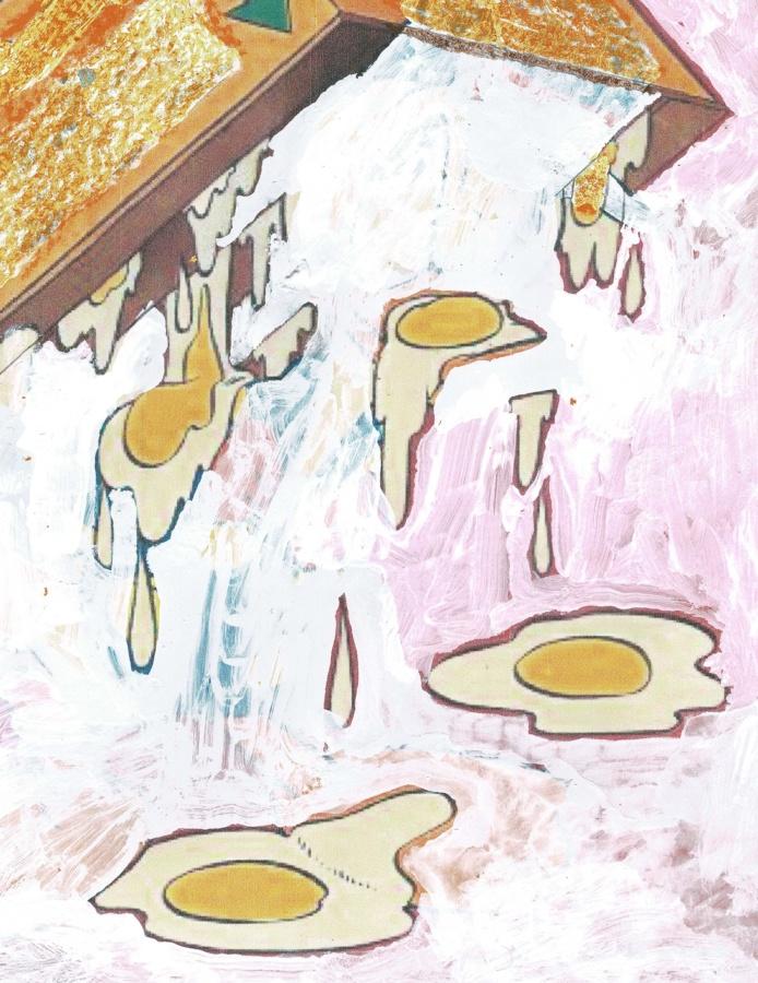
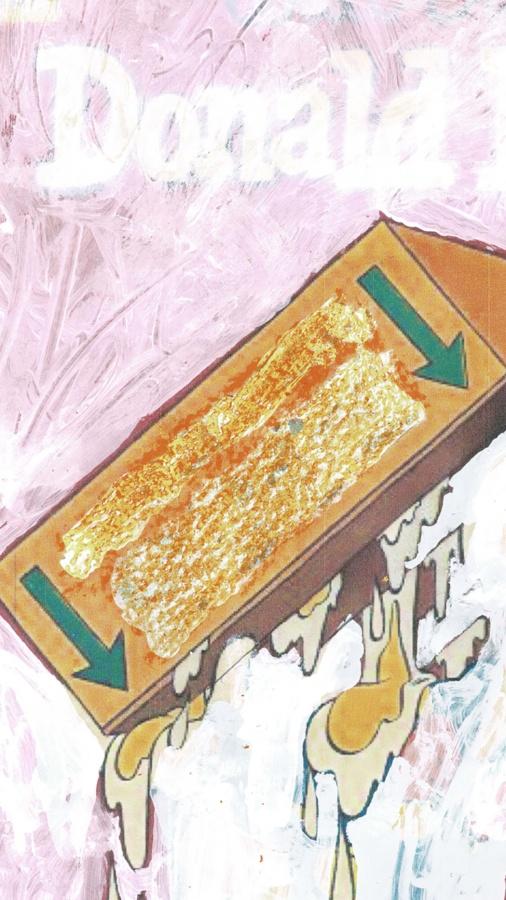
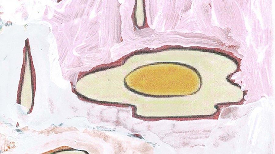
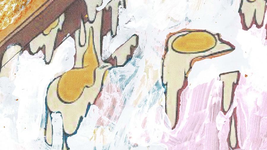
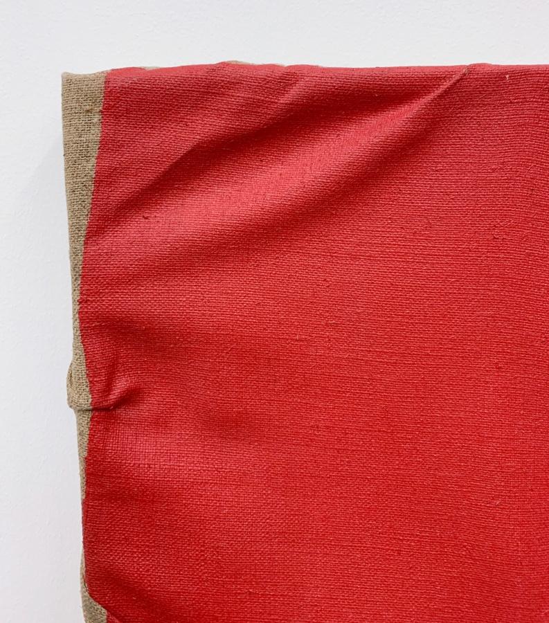
Will Boone
Thumper, 2020
Acrylic, enamel, oil, resin, and nylon flag on canvas
72 3⁄4 × 45 1⁄2 inches; 185 × 115 1⁄2 cm
WB-20-001
Will Boone
Thumper, 2020
Acrylic, enamel, oil, resin, and nylon flag on canvas
72 3⁄4 × 45 1⁄2 inches; 185 × 115 1⁄2 cm
WB-20-001
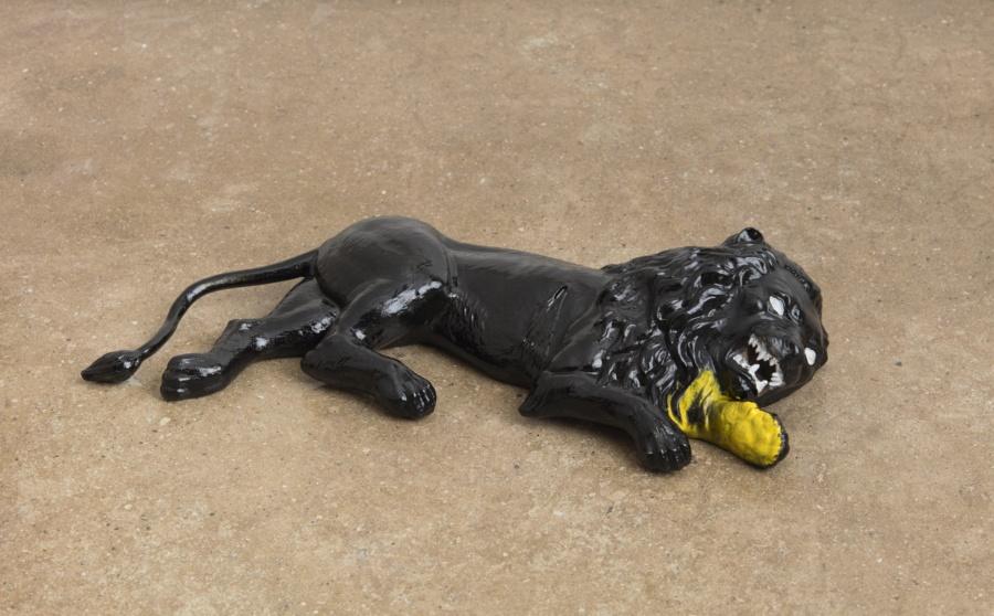
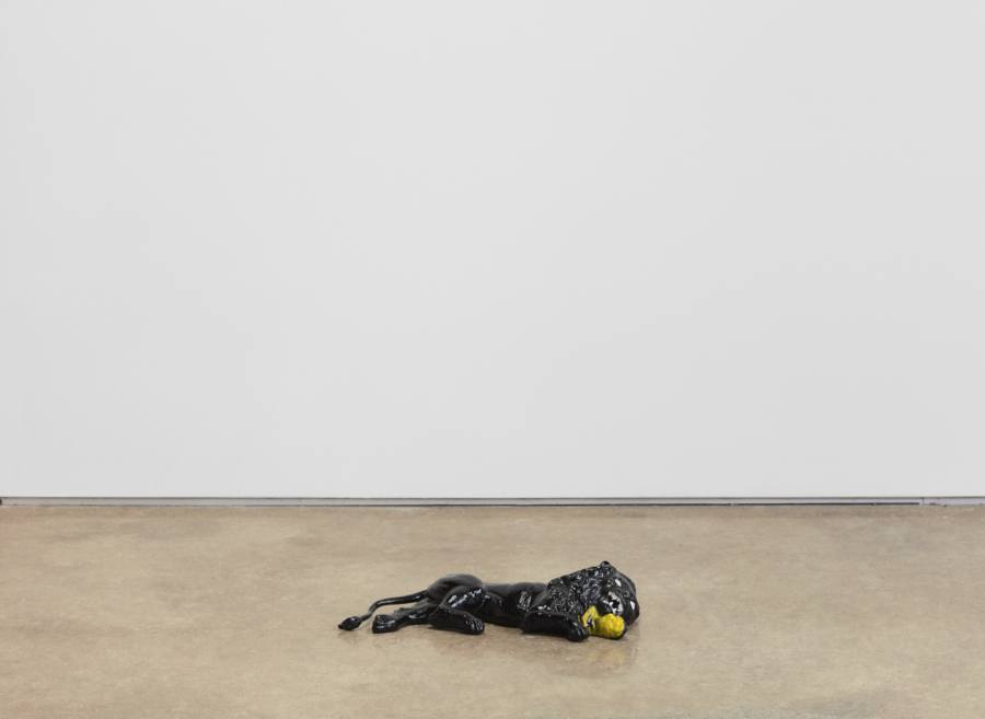
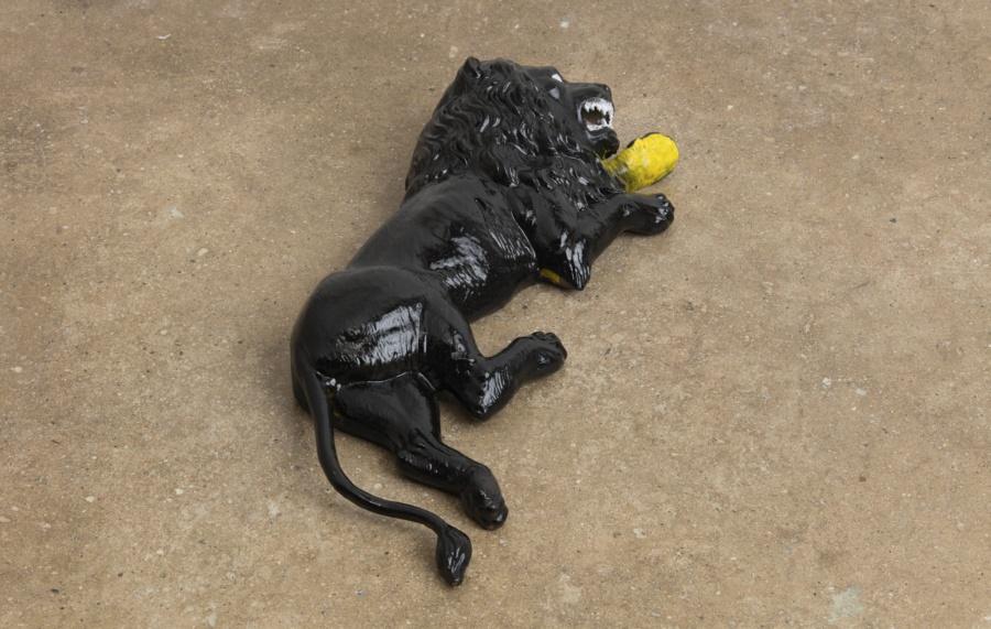
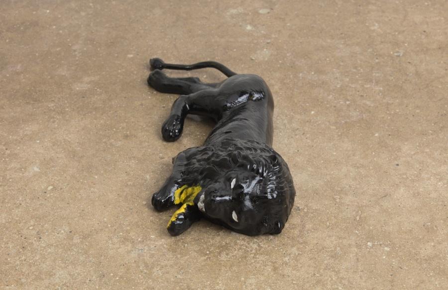
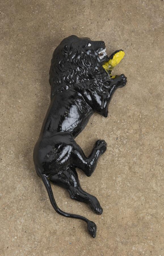
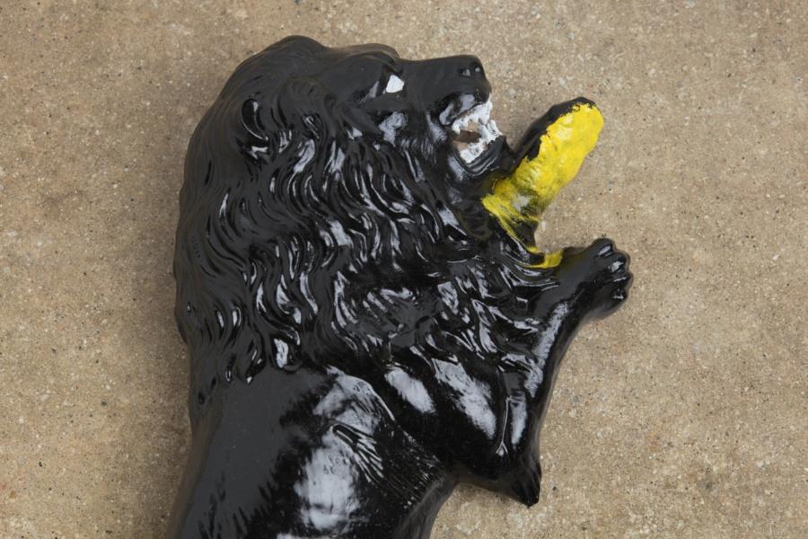
Will Boone
Nemean Lion, 2020
Enamel on bronze
4 1⁄2 × 20 × 9 inches; 11 1⁄2 × 51 × 23 cm
Edition of 1 + 1 AP
WB-20-002
Will Boone
Nemean Lion, 2020
Enamel on bronze
4 1⁄2 × 20 × 9 inches; 11 1⁄2 × 51 × 23 cm
Edition of 1 + 1 AP
WB-20-002

Mathew Cerletty Studio, Brooklyn
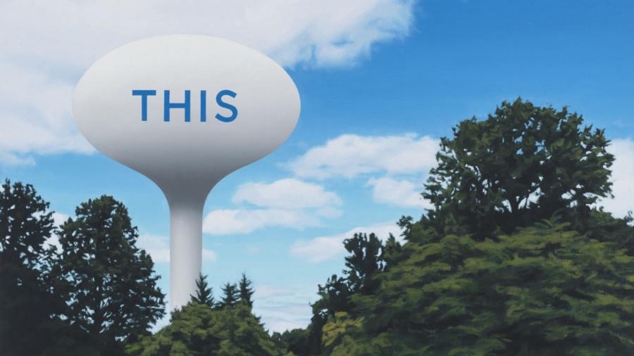
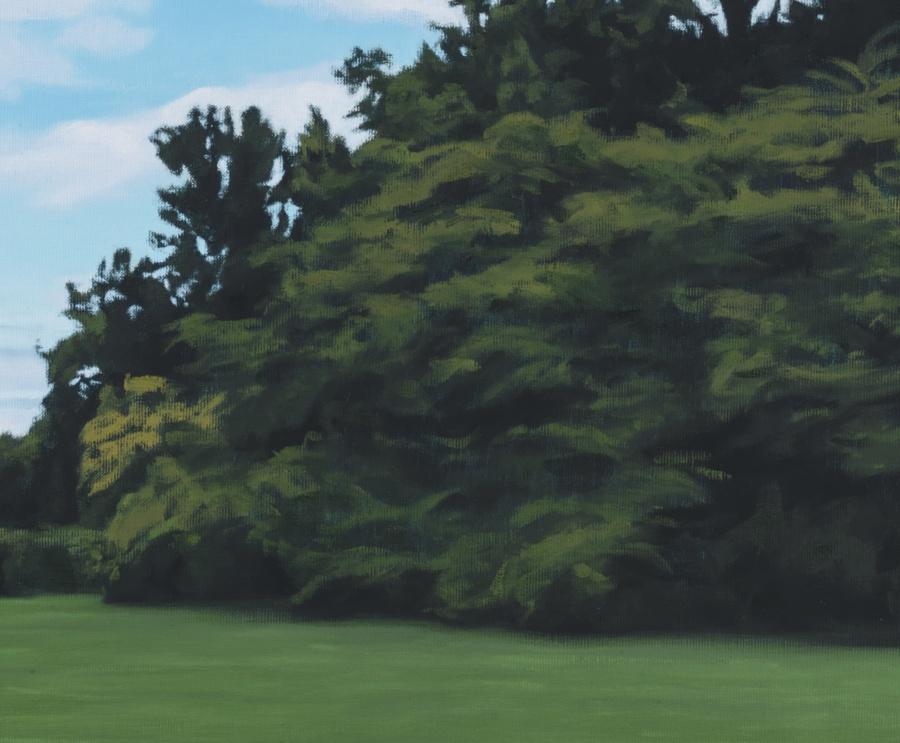
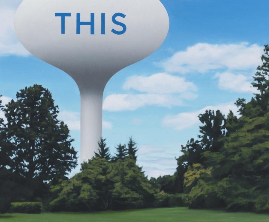
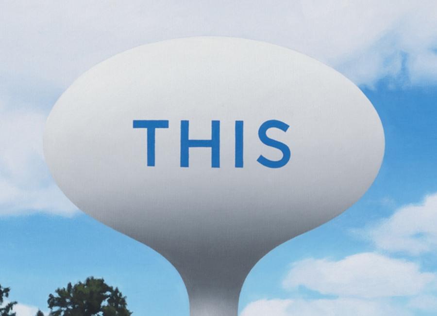
Cerletty’s interest in text, the familiar graphics of branding, and repetition comes to fruition in the depiction of a commercial object and its variant. In a move, he throws off the mantle of portrait artist and becomes, as de Kooning once dubbed Jasper Johns, “a sign painter”—that is, a painter whose work doesn’t bear the weight of an academic tradition but presents its subject straightforwardly.
– Nicole Rudick, “Portraits, Self and Otherwise,” 2018
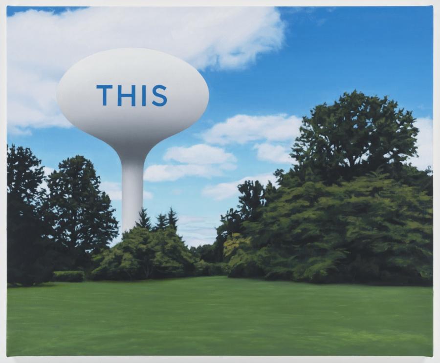
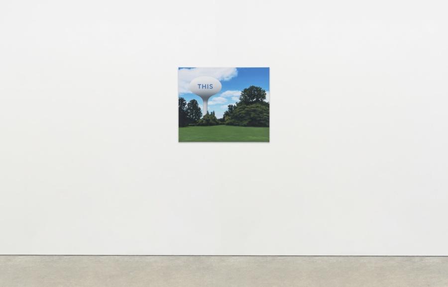
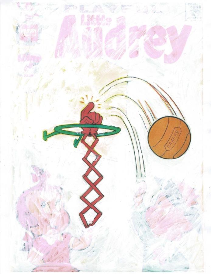
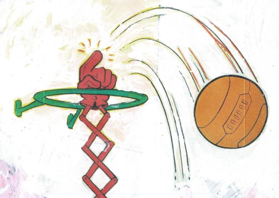
Mathew Cerletty
THIS, 2015
Oil on linen
26 1⁄2 × 32 inches; 67 × 81 cm
MC-15-001
Mathew Cerletty
THIS, 2015
Oil on linen
26 1⁄2 × 32 inches; 67 × 81 cm
MC-15-001
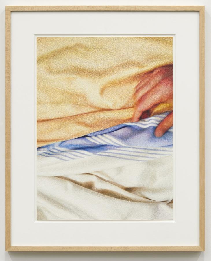
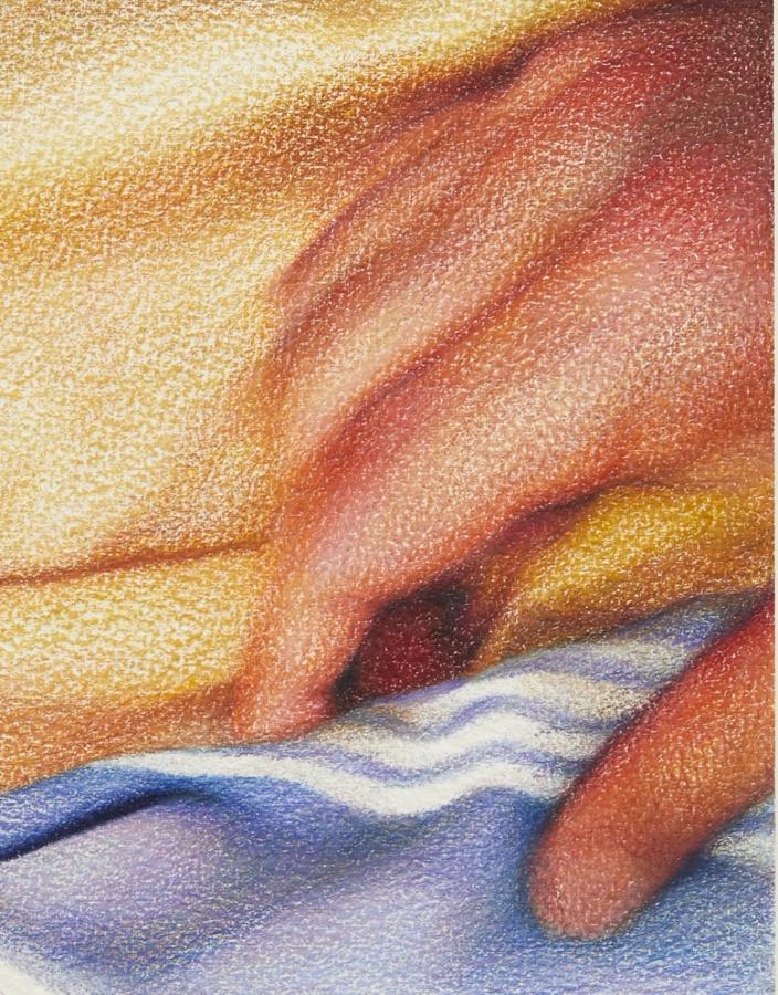
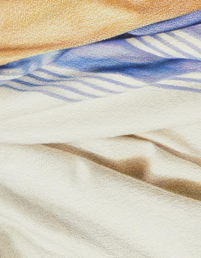
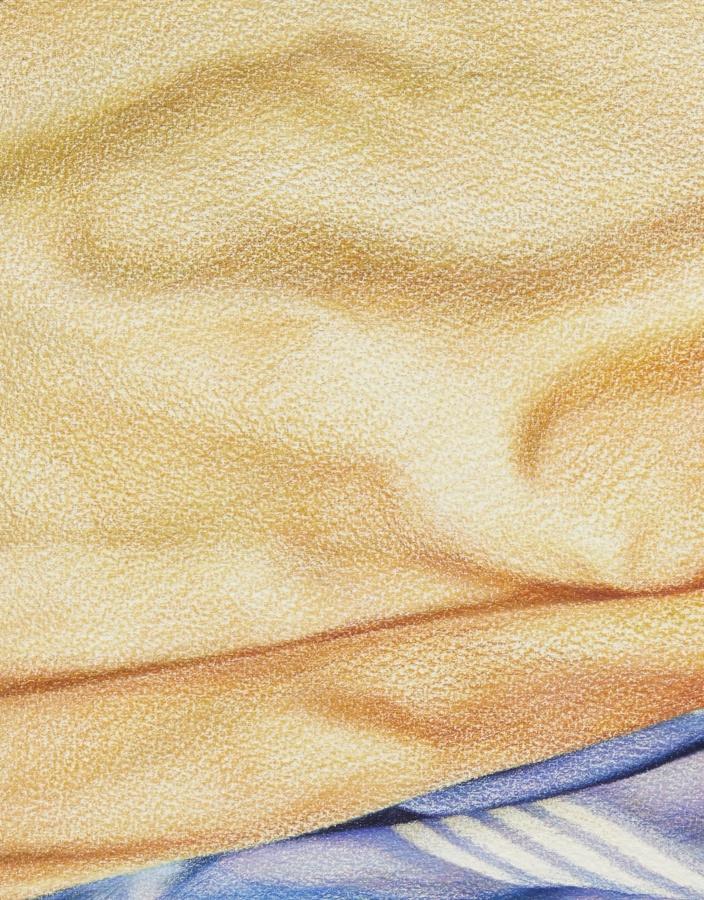
Mathew Cerletty
Hand in Bed, 2016
Colored pencil on paper
17 1⁄2 × 13 inches; 44 1⁄2 × 33 cm (unframed)
23 1⁄2 × 19 inches; 60 × 48 cm (framed)
MC-16-003
Mathew Cerletty
Hand in Bed, 2016
Colored pencil on paper
17 1⁄2 × 13 inches; 44 1⁄2 × 33 cm (unframed)
23 1⁄2 × 19 inches; 60 × 48 cm (framed)
MC-16-003
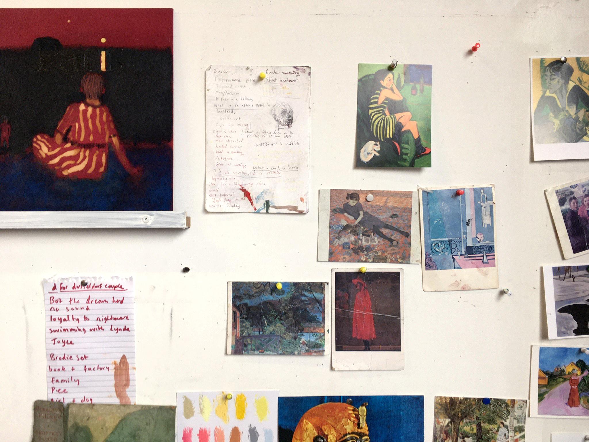
Andrew Cranston Studio, Glasgow
Peter Doig: I think all your paintings have mystery. And curiosity.
Andrew Cranston: You try to demystify the thing, in many ways, to talk about it. But still in that sense, mystery is quite important…And I think that’s kind of true – sometimes you can have too much reference and too much information. Sometimes you just get a glimpse of something and you think…
PD: Well there are a lot of “glimpses” in your work. A lot of glimpses that give you just enough information to give the painting context or a sense of place. You often use this window motif… and in a way the window motif allows you to set a scene. I guess that’s something you see in Renaissance paintings; you get the view out of the window. But you do it in a different way; you do it so that what you see of the window almost becomes the abstract element of the painting – the “glimpse”. I really like that, if you zoom in on the paintings you can only see material, but if you bring it back into the frame of the entire picture it adds tremendous atmosphere or light, or whatever you need from it.
– “Andrew Cranston in conversation with Peter Doig,” Andrew Cranston, But the Dream Had No Sound, Ingleby, Edinburgh, 2018
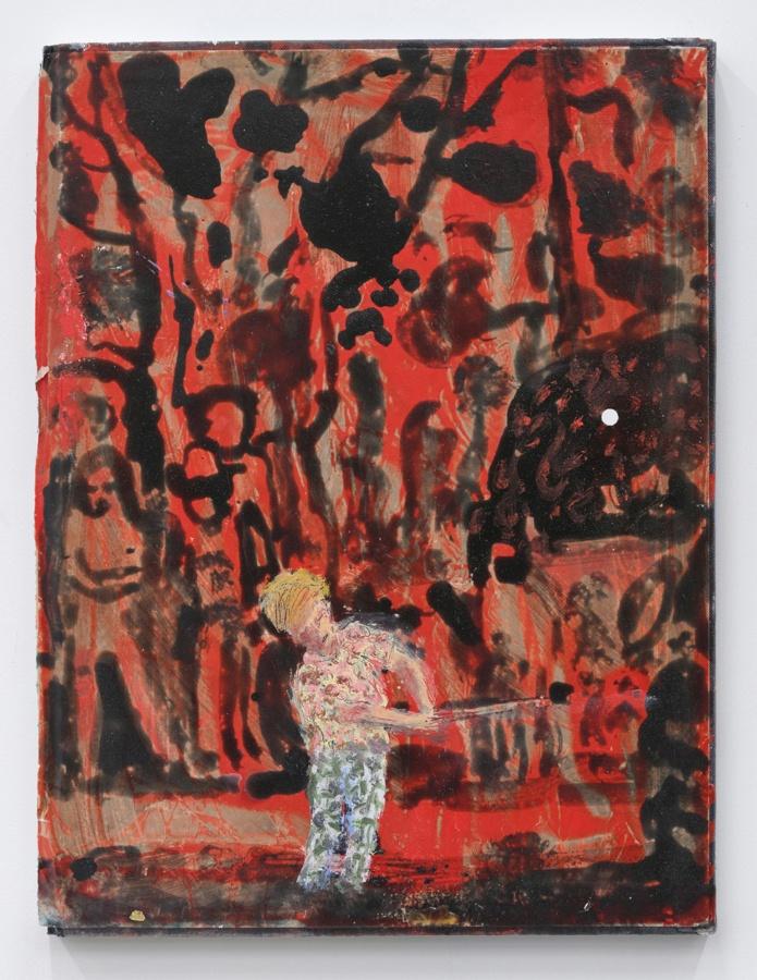
Andrew Cranston
Bunker, 2019
Distemper and oil on hardback book cover
12 × 9 inches; 30 1⁄2 × 23 cm
ACR-19-002
Andrew Cranston
Bunker, 2019
Distemper and oil on hardback book cover
12 × 9 inches; 30 1⁄2 × 23 cm
ACR-19-002
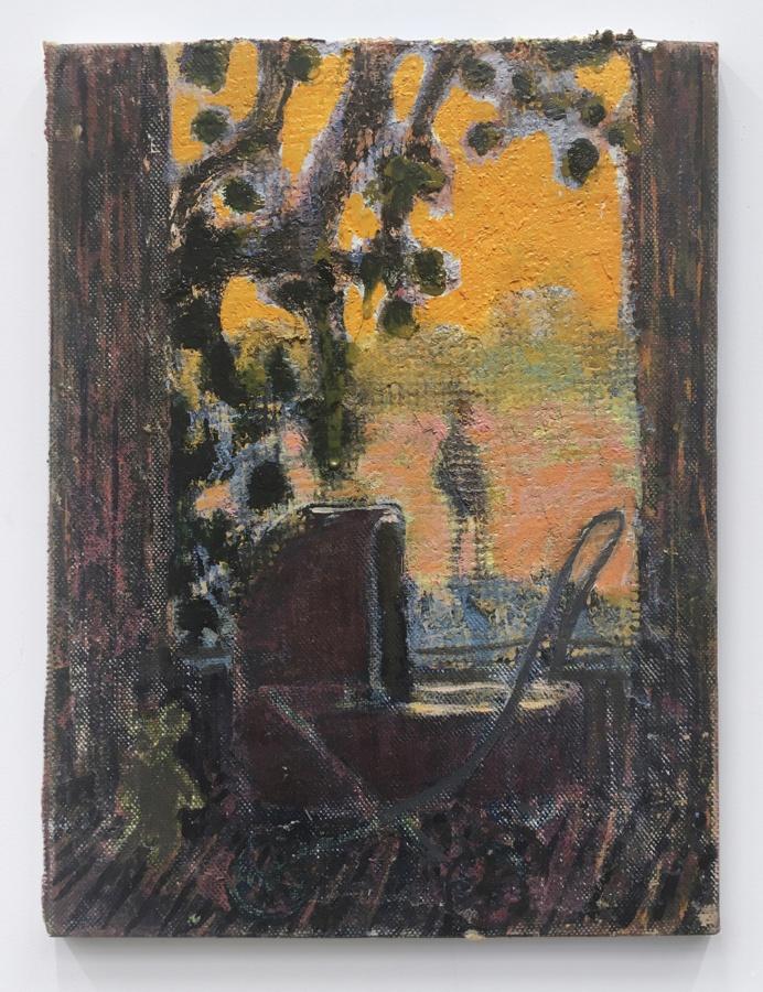
Andrew Cranston
Ginger in Africa, 2020
Oil and varnish on hardback book cover
7 3⁄8 × 10 inches; 19 × 25 1⁄2 cm
ACR-20-001
Andrew Cranston
Ginger in Africa, 2020
Oil and varnish on hardback book cover
7 3⁄8 × 10 inches; 19 × 25 1⁄2 cm
ACR-20-001
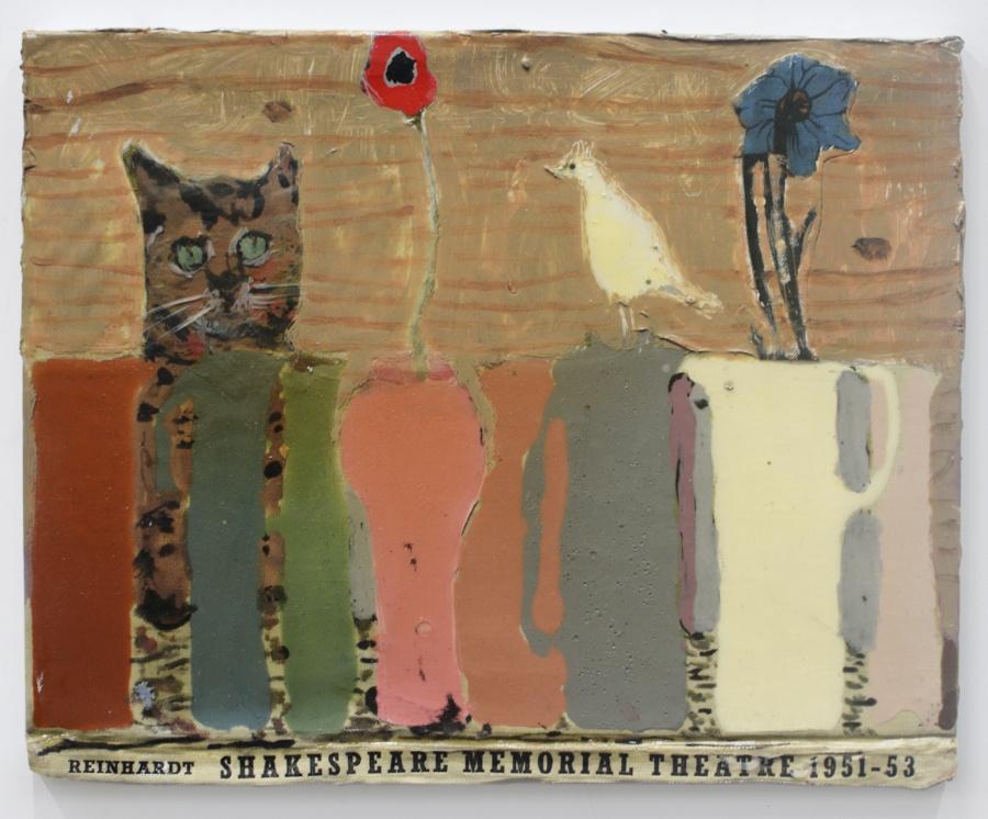
Andrew Cranston
Stranger Danger, 2020
distemper and varnish on hardback book cover
8 1⁄2 × 11 3⁄8 inches; 22 × 27 cm
ACR-20-002
Andrew Cranston
Stranger Danger, 2020
distemper and varnish on hardback book cover
8 1⁄2 × 11 3⁄8 inches; 22 × 27 cm
ACR-20-002
Ann Craven in her studio, Cushing
Ann Craven makes paintings in New York City and Cushing, Maine. Both places give her something to look at. Let’s assume she can paint anything she wants—any soup can—but there is something auspicious in her choices. Moons, birds, friends, and flowers are the perfect runway for her brush. (They allow her to take off.) Painting nature, in all its fullness and momentariness, is to perpetually fail to capture time’s passage, and having to settle for the frozen moment. Like a Japanese master calligrapher, Craven brings her beginner’s mind to these fleeting moments, and discovers something not noticed before—a half-moon bisected by a tree branch, or, from a slightly different spot in the yard, the same moon, now magenta, just before it dissolves into the purple beech. Craven is so much merged with the making of her making, it allows her to reach deeply into painting’s mysterious relationship to time—how to return over and over to the same motif and make it fresh, thereby connecting that frozen moment to the endless accumulation of similar moments, to the whole temporal flow of life.
– David Salle and Sarah French, “Ann Craven and the Art of Happy Hands,” 2018.
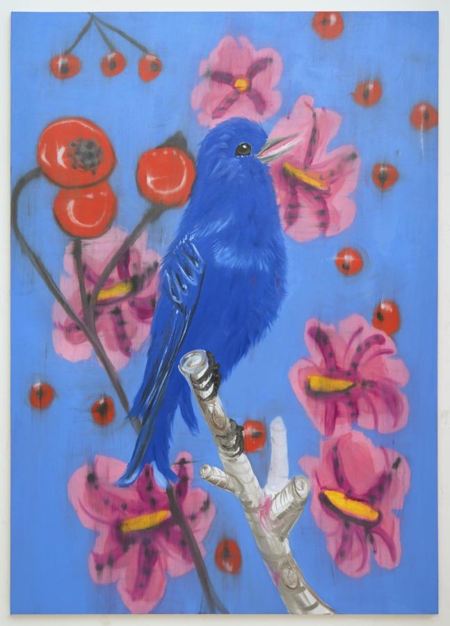
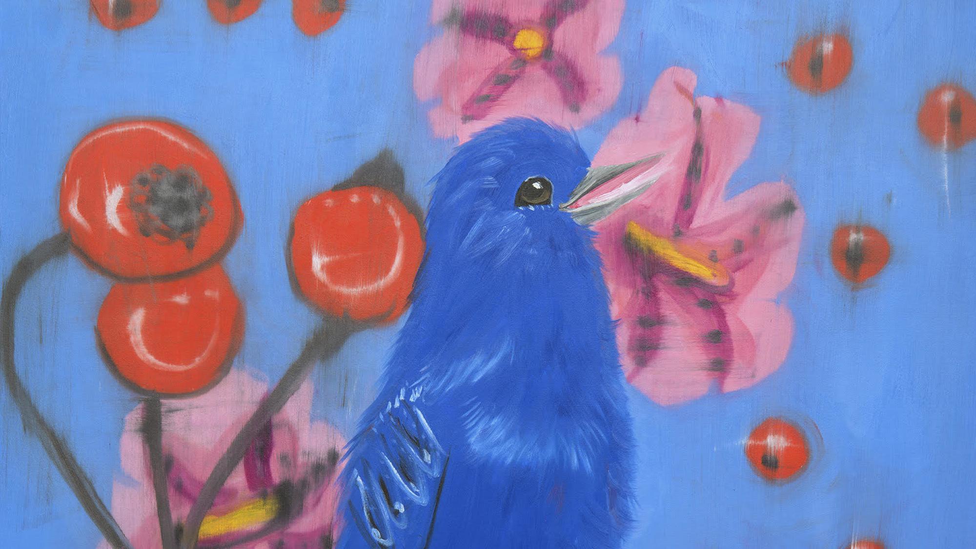
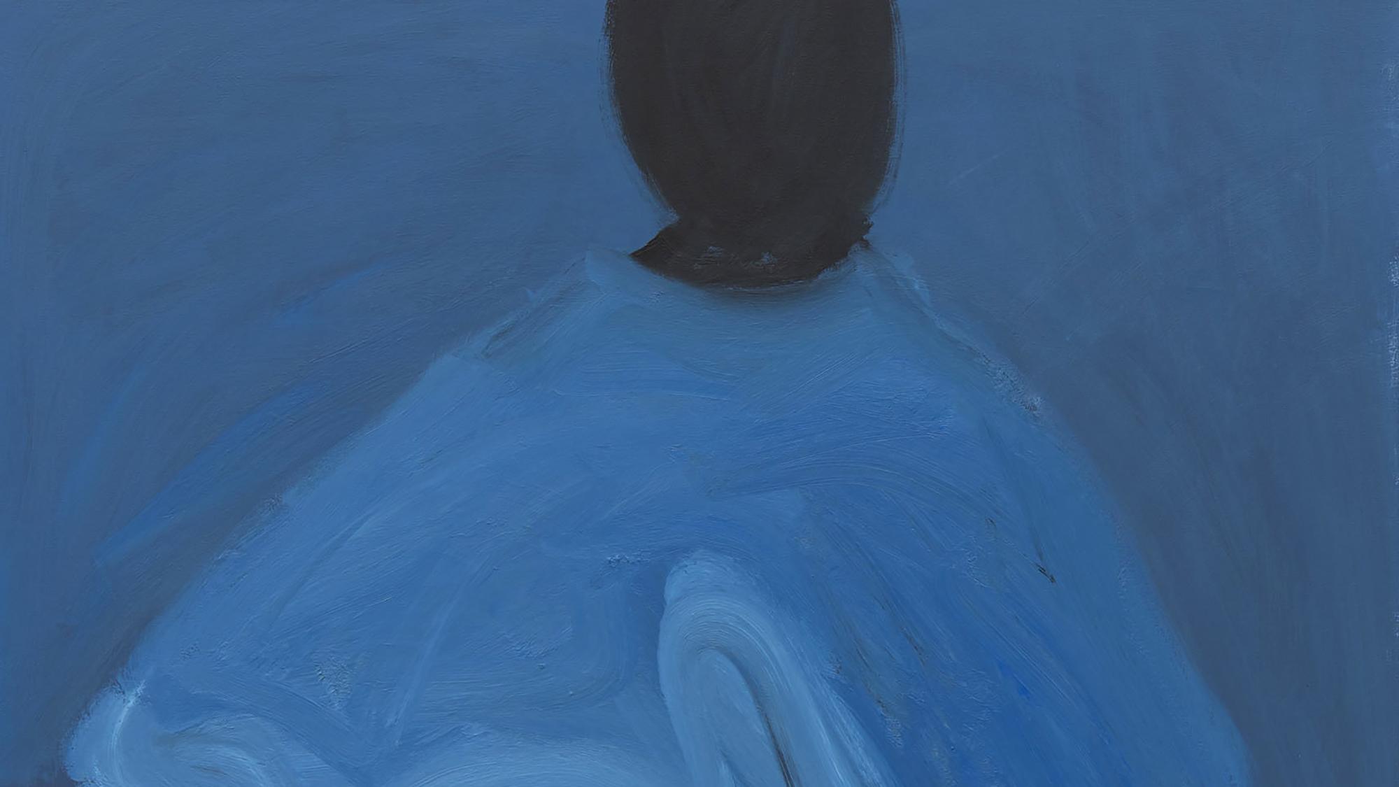
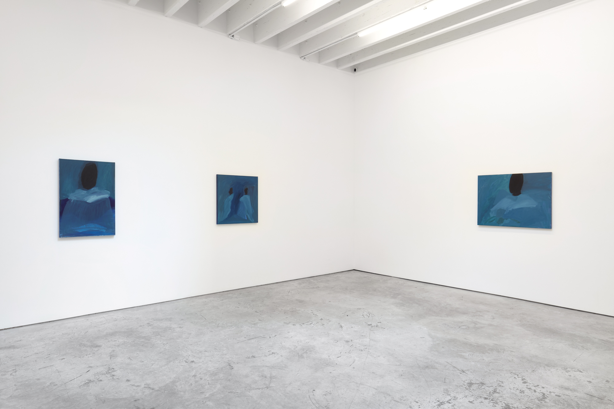
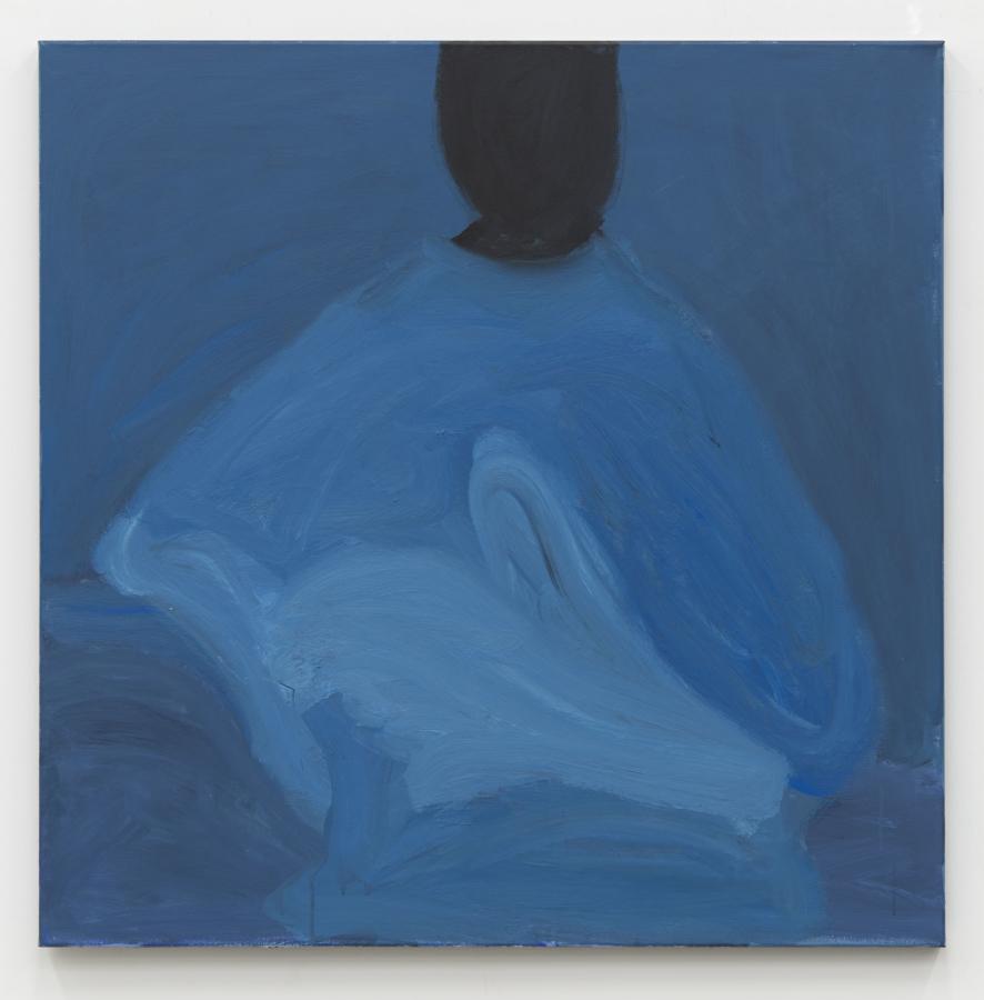
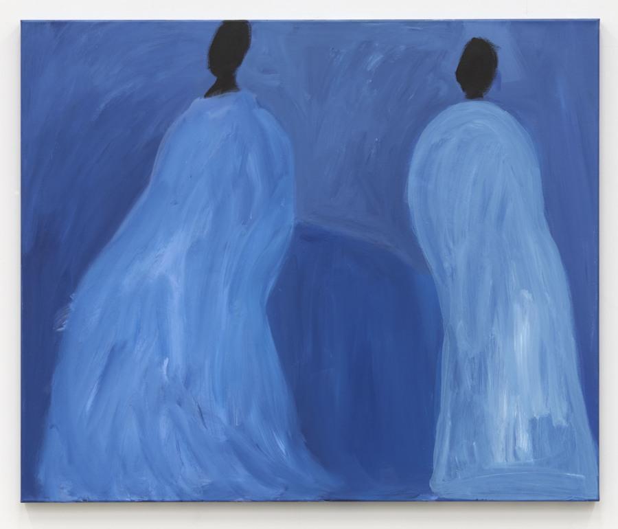
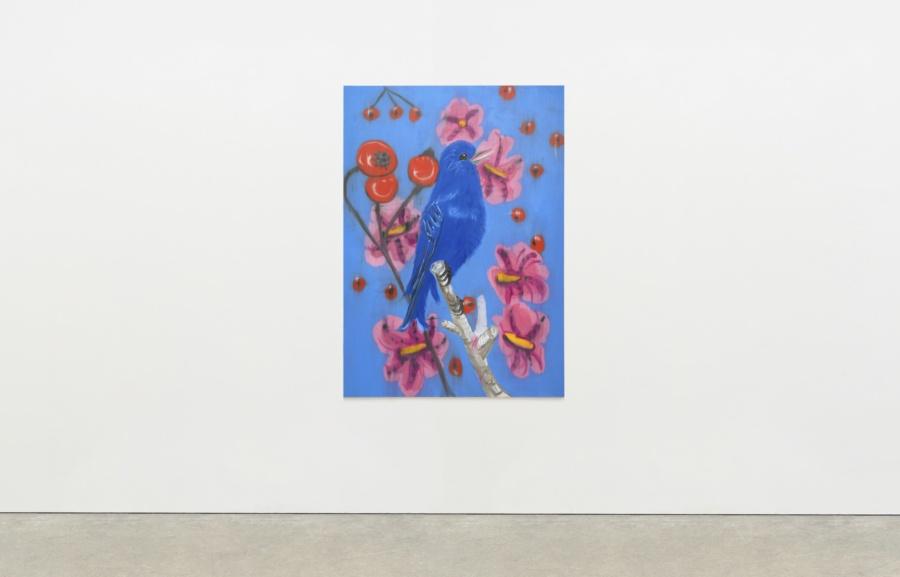
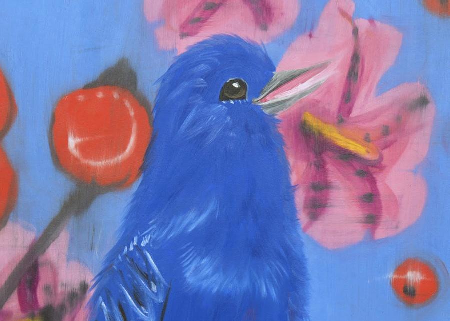
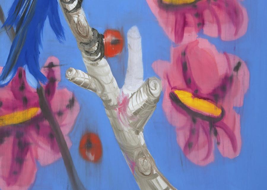
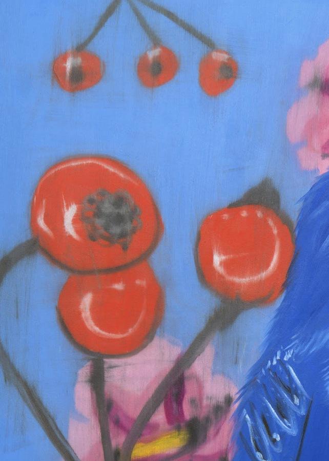
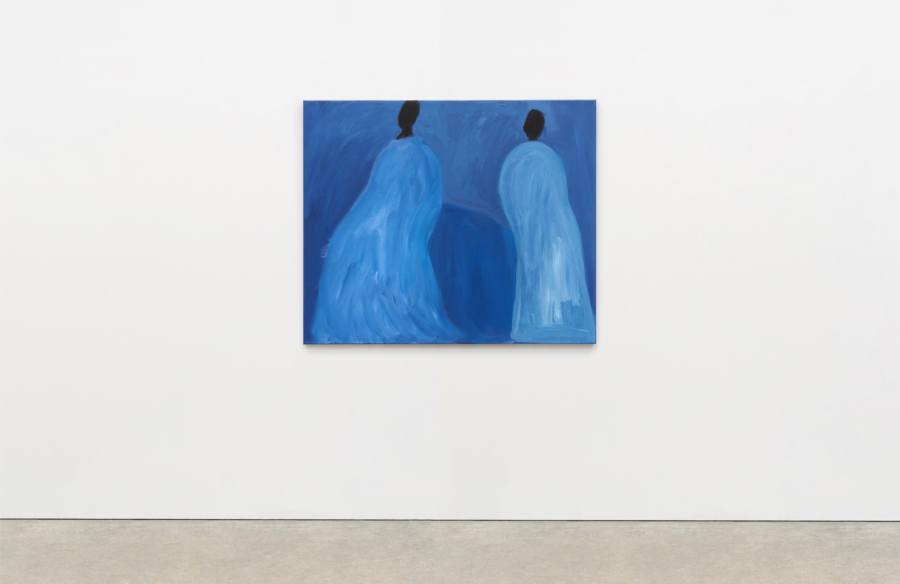
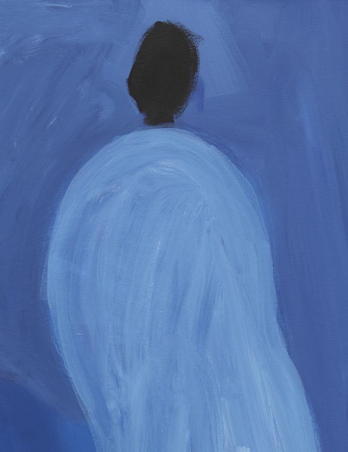
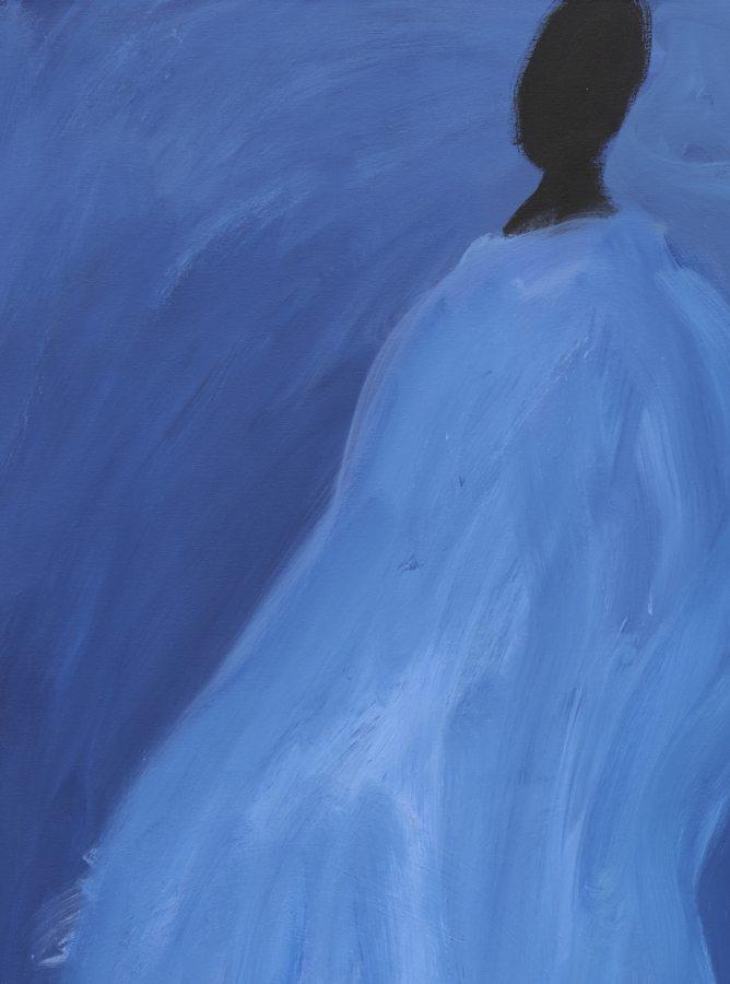
Ann Craven
Blue Song (Singing, on Blue, Mirrored), 2020, 2020
Oil on canvas
84 × 60 inches; 213 × 154 cm
AC-20-012
Ann Craven
Blue Song (Singing, on Blue, Mirrored), 2020, 2020
Oil on canvas
84 × 60 inches; 213 × 154 cm
AC-20-012

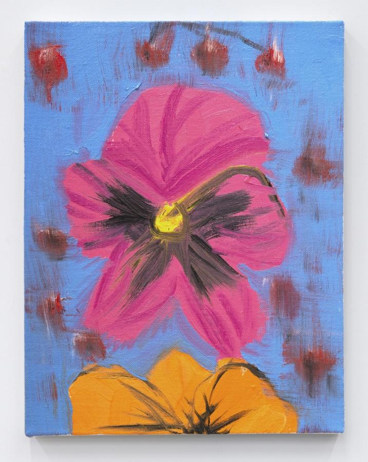
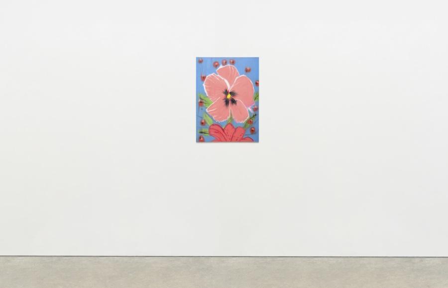
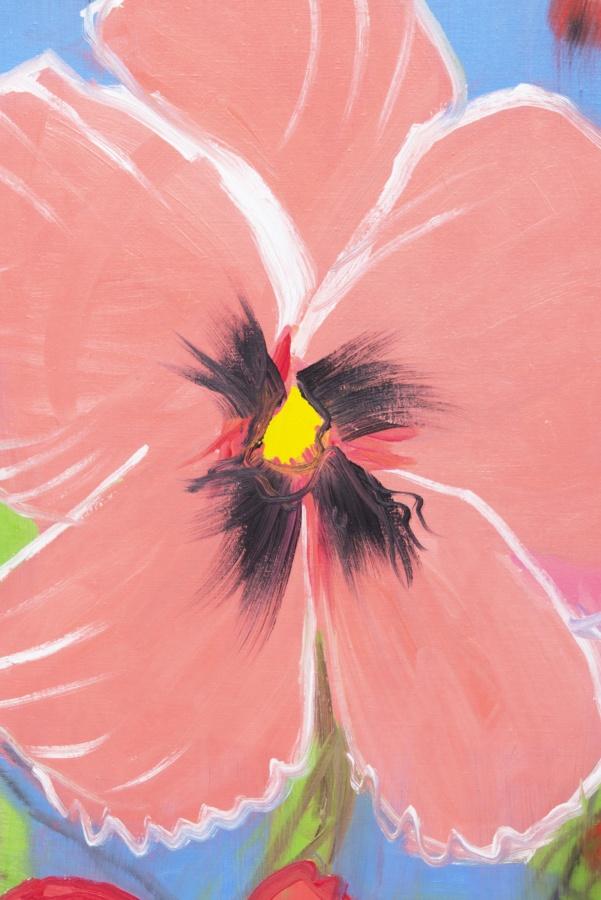
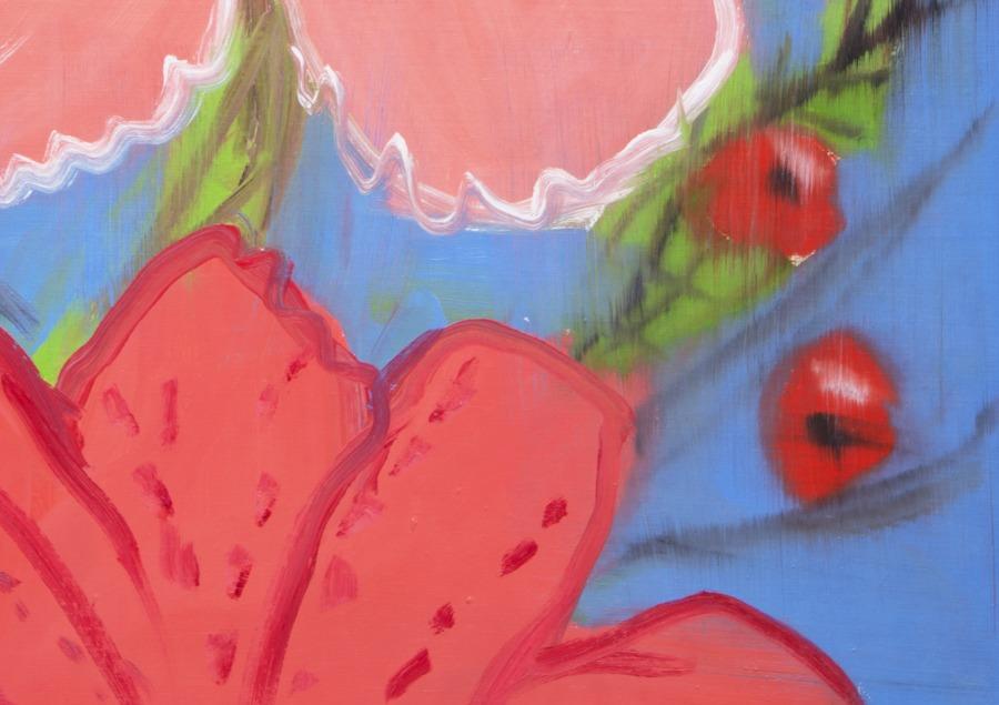
Ann Craven
Pensée (Rose Glow, Pink, on Blue with Cherries), 2020, 2020
Oil on canvas
40 × 30 inches; 102 × 76 cm
AC-20-010
Ann Craven
Pensée (Rose Glow, Pink, on Blue with Cherries), 2020, 2020
Oil on canvas
40 × 30 inches; 102 × 76 cm
AC-20-010
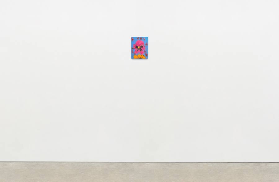
Ann Craven
Pensée (Pink, Orange, on Blue with Cherries), 2020
Oil on canvas
14 × 11 inches; 35 1⁄2 × 28 cm
AC-20-014
Ann Craven
Pensée (Pink, Orange, on Blue with Cherries), 2020
Oil on canvas
14 × 11 inches; 35 1⁄2 × 28 cm
AC-20-014
Alex Da Corte in his studio, Philadelphia. Photo: Marvin Joseph
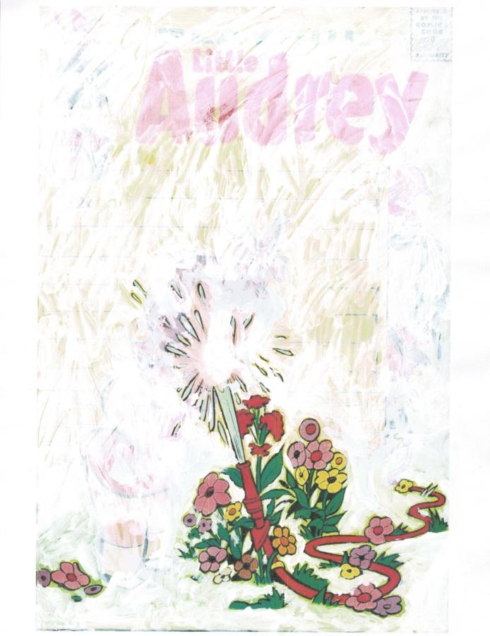
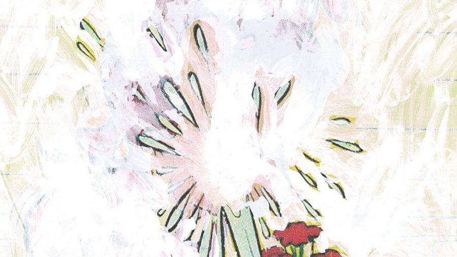
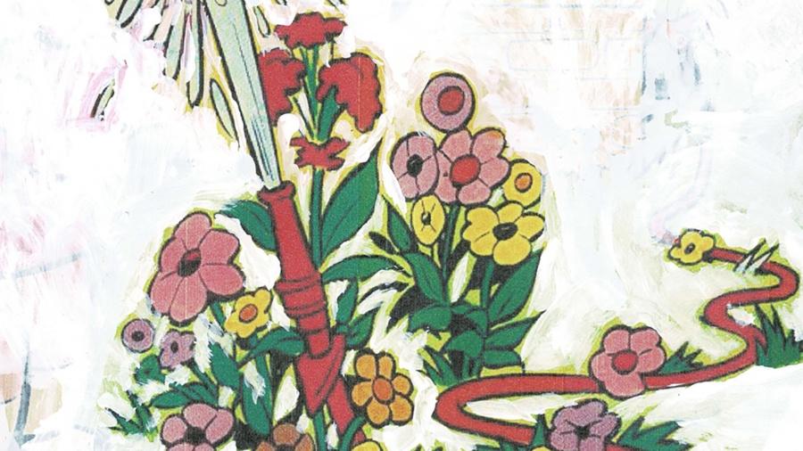
The modeled surface of the frames and the overlaid images recall children’s play-dough sculptures and their wanton scribbles in comic books. But hung at eye level and spaced throughout the room, cartoon characters are refashioned as makeshift icons. Through his modifications, Da Corte undermines his sources’ narrative in order to toy with their larger cultural role. This reaches beyond the cynicism of Pop and the detachment of pastiche to open up a space to examine the implicit cultural faith placed in cartoons, television characters, and popular icons.
– Anna Tome, “Alex Da Corte: Marigolds” The Brooklyn Rail
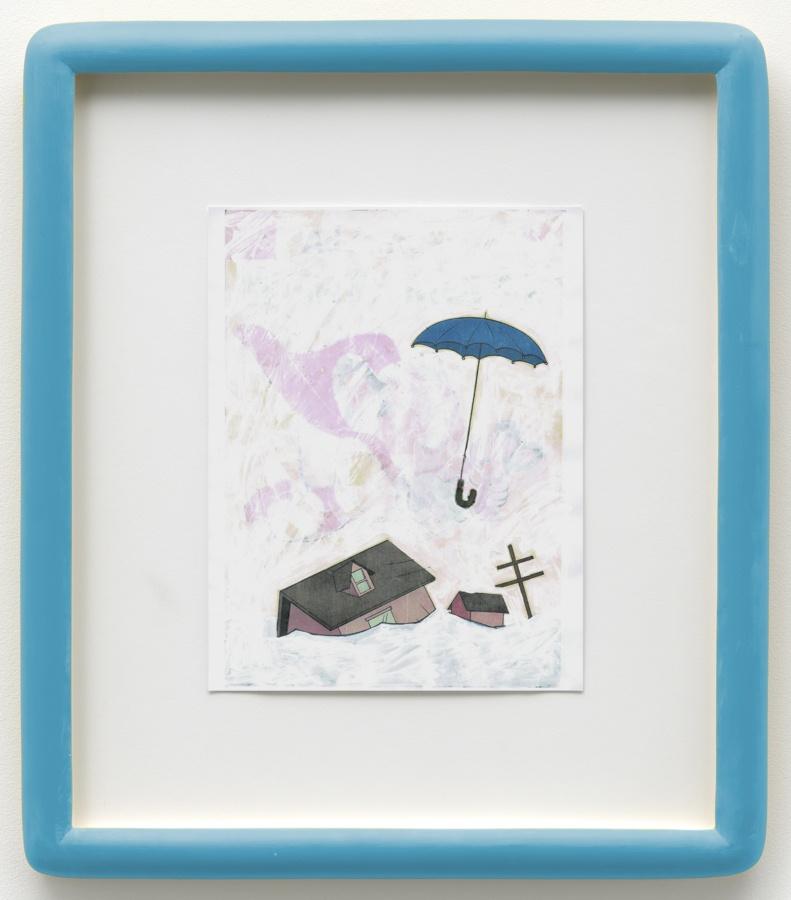
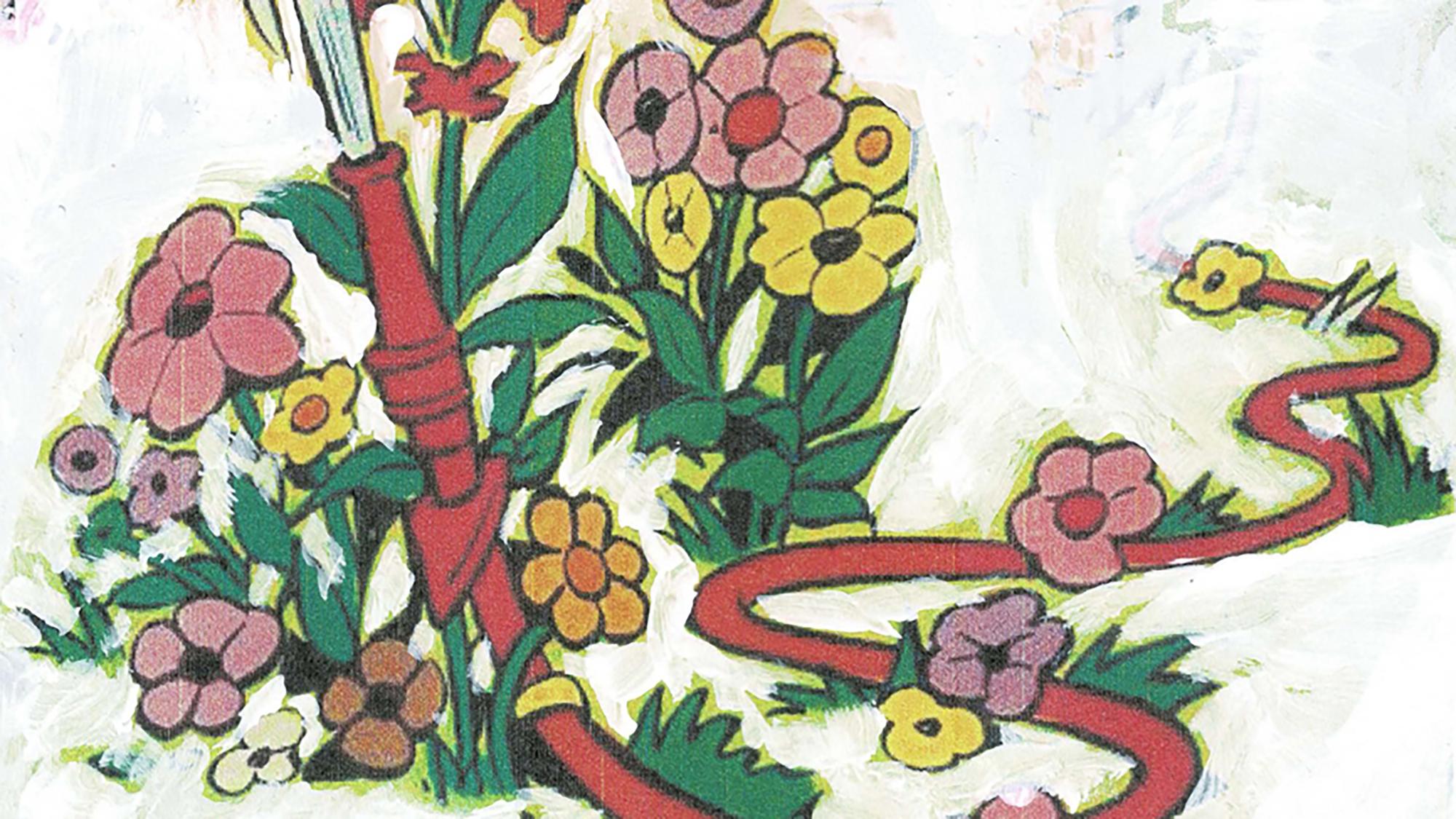
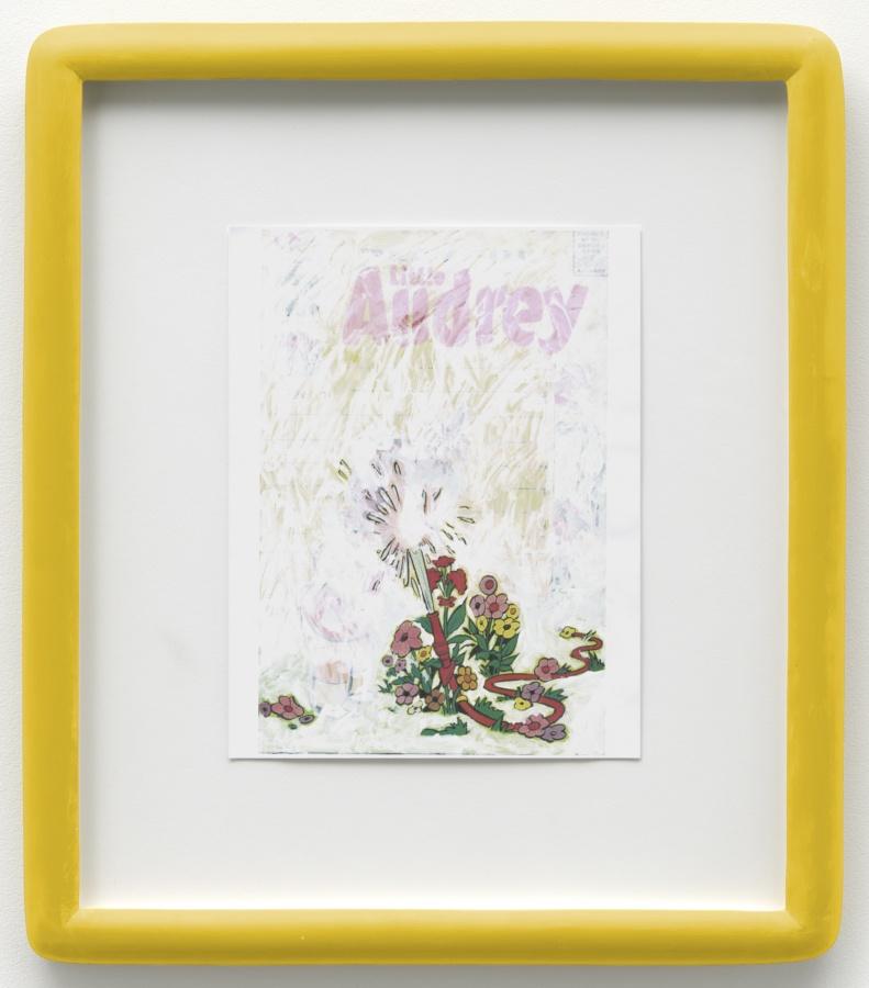
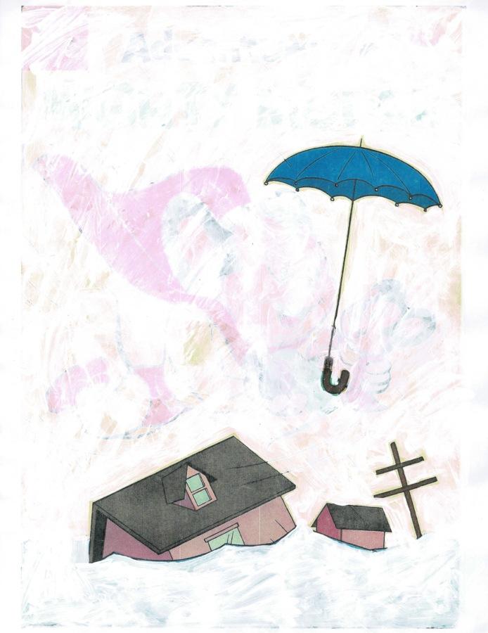
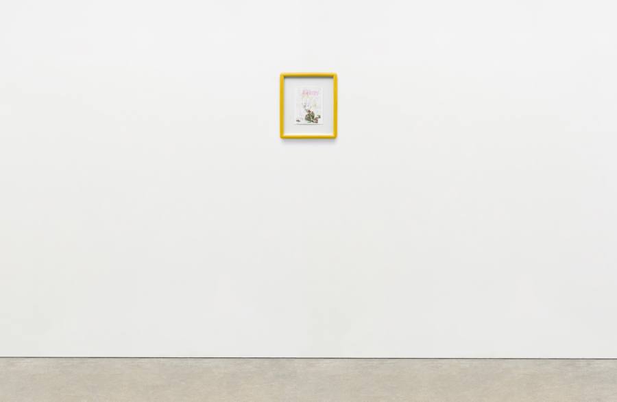
Alex Da Corte
Blue Pencil Drawing (The Flood), 2020
Inkjet and White Out on paper, cast polyester resin frame, plexiglass, mat-board, coroplast, wooden strainer, and hardware
17 1⁄8 × 14 7⁄8 inches; 43 1⁄2 × 38 cm
ADC-20-006
Alex Da Corte
Blue Pencil Drawing (The Flood), 2020
Inkjet and White Out on paper, cast polyester resin frame, plexiglass, mat-board, coroplast, wooden strainer, and hardware
17 1⁄8 × 14 7⁄8 inches; 43 1⁄2 × 38 cm
ADC-20-006
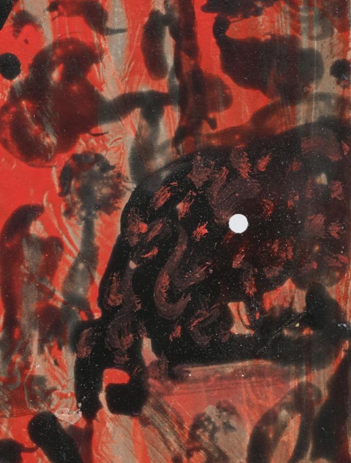
Alex Da Corte
Blue Pencil Drawing (Spit in the Eye), 2020
Inkjet and White Out on paper, cast polyester resin frame, plexiglass, mat-board, coroplast, wooden strainer, and hardware
17 1⁄8 × 14 7⁄8 inches; 43 1⁄2 × 38 cm
ADC-20-004
Alex Da Corte
Blue Pencil Drawing (Spit in the Eye), 2020
Inkjet and White Out on paper, cast polyester resin frame, plexiglass, mat-board, coroplast, wooden strainer, and hardware
17 1⁄8 × 14 7⁄8 inches; 43 1⁄2 × 38 cm
ADC-20-004
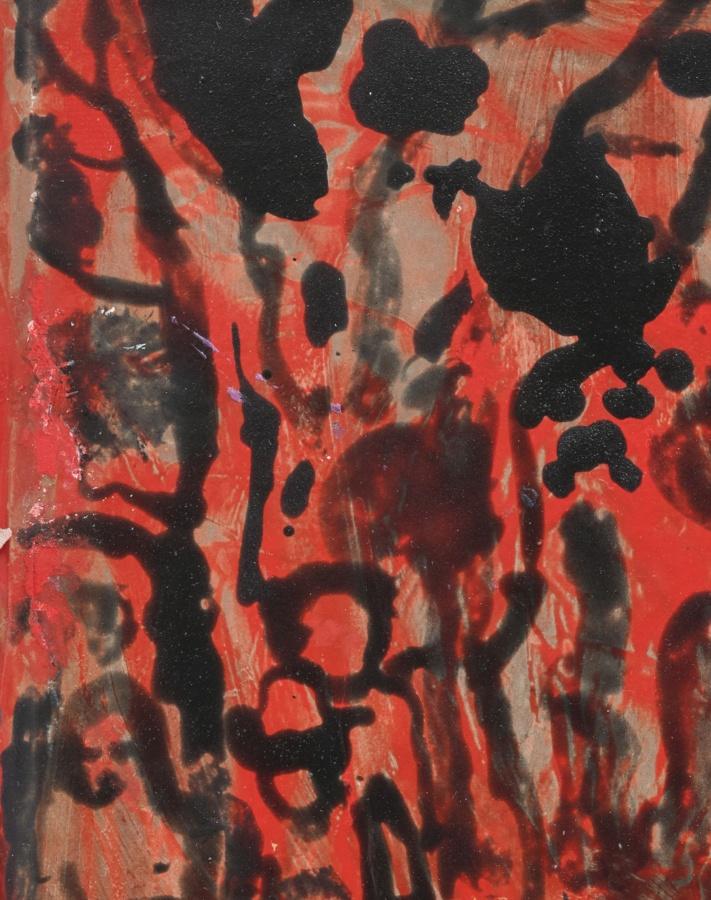
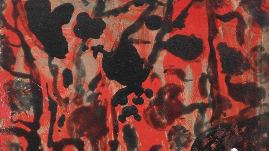
Alex Da Corte
Blue Pencil Drawing (Henny Penny), 2020
Inkjet and White Out on paper, cast polyester resin frame, plexiglass, mat-board, coroplast, wooden strainer, hardware
17 1⁄8 × 14 7⁄8 inches; 43 1⁄2 × 38 cm
ADC-20-008
Alex Da Corte
Blue Pencil Drawing (Henny Penny), 2020
Inkjet and White Out on paper, cast polyester resin frame, plexiglass, mat-board, coroplast, wooden strainer, hardware
17 1⁄8 × 14 7⁄8 inches; 43 1⁄2 × 38 cm
ADC-20-008
Alex Da Corte
Blue Pencil Drawing (Something for Nothing for Lusia), 2020
Inkjet and White Out on paper, cast polyester resin frame, plexiglass, mat-board, coroplast, wooden strainer, and hardware
17 1⁄8 × 14 7⁄8 inches; 43 1⁄2 × 38 cm
ADC-20-009
Alex Da Corte
Blue Pencil Drawing (Something for Nothing for Lusia), 2020
Inkjet and White Out on paper, cast polyester resin frame, plexiglass, mat-board, coroplast, wooden strainer, and hardware
17 1⁄8 × 14 7⁄8 inches; 43 1⁄2 × 38 cm
ADC-20-009
Louise Fishman in her studio, New York. Photo: Nina Subin
Fishman begins by making spontaneous paint marks that relate in some way to the shape and dimensions of the rectangle. These marks may or may not remain visible in the composition of the finished painting. She continues building from and upon them as she so deems, working outwards toward the gaze of the viewer. Her paint is applied boldly and toughly, but loosely and gratifyingly, with a wide variety of paint densities and applications. It appears layered, as I said before, and as such, starts to “come off the wall” and into the space of the viewer, so that one is with the painting rather than just looking at it. The paint provides many seemingly changing dimensions. Each addition (or subtraction?) seems very much deliberated. And I imagine that she loses herself in the work, alone, without being conscious of the time passing, or the hours or days it takes to make the painting.
– Suzan Frecon, “Travelling in Fishman Terrain,” 2017
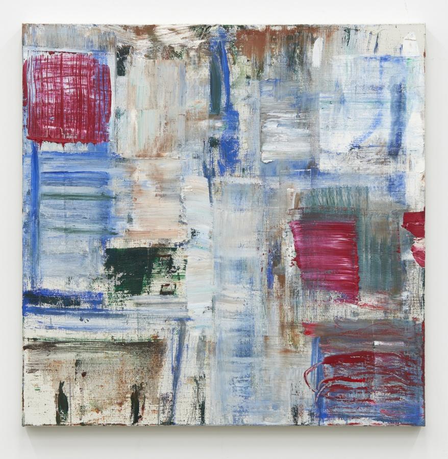
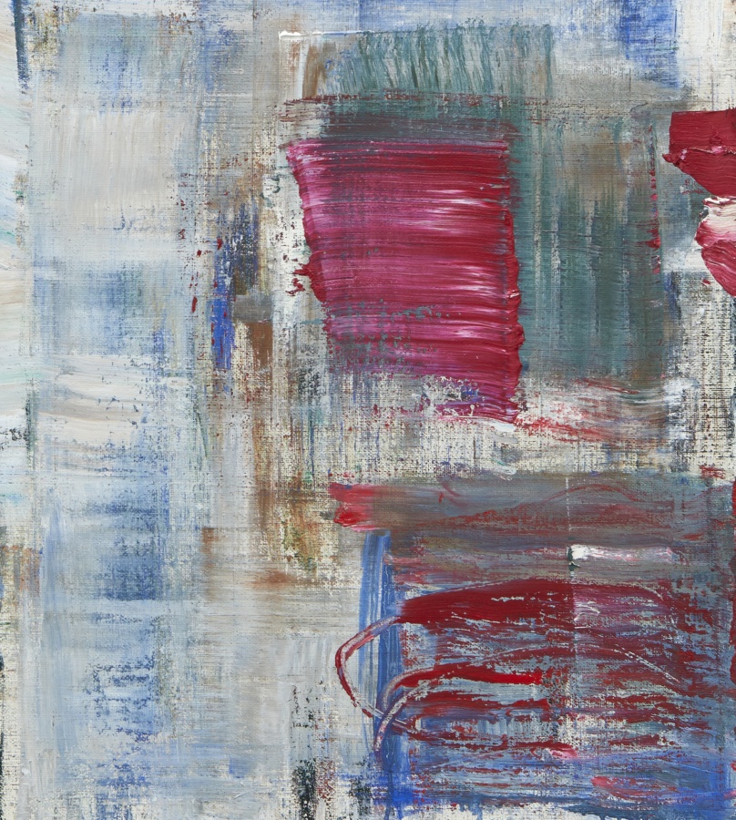
Louise Fishman
TRAGHETTO, 2019
Oil on linen
40 × 40 inches; 102 × 102 cm
LF-19-005
Louise Fishman
TRAGHETTO, 2019
Oil on linen
40 × 40 inches; 102 × 102 cm
LF-19-005
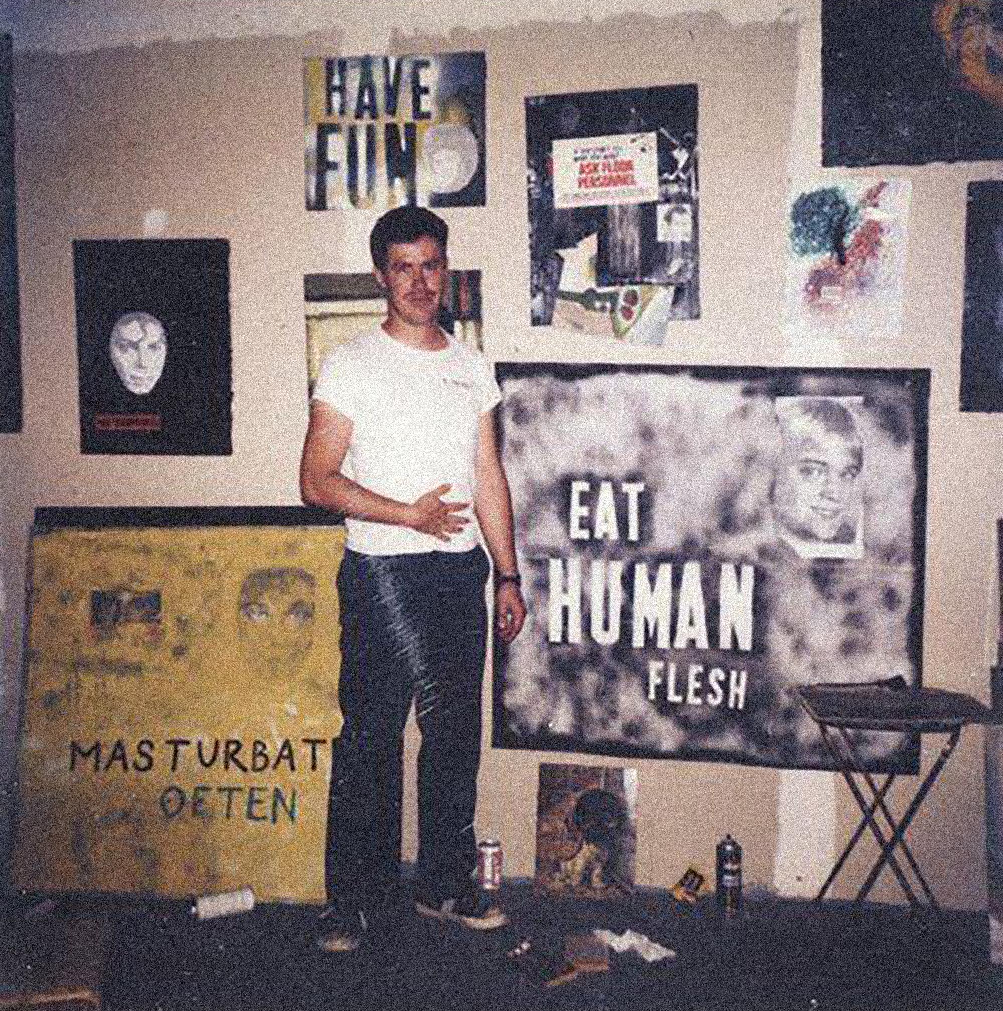
Mark Flood in his studio, Houston
Cezanne and Matisse are the painters to whom I feel closest, but my work bears little resemblance to theirs. I appreciate their manner of working before the “motif,” their determination to express its truth, its “fundamental nature…even if it means sacrificing some of its more pleasant qualities,” even if the resulting painting appears ugly or inept. I can sum up my views on technique with Matisse’s remark that “the simplest means of expressing one’s self are always the best.” Cezanne and Matisse took as their motif the visual world, but that project holds less interest for our time, and none for me. My motif is the social. I would like to express its fundamental nature in two dimensions.
– Mark Flood, 1987
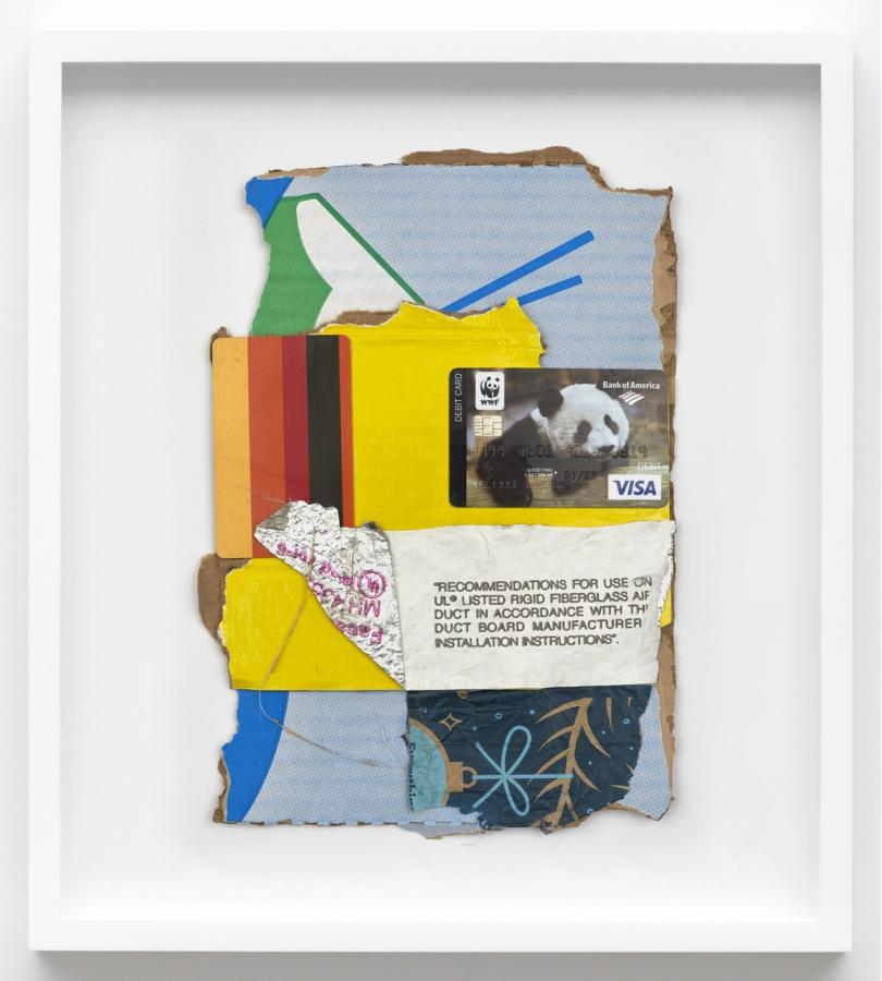
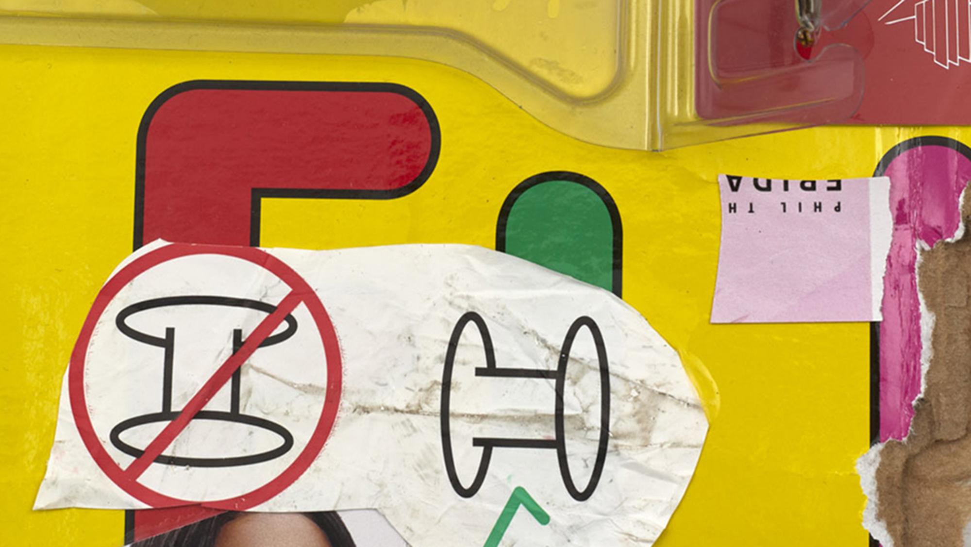
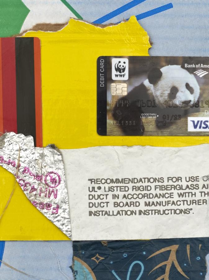
Mark Flood
Visa Panda, 2019
Mixed media
10 3⁄4 × 7 1⁄2 inches; 27 × 19 cm (unframed)
MAF-19-012
Mark Flood
Visa Panda, 2019
Mixed media
10 3⁄4 × 7 1⁄2 inches; 27 × 19 cm (unframed)
MAF-19-012
Mark Flood
Keyboard, 2019
Mixed media
8 1⁄2 × 5 3⁄4 inches; 21 1⁄2 × 14 6⁄10 cm (unframed)
MAF-19-021
Mark Flood
Keyboard, 2019
Mixed media
8 1⁄2 × 5 3⁄4 inches; 21 1⁄2 × 14 6⁄10 cm (unframed)
MAF-19-021
Mark Flood
Solo, 2019
Mixed media
14 × 7 1⁄2 inches; 35 1⁄2 × 19 cm (unframed)
MAF-19-014
Mark Flood
Solo, 2019
Mixed media
14 × 7 1⁄2 inches; 35 1⁄2 × 19 cm (unframed)
MAF-19-014
Mark Flood
GU, 2019
Mixed media
11 × 6 1⁄2 inches; 28 × 16 1⁄2 cm (unframed)
MAF-19-013
Mark Flood
GU, 2019
Mixed media
11 × 6 1⁄2 inches; 28 × 16 1⁄2 cm (unframed)
MAF-19-013
Marley Freeman in her studio, New York. Photo: Sarah Rice
[Freeman’s paintings] can be pared down and dreamlike, sunny and syncopated, and/or patterned in manners often reminiscent of Forrest Bess, with micro flashes of Frankenthaler, Milton Avery, Bauhaus, Ab Ex, and Pattern & Decoration. Proximity is valued, and warmth permeates—a warmth accrued like coats, sheets, and blankets laid on. She finds images, she says, through layering, which is foundational and has something to do with growing up with a father who is an antique textile dealer: “My sense of color and interest in image-making comes from textiles and their varying levels of transparency, which is often related to weaving structures. Everything in my paintings is interwoven.”
– Sarah Lehrer-Graiwer, 2020
Marley Freeman
Milkweed, 2020
Oil and acrylic on linen
16 × 11 inches; 41 × 28 cm (unframed)
17 1⁄4 × 12 1⁄4 inches; 44 × 31 cm (framed)
MF-20-006
Marley Freeman
Milkweed, 2020
Oil and acrylic on linen
16 × 11 inches; 41 × 28 cm (unframed)
17 1⁄4 × 12 1⁄4 inches; 44 × 31 cm (framed)
MF-20-006
Marley Freeman
Outer Lineation, 2020
Oil and acrylic on linen
14 1⁄4 × 11 1⁄4 inches; 34 × 29 cm (unframed)
15 1⁄2 × 12 1⁄2 inches; 39 × 32 cm (framed)
MF-20-013
Marley Freeman
Outer Lineation, 2020
Oil and acrylic on linen
14 1⁄4 × 11 1⁄4 inches; 34 × 29 cm (unframed)
15 1⁄2 × 12 1⁄2 inches; 39 × 32 cm (framed)
MF-20-013
Marley Freeman
Picture for Private Devotion, 2020
Oil and acrylic on linen
23 3⁄4 × 18 inches; 60 × 46 cm (unframed)
25 × 19 1⁄4 inches; 63 1⁄2 × 49 cm (framed)
MF-20-017
Marley Freeman
Picture for Private Devotion, 2020
Oil and acrylic on linen
23 3⁄4 × 18 inches; 60 × 46 cm (unframed)
25 × 19 1⁄4 inches; 63 1⁄2 × 49 cm (framed)
MF-20-017
Installation view of Ruth Ige, Karma, 2019
When I first met Ruth Ige, I recognized a quietude we both shared—an introversion that strikes me as less of a personality trait and more of a discrete caution that one carries with them into the world. I recognize this same sentiment in her work. Her paintings oscillate between abstraction and figuration, at times concealing forms within the pictorial frame and at others revealing them. Ige enshrines her figures in mystery. She views this as a form of empowerment, one that allows for a portrayal of blackness that is “enigmatic and not expected.” Ige is interested in creating new narrative forms of blackness. Central to her practice is a politics of representation and absence that gestures toward the historical omission of blackness from Western art canons.
– Cameron Ah Loo-Matamua, 2019
Ruth Ige
All is well, 2020
Acrylic on canvas
47 1⁄4 × 47 1⁄2 inches; 120 × 121 cm
RI-20-002
Ruth Ige
All is well, 2020
Acrylic on canvas
47 1⁄4 × 47 1⁄2 inches; 120 × 121 cm
RI-20-002
Ruth Ige
Present and Future, 2020
Acrylic on canvas
39 1⁄4 × 47 1⁄2 inches; 100 × 121 cm
RI-20-003
Ruth Ige
Present and Future, 2020
Acrylic on canvas
39 1⁄4 × 47 1⁄2 inches; 100 × 121 cm
RI-20-003
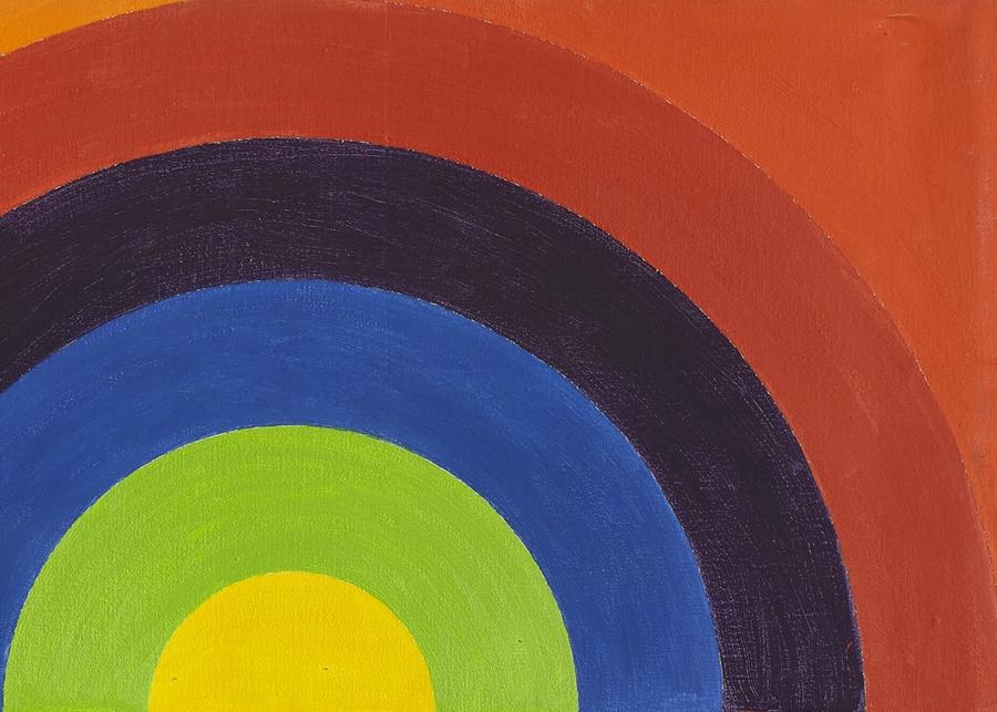
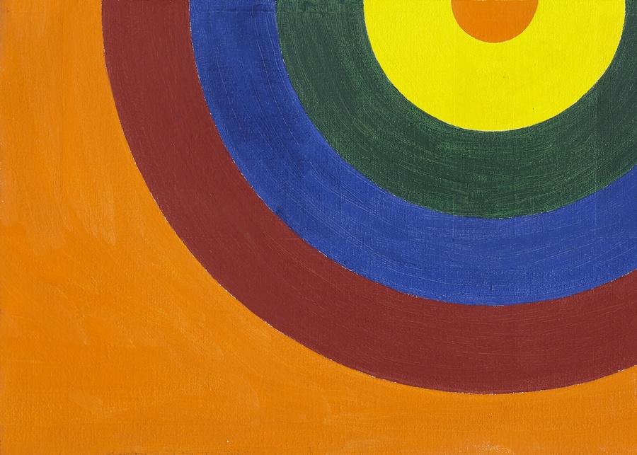
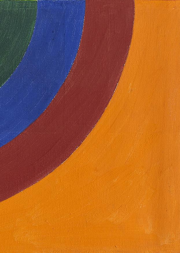
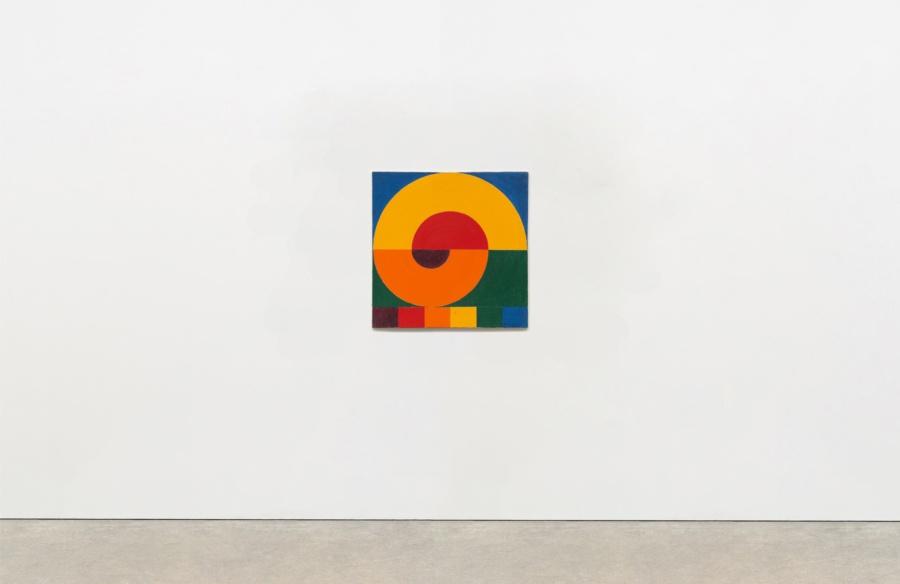
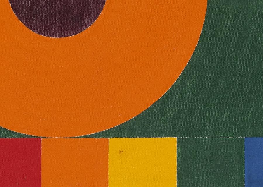
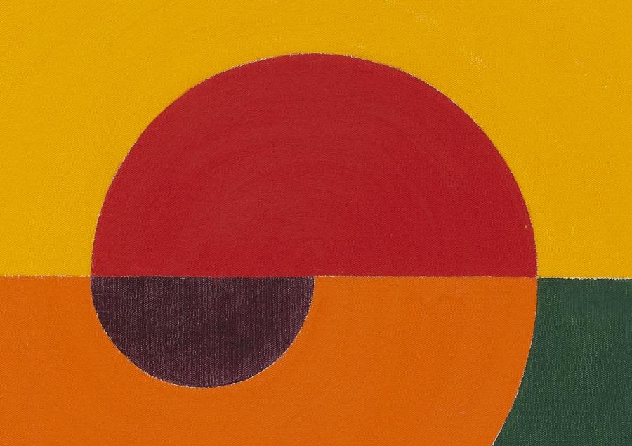
Installation view of Paul Mogensen, Karma, 2018
Hans Ulrich Obrist: Do you have a favorite color?
Paul Mogensen: I like them all. I had a lot of inorganic chemistry. Years later, when I took my art studio class, the first day, they handed out a list of all the pigments that you’re supposed to know. It was completely familiar to me because they’re chemicals. I actually made some of those in the lab, making experiments. I always liked how great they are. People spend their whole life developing pigments. Like the Lascaux paintings in France, 40,000 years old. Some of those pigments come from hundreds of miles away. Obviously, they wanted to get the right color.
The way I pick the colors, I go to an art supply store and open up a tube and then look at it to see what it looks like. When I get a good one, I just use that. This painting is a progression like my other recent paintings, except that the progression goes on the edges. It goes around on the edges, and then goes again. The blue is flat, not glossy, and the red is very glossy. I did that for my first show, at the back, where I showed this white gloss sixteen rectangles next to a completely flat black. I didn’t know it would do this but I was looking at them in there, the gloss and the flat was really—did a whole thing I never anticipated. I’ve been doing it ever since.
—Hans Ulrich Obrist with Paul Mogensen, 2018.
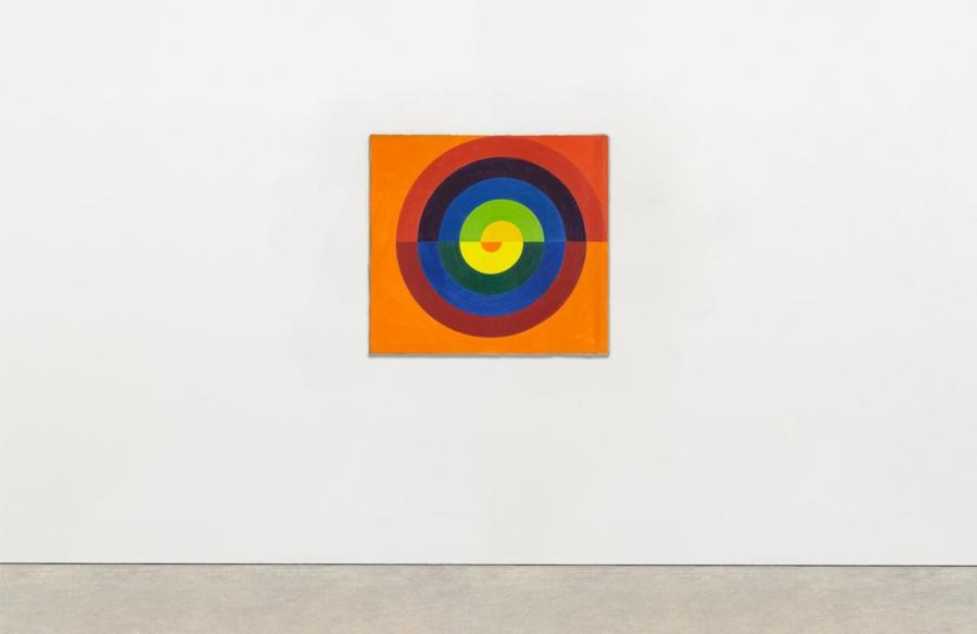
Paul Mogensen
no title, 1972
Oil on canvas
28 × 31 inches; 71 × 79 cm
PM-72-005
Paul Mogensen
no title, 1972
Oil on canvas
28 × 31 inches; 71 × 79 cm
PM-72-005
Paul Mogensen
no title, 1971
Oil on canvas
19 1⁄4 × 19 1⁄2 inches; 49 × 49 1⁄2 cm
PM-71-004
Paul Mogensen
no title, 1971
Oil on canvas
19 1⁄4 × 19 1⁄2 inches; 49 × 49 1⁄2 cm
PM-71-004
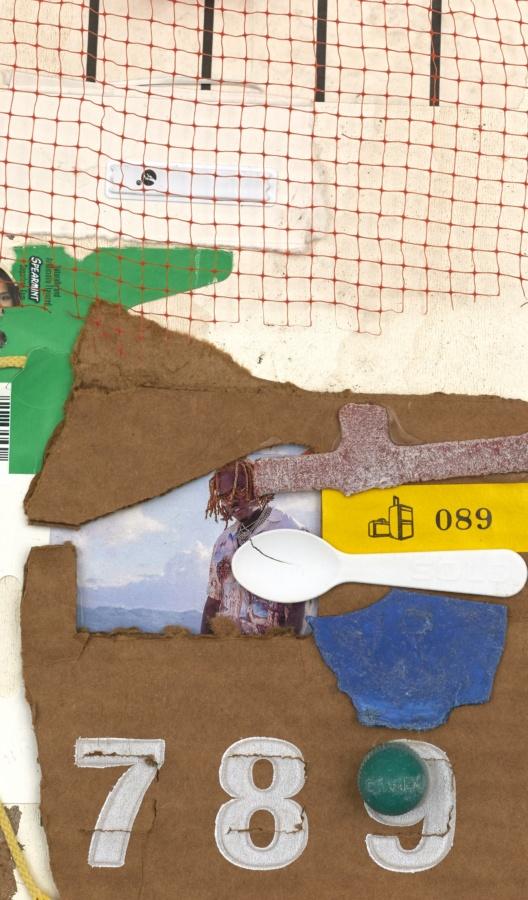
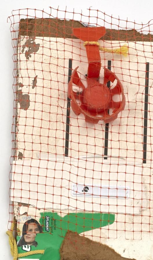
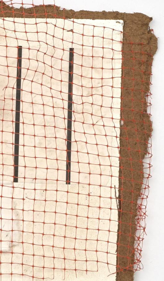
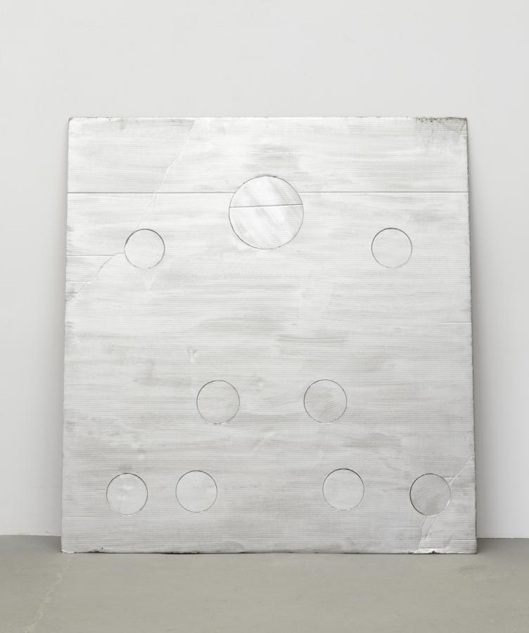
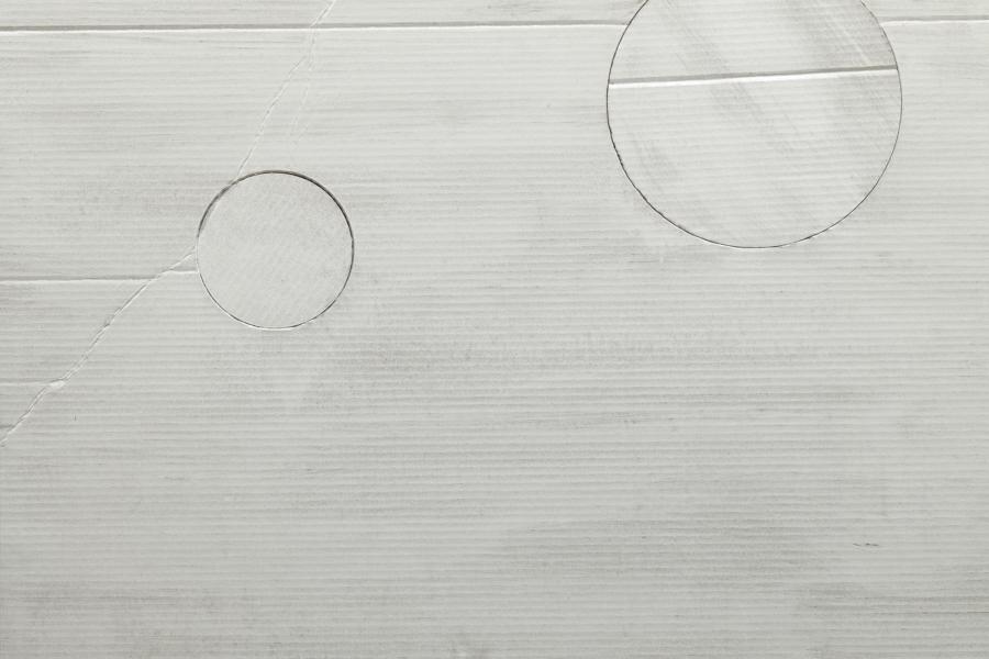
Installation view of Cady Noland, MMK Museum für Moderne Kunst, Frankfurt am Main, 2019
Cady Noland’s subjects are not social anthropology, but clues to herself. She uses emotional triggers that represent weakness. Crashed Car (Cady was in a wreck at a young age), Plane Crash Photos (Cady is afraid to fly), The Family and the SLA that kidnapped Patty Hearst (Cady has a fear of cults). What I mean is, Noland is not making arbitrary choices as a pop artist would. To pop artists all images generated by society are equal and impersonal. Cady’s choices are highly personal; they are based on her fears, and how she chooses to deal with them. She aestheticizes her fears and tries to control them by pinning them up.
– Steven Parrino on Cady Noland, 2001
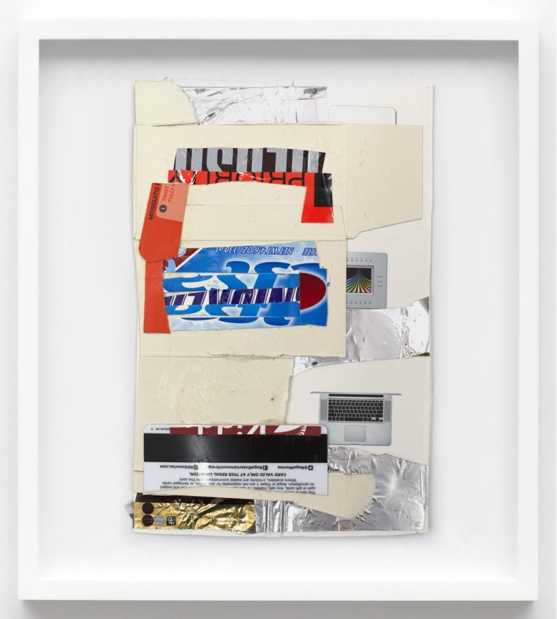
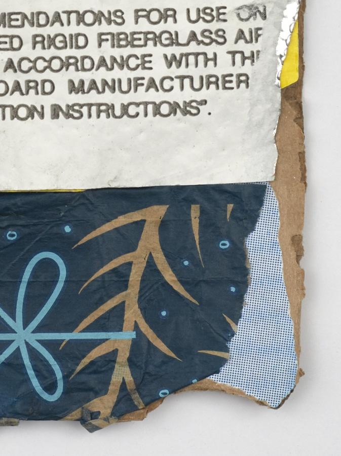
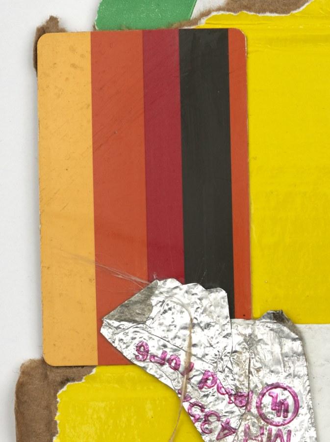
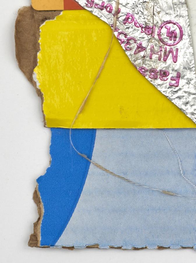
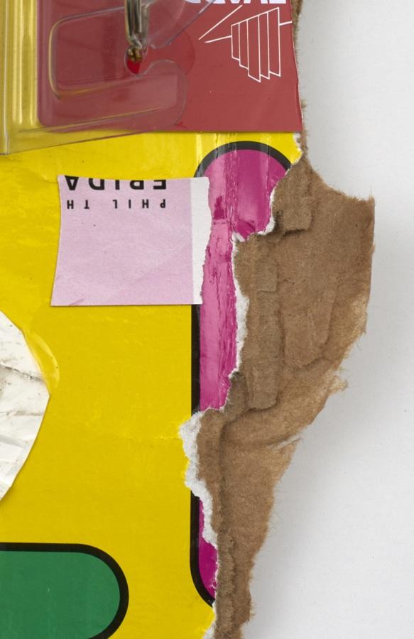
Cady Noland
(Not Yet Titled), 1996
Cardboard, lacquer-based sanding sealer, and aluminum enamel spray paint
56 × 54 inches; 142 × 137 cm
Unique edition of 60, AP VI/XV
CN-96-001
Cady Noland
(Not Yet Titled), 1996
Cardboard, lacquer-based sanding sealer, and aluminum enamel spray paint
56 × 54 inches; 142 × 137 cm
Unique edition of 60, AP VI/XV
CN-96-001
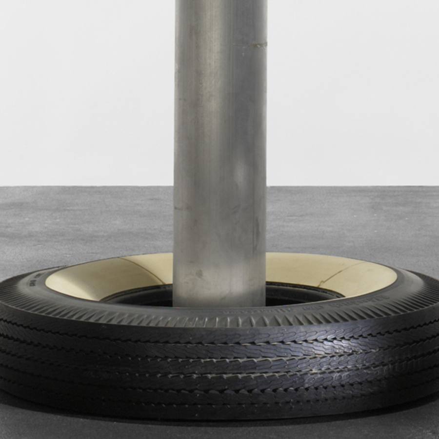
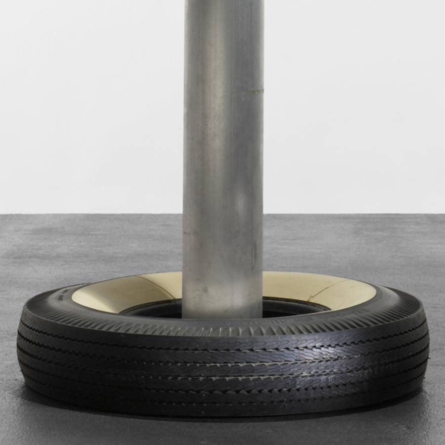
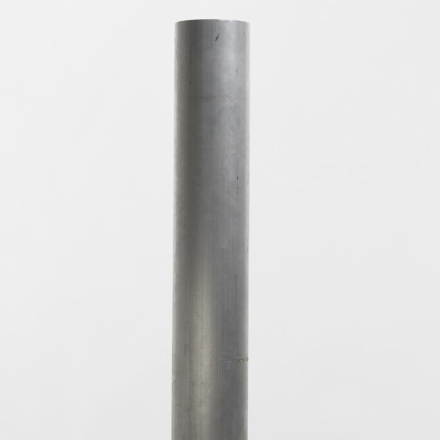
Cady Noland
Untitled, 1997-1998
Aluminium pipe and whitewall tire
48 × 30 × 30 inches; 122 × 76 × 76 cm
Edition of 30
CN-98-001
Cady Noland
Untitled, 1997-1998
Aluminium pipe and whitewall tire
48 × 30 × 30 inches; 122 × 76 × 76 cm
Edition of 30
CN-98-001
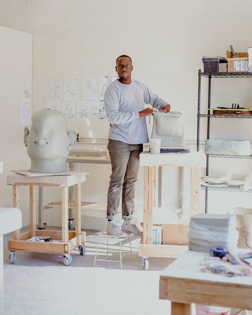
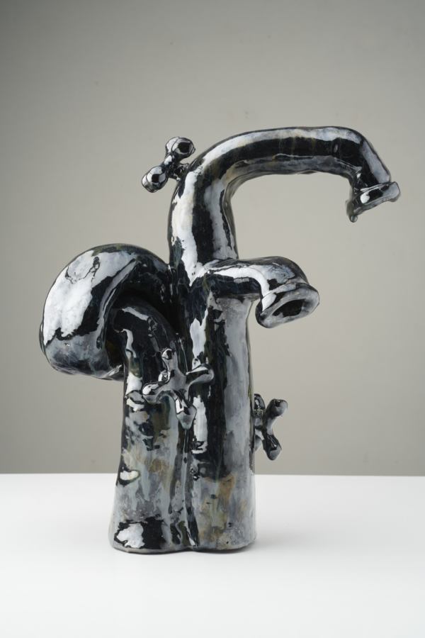
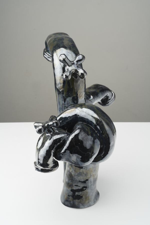
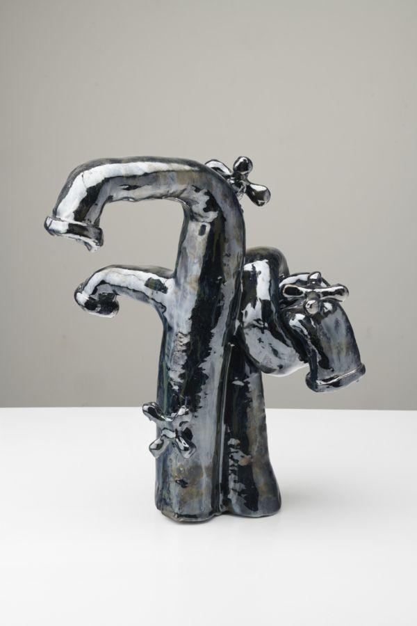
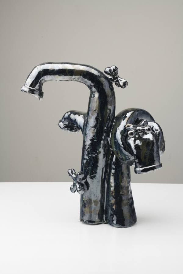
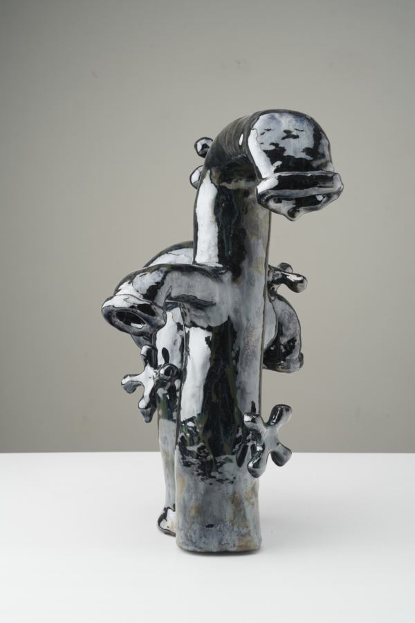
Woody De Othello in his studio, Richmond. Photo: Mark Mahaney
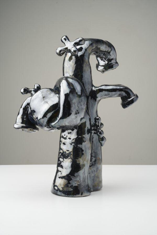
The objects mimic actions that humans perform; they’re extensions of our own actions. We use phones to speak and to listen, clocks to tell time, vessels to hold things, and our bodies are indicators of all of those, as mentioned earlier. We communicate and listen; our bodies are indicators of time passing; and we hold things both actually and metaphorically, whether it’s an emotion, a memory, or a feeling. Morphing humanoid feature combinations just kind of makes sense to me. I could see how there is this eerie otherness, but I’d like to think of it as uncanny similarities. I choose objects that are already very human in this regard.
– Woody De Othello, in conversation with Chiara Moioli, “Gravity at Play: Woody De Othello,” Mousse Magazine, 2020
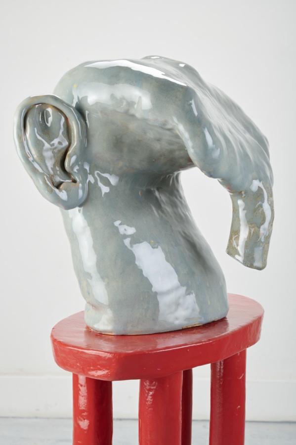
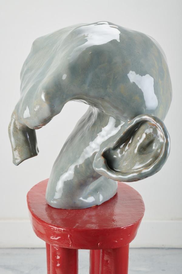
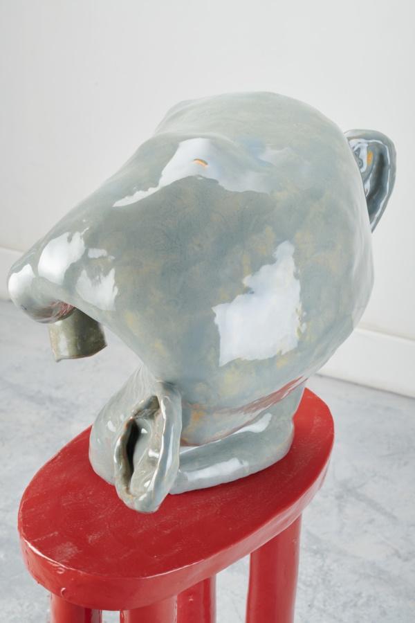
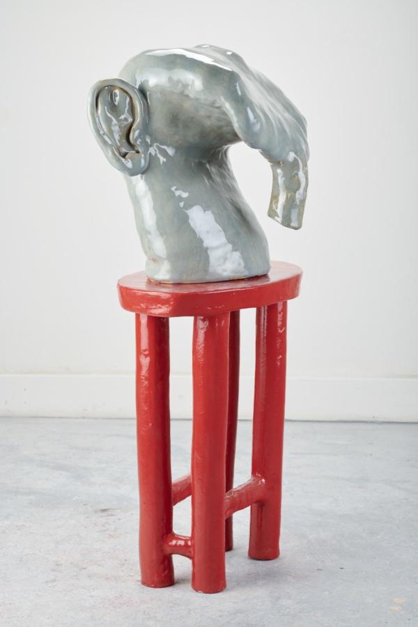
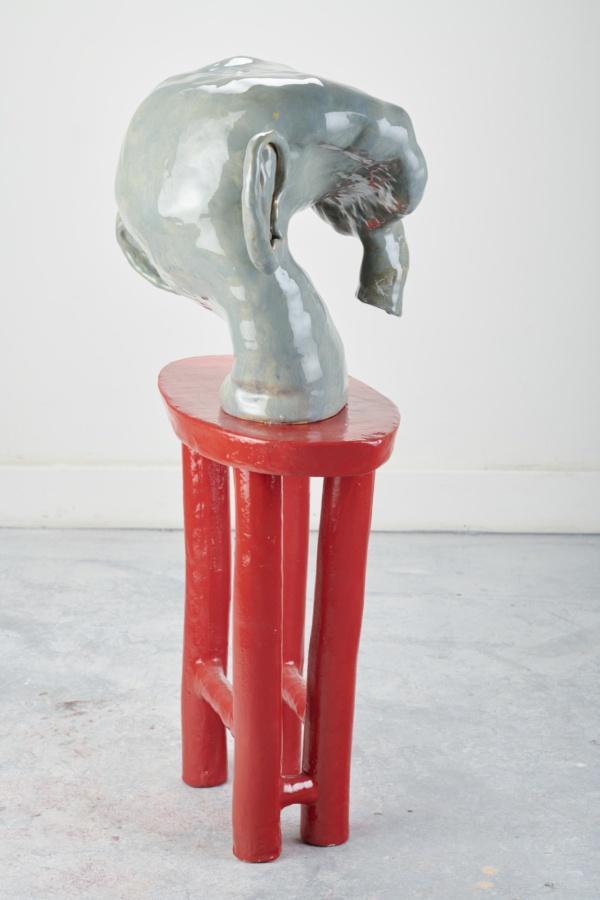
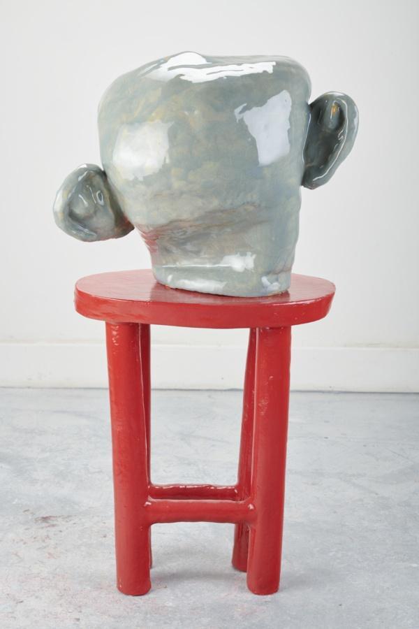
Woody De Othello
Downward Gaze, 2019
Ceramic and glaze
36 × 21 × 14 inches; 92 × 53 × 36 cm
WDO-19-024
Woody De Othello
Downward Gaze, 2019
Ceramic and glaze
36 × 21 × 14 inches; 92 × 53 × 36 cm
WDO-19-024
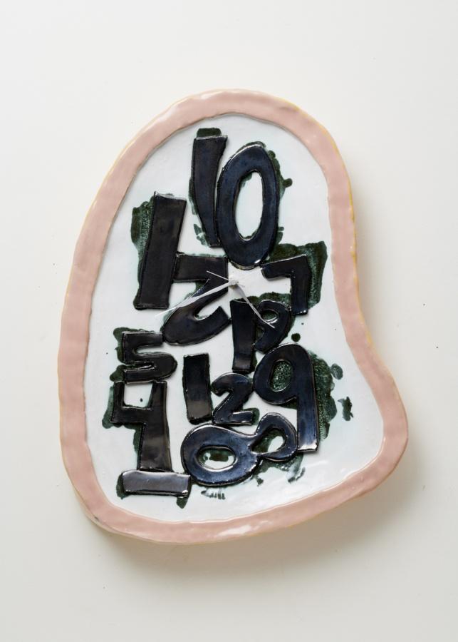
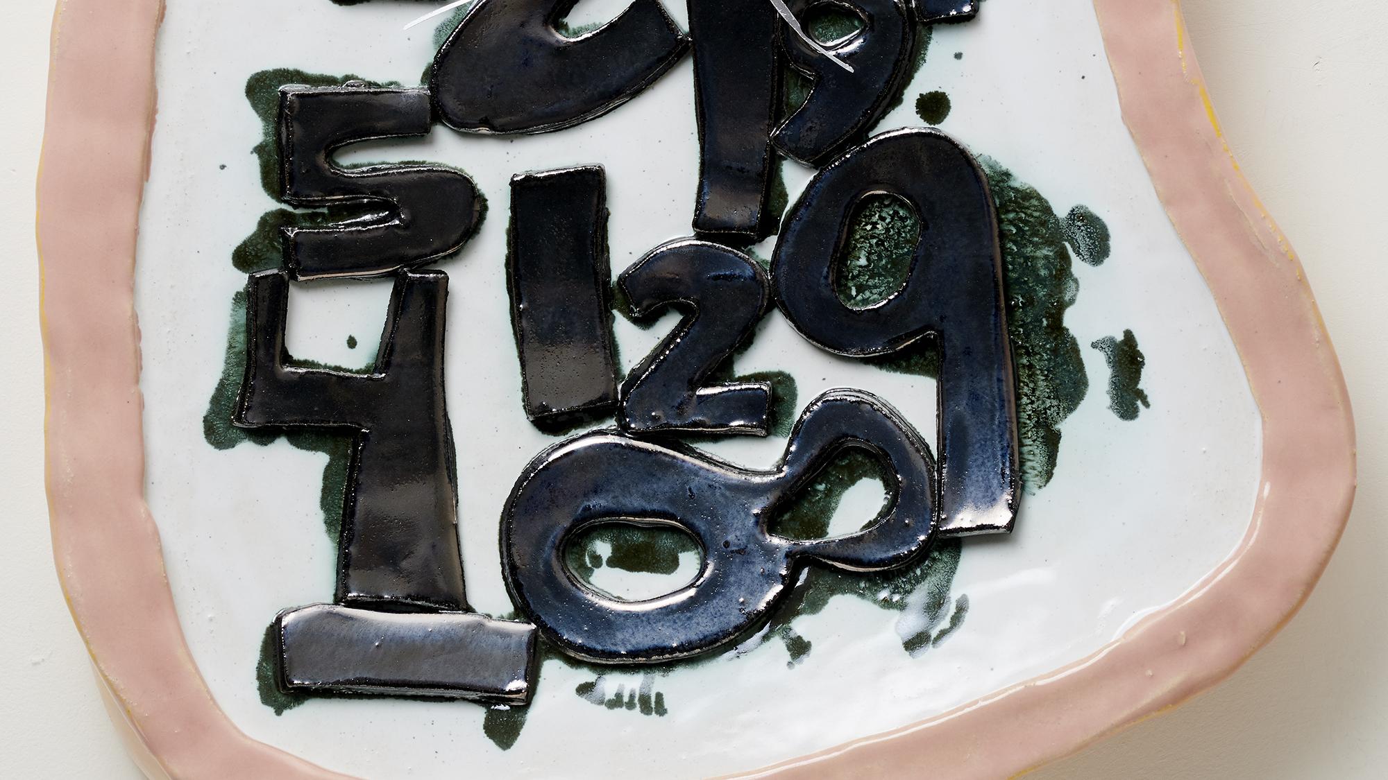
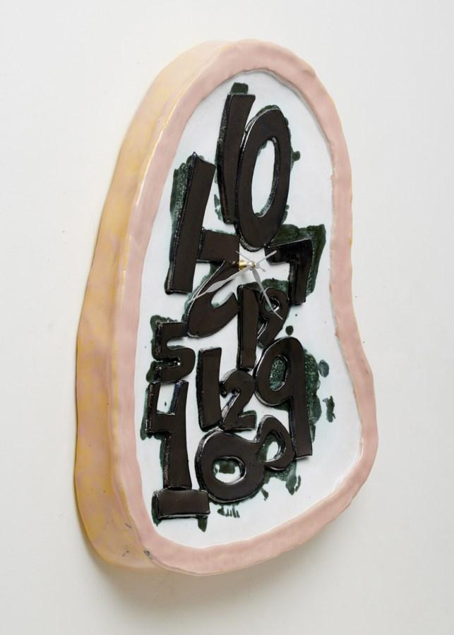
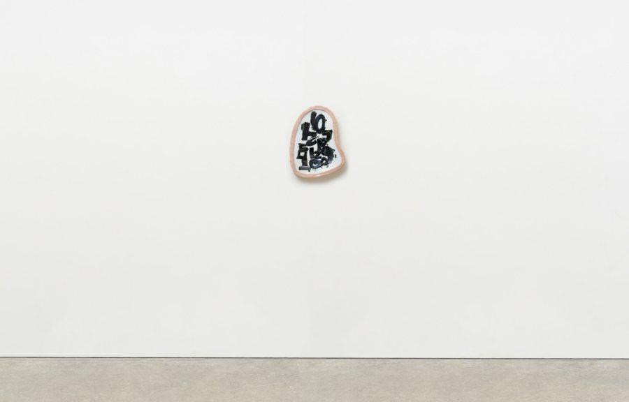
Woody De Othello
Dispersed, 2020
Ceramics, underglaze and glaze, clock hands, clock motor, and battery
20 × 15 1⁄2 × 3 inches; 51 × 40 × 8 cm
WDO-20-006
Woody De Othello
Dispersed, 2020
Ceramics, underglaze and glaze, clock hands, clock motor, and battery
20 × 15 1⁄2 × 3 inches; 51 × 40 × 8 cm
WDO-20-006
Woody De Othello
Plenty Empty, 2020
Ceramics, underglaze and glaze
13 × 12 × 11 inches; 33 × 30 1⁄2 × 28 cm
WDO-20-005
Woody De Othello
Plenty Empty, 2020
Ceramics, underglaze and glaze
13 × 12 × 11 inches; 33 × 30 1⁄2 × 28 cm
WDO-20-005
Woody De othello
Jack, 2020
Ceramics, underglaze and glaze
6 × 4 × 1 1⁄2 inches; 15 × 10 × 4 cm
WDO-20-003
Woody De othello
Jack, 2020
Ceramics, underglaze and glaze
6 × 4 × 1 1⁄2 inches; 15 × 10 × 4 cm
WDO-20-003
Olivier Mosset and Steven Parrino, Studio Photo, 1990
Parrino’s really dealing with the disruption of the monochrome.
The folds in the mis-stretched paintings are like brushstrokes, the exaggerated sign of the paint. But they’re also like paintings that were in accidents. They’re Parrino’s “disaster” paintings, calling to mind Warhols car crashes. With Warhol, they are also the paintings to which he added a monochrome canvas. In these works the monochrome canvases, whether behind or adjacent to the silkscreened image—the flat, one color panels which Warhol referred to as “the blanks”,—stand in for painting. They’re painted, while the silkscreen canvas is printed. They only make sense because they’re on stretched canvas… Just as Parrino’s monochromes only make sense because they’ve been mis-stretched
– Bob Nickas, “Two Or Three Things We Know About Them,” 1990
Steven Parrino
Untitled, 1983
Enamel on linen
14 × 14 inches; 35 1⁄2 × 35 1⁄2 cm
SP-83-001
Steven Parrino
Untitled, 1983
Enamel on linen
14 × 14 inches; 35 1⁄2 × 35 1⁄2 cm
SP-83-001
Steven Parrino
Untitled, 1986
Graphite on vellum
7 1⁄4 × 4 1⁄4 inches; 18 × 11 cm (unframed)
14 × 10 1⁄2 inches; 35 1⁄2 × 27 cm (framed)
SP-86-001
Steven Parrino
Untitled, 1986
Graphite on vellum
7 1⁄4 × 4 1⁄4 inches; 18 × 11 cm (unframed)
14 × 10 1⁄2 inches; 35 1⁄2 × 27 cm (framed)
SP-86-001
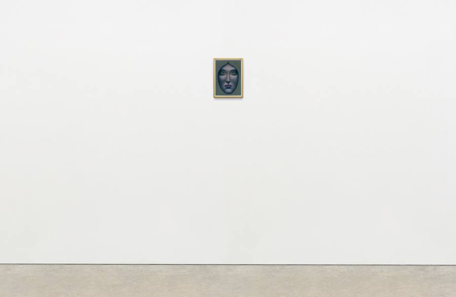
Nicolas Party, Brussels. Photo: Wai Lin Tse.
I saw a Picasso show and I was blown away by a pastel portrait. It’s a small work from his neo-classical period, dated 1921 and titled Tête de femme. I bought the postcard and went to the art store the next day to buy a pastel kit. I had never tried working with pastel before and started to copy Picasso’s portrait. And while I was working on it, I wasn’t seeing a woman on the postcard, just a portrait. Not a man or a woman, just a human head. When Picasso made his pastel, he was looking at a lot of Greek sculpture. I think he wasn’t paying attention to whether they were men or women; he was just fascinated by the perfection of the faces. He was probably also intrigued by their androgynous aspect: some statues of men could be women and vice versa. The title of this pastel means “head of woman”. Not ” head of a woman” or “portrait of Julia”: only the word “head” and the word “woman”. I think Picasso chose to include the word “woman” because he knew that the portrait could just as well be a man, and he wanted to make sure that we would look at it in a particular way. I think it’s interesting not to know if it’s male or female.”
– Nicolas Party in “Portrait: Nicolas Party”, Rita Vitorelli, Spike Art Quarterly, 2015
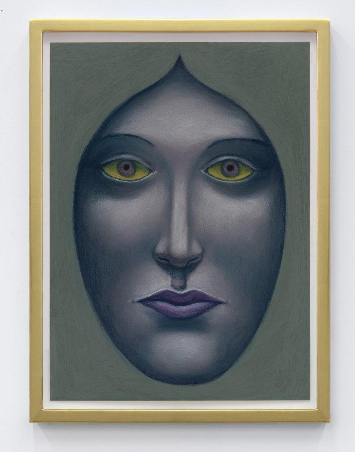
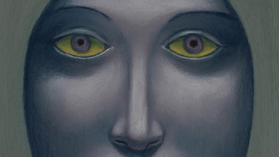
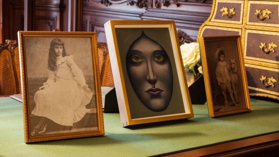
Nicolas Party
Face, 2019
Soft pastel on pastel card
11 × 8 inches; 28 × 20 cm (unframed)
12 3⁄8 × 9 1⁄4 inches; 31 × 23 1⁄2 cm (framed)
NP-19-015
Nicolas Party
Face, 2019
Soft pastel on pastel card
11 × 8 inches; 28 × 20 cm (unframed)
12 3⁄8 × 9 1⁄4 inches; 31 × 23 1⁄2 cm (framed)
NP-19-015
Mungo Thomson, Crickets for Solo and Ensemble, Artpace San Antonio, 2014. Photo: Mark Menjivar
I’m interested in the twilight of the analog. I think what something is, is most acutely felt when it is in decline. Currently, culture is half-and-half. While digital culture is ascending, art remains stubbornly analog. I have made an app as an artwork, and I am constantly online, but it can be like a casino on the internet, you know, airless and without clocks. I want things to feel real, to have aura, to have haptics.
– Mungo Thomson, 2019
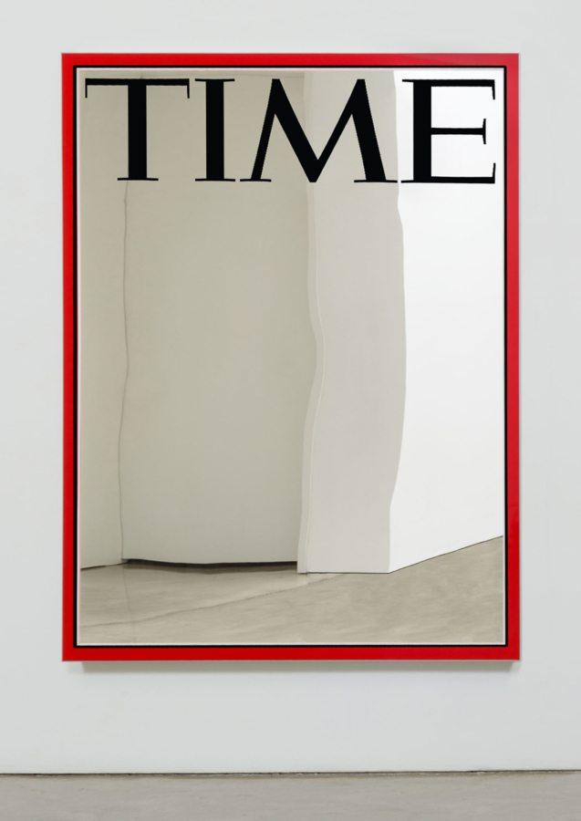
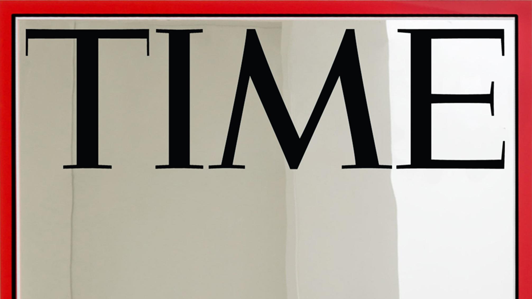
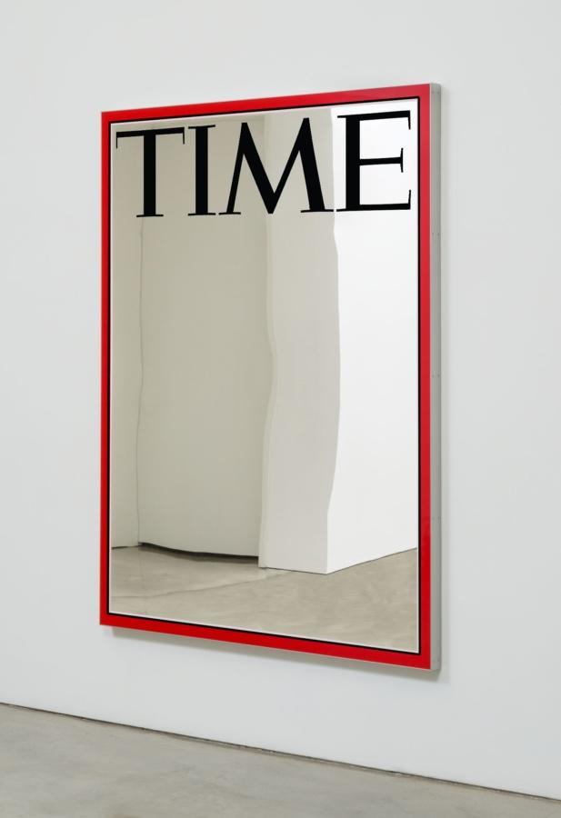
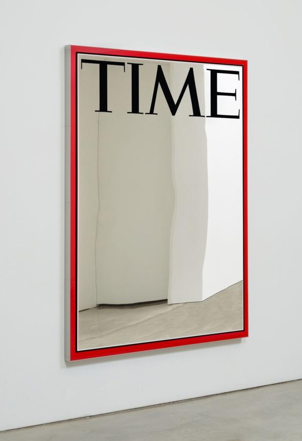
Mungo Thomson
December 21, 1998 (Will They Really Do it?), 2020
Enamel on low-iron mirror, poplar and aluminum
74 × 56 × 2 1⁄2 inches; 188 × 142 × 6 cm
MT-20-013
Mungo Thomson
December 21, 1998 (Will They Really Do it?), 2020
Enamel on low-iron mirror, poplar and aluminum
74 × 56 × 2 1⁄2 inches; 188 × 142 × 6 cm
MT-20-013
Mungo Thomson
SNOWMAN, 2020
Painted bronze
32 5⁄8 × 18 1⁄8 × 18 1⁄8 inches; 83 × 47 × 47 cm
MT-20-010
Mungo Thomson
SNOWMAN, 2020
Painted bronze
32 5⁄8 × 18 1⁄8 × 18 1⁄8 inches; 83 × 47 × 47 cm
MT-20-010
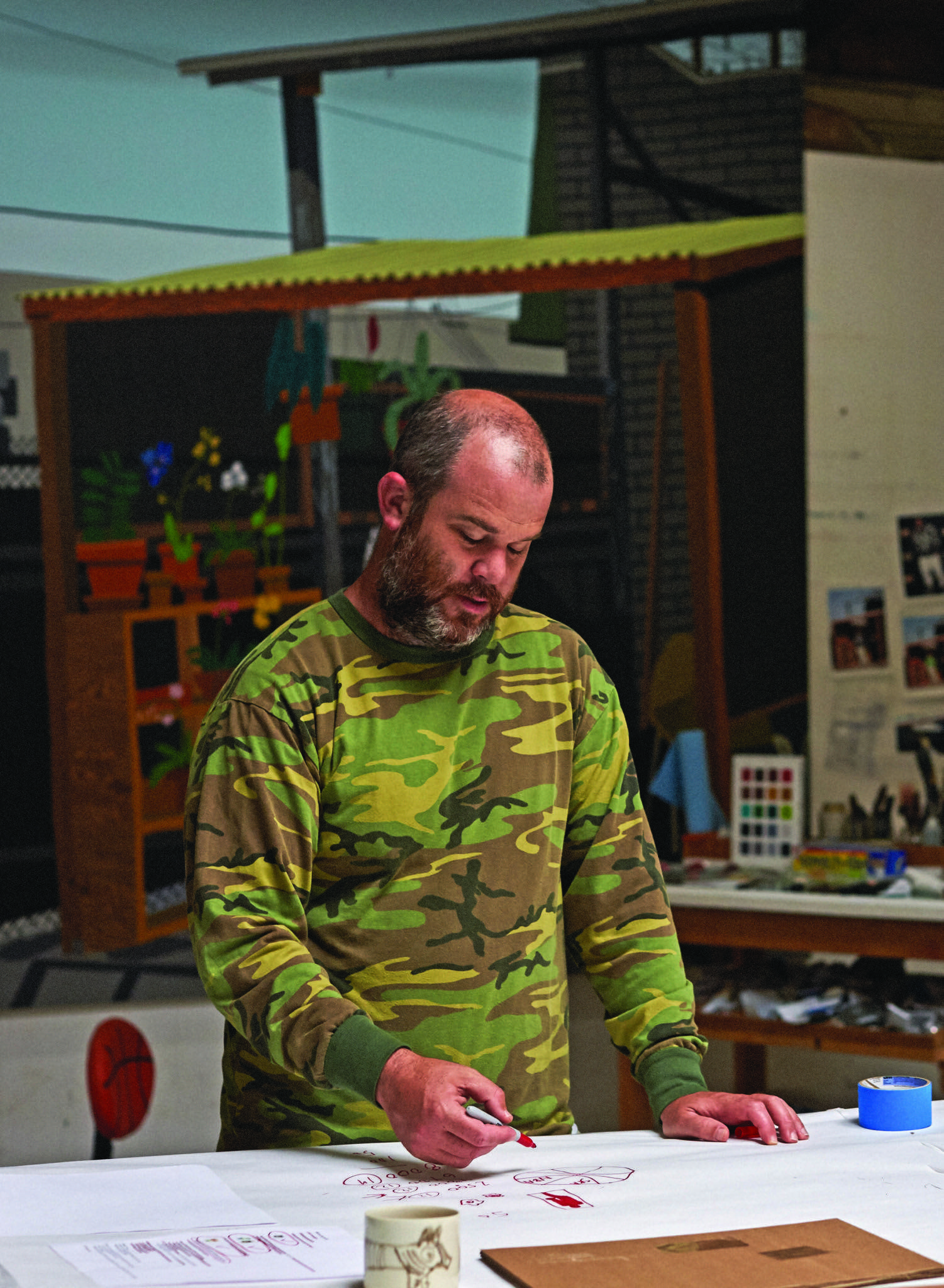
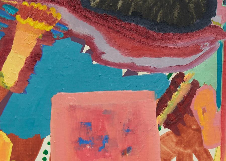
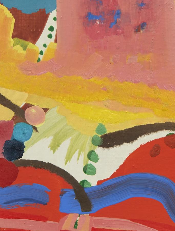
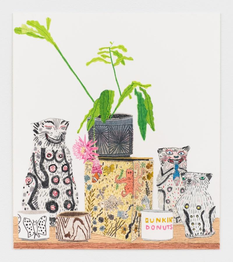
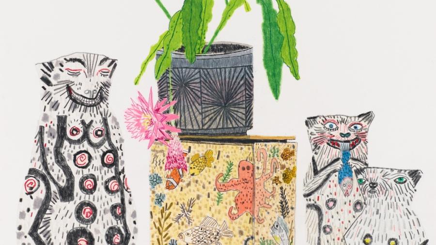
Jonas Wood in his studio, Los Angeles. Photo: Steven Taylor
Wood is committed to the twentieth century’s call for a merger of art and life, he has fashioned a life dedicated to art and an art dedicated to life. To this end, he has produced a body of work that is stylized and repetitive. This repetition comes in part from his interest in the decorative and the everyday – two arenas where repetition is paramount. But the repetition is also a meditation; a daily practice of engaging with the things and people he loves. That this practice is labour-intensive and time-consuming and difficult, but that the end result is beautiful and casual and appears easy, is part of the game. All artwork needs an engine to make it; every artist has to hook up their desire and ambition to some external force in order to get up the energy to go into the studio day after day to make things that will ultimately render them vulnerable on a public stage.
– Helen Molesworth, Everyday Tenderness, Jonas Wood, Phaidon, 2019
Jonas Wood
Kusaka, Takamori, Frimkess and Cressey Still Life, 2020
Colored pencil on paper
13 7⁄8 × 12 1⁄8 inches; 35 × 31 cm (unframed)
17 3⁄8 × 15 5⁄8 inches; 44 × 40 cm (framed)
JW-20-002
Jonas Wood
Kusaka, Takamori, Frimkess and Cressey Still Life, 2020
Colored pencil on paper
13 7⁄8 × 12 1⁄8 inches; 35 × 31 cm (unframed)
17 3⁄8 × 15 5⁄8 inches; 44 × 40 cm (framed)
JW-20-002
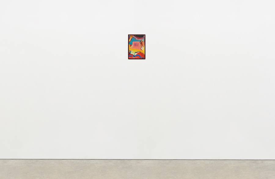
Gertrude Abercrombie
Untitled, c. 1939
Oil on masonite
3 3⁄8 × 2 1⁄2 inches; 8 1⁄2 × 6 cm (unframed)
8 5⁄8 × 8 inches; 22 × 20 cm (framed)
GA-ND-008
Gertrude Abercrombie
Untitled, c. 1939
Oil on masonite
3 3⁄8 × 2 1⁄2 inches; 8 1⁄2 × 6 cm (unframed)
8 5⁄8 × 8 inches; 22 × 20 cm (framed)
GA-ND-008
Henni Alftan
Garden Party, 2017
Oil on canvas
51 1⁄8 × 76 3⁄4 inches; 130 × 195 cm
HA-17-017
Henni Alftan
Garden Party, 2017
Oil on canvas
51 1⁄8 × 76 3⁄4 inches; 130 × 195 cm
HA-17-017
Henni Alftan
Buffet, 2018
Oil on canvas
55 1⁄8 × 78 3⁄4 inches; 140 × 200 cm
HA-18-007
Henni Alftan
Buffet, 2018
Oil on canvas
55 1⁄8 × 78 3⁄4 inches; 140 × 200 cm
HA-18-007
Dike Blair
Untitled, 2020
Oil on aluminum
12 × 9 inches; 30 1⁄2 × 23 cm
DB-20-009
Dike Blair
Untitled, 2020
Oil on aluminum
12 × 9 inches; 30 1⁄2 × 23 cm
DB-20-009
Dike Blair
Untitled, 2020
Oil on aluminum
12 × 9 inches; 30 1⁄2 × 23 cm
DB-20-008
Dike Blair
Untitled, 2020
Oil on aluminum
12 × 9 inches; 30 1⁄2 × 23 cm
DB-20-008
Dike Blair
Untitled, 2019
Charcoal, gouache and gesso on paper
10 1⁄2 × 14 inches; 27 × 35 1⁄2 cm (unframed)
11 5⁄8 × 15 1⁄8 inches; 29 1⁄2 × 38 cm (framed)
DB-19-060
Dike Blair
Untitled, 2019
Charcoal, gouache and gesso on paper
10 1⁄2 × 14 inches; 27 × 35 1⁄2 cm (unframed)
11 5⁄8 × 15 1⁄8 inches; 29 1⁄2 × 38 cm (framed)
DB-19-060
Dike Blair
Untitled, 2018
Charcoal and pencil on paper
10 × 7 1⁄2 inches; 25 × 19 cm (unframed)
11 1⁄2 × 9 inches; 29 × 23 cm (framed)
DB-18-005
Dike Blair
Untitled, 2018
Charcoal and pencil on paper
10 × 7 1⁄2 inches; 25 × 19 cm (unframed)
11 1⁄2 × 9 inches; 29 × 23 cm (framed)
DB-18-005
Will Boone
Thumper, 2020
Acrylic, enamel, oil, resin, and nylon flag on canvas
72 3⁄4 × 45 1⁄2 inches; 185 × 115 1⁄2 cm
WB-20-001
Will Boone
Thumper, 2020
Acrylic, enamel, oil, resin, and nylon flag on canvas
72 3⁄4 × 45 1⁄2 inches; 185 × 115 1⁄2 cm
WB-20-001
Will Boone
Nemean Lion, 2020
Enamel on bronze
4 1⁄2 × 20 × 9 inches; 11 1⁄2 × 51 × 23 cm
Edition of 1 + 1 AP
WB-20-002
Will Boone
Nemean Lion, 2020
Enamel on bronze
4 1⁄2 × 20 × 9 inches; 11 1⁄2 × 51 × 23 cm
Edition of 1 + 1 AP
WB-20-002
Mathew Cerletty
THIS, 2015
Oil on linen
26 1⁄2 × 32 inches; 67 × 81 cm
MC-15-001
Mathew Cerletty
THIS, 2015
Oil on linen
26 1⁄2 × 32 inches; 67 × 81 cm
MC-15-001
Mathew Cerletty
Hand in Bed, 2016
Colored pencil on paper
17 1⁄2 × 13 inches; 44 1⁄2 × 33 cm (unframed)
23 1⁄2 × 19 inches; 60 × 48 cm (framed)
MC-16-003
Mathew Cerletty
Hand in Bed, 2016
Colored pencil on paper
17 1⁄2 × 13 inches; 44 1⁄2 × 33 cm (unframed)
23 1⁄2 × 19 inches; 60 × 48 cm (framed)
MC-16-003
Andrew Cranston
Bunker, 2019
Distemper and oil on hardback book cover
12 × 9 inches; 30 1⁄2 × 23 cm
ACR-19-002
Andrew Cranston
Bunker, 2019
Distemper and oil on hardback book cover
12 × 9 inches; 30 1⁄2 × 23 cm
ACR-19-002
Andrew Cranston
Ginger in Africa, 2020
Oil and varnish on hardback book cover
7 3⁄8 × 10 inches; 19 × 25 1⁄2 cm
ACR-20-001
Andrew Cranston
Ginger in Africa, 2020
Oil and varnish on hardback book cover
7 3⁄8 × 10 inches; 19 × 25 1⁄2 cm
ACR-20-001
Andrew Cranston
Stranger Danger, 2020
distemper and varnish on hardback book cover
8 1⁄2 × 11 3⁄8 inches; 22 × 27 cm
ACR-20-002
Andrew Cranston
Stranger Danger, 2020
distemper and varnish on hardback book cover
8 1⁄2 × 11 3⁄8 inches; 22 × 27 cm
ACR-20-002
Ann Craven
Blue Song (Singing, on Blue, Mirrored), 2020, 2020
Oil on canvas
84 × 60 inches; 213 × 154 cm
AC-20-012
Ann Craven
Blue Song (Singing, on Blue, Mirrored), 2020, 2020
Oil on canvas
84 × 60 inches; 213 × 154 cm
AC-20-012
Ann Craven
Pensée (Rose Glow, Pink, on Blue with Cherries), 2020, 2020
Oil on canvas
40 × 30 inches; 102 × 76 cm
AC-20-010
Ann Craven
Pensée (Rose Glow, Pink, on Blue with Cherries), 2020, 2020
Oil on canvas
40 × 30 inches; 102 × 76 cm
AC-20-010
Ann Craven
Pensée (Pink, Orange, on Blue with Cherries), 2020
Oil on canvas
14 × 11 inches; 35 1⁄2 × 28 cm
AC-20-014
Ann Craven
Pensée (Pink, Orange, on Blue with Cherries), 2020
Oil on canvas
14 × 11 inches; 35 1⁄2 × 28 cm
AC-20-014
Alex Da Corte
Blue Pencil Drawing (The Flood), 2020
Inkjet and White Out on paper, cast polyester resin frame, plexiglass, mat-board, coroplast, wooden strainer, and hardware
17 1⁄8 × 14 7⁄8 inches; 43 1⁄2 × 38 cm
ADC-20-006
Alex Da Corte
Blue Pencil Drawing (The Flood), 2020
Inkjet and White Out on paper, cast polyester resin frame, plexiglass, mat-board, coroplast, wooden strainer, and hardware
17 1⁄8 × 14 7⁄8 inches; 43 1⁄2 × 38 cm
ADC-20-006
Alex Da Corte
Blue Pencil Drawing (Spit in the Eye), 2020
Inkjet and White Out on paper, cast polyester resin frame, plexiglass, mat-board, coroplast, wooden strainer, and hardware
17 1⁄8 × 14 7⁄8 inches; 43 1⁄2 × 38 cm
ADC-20-004
Alex Da Corte
Blue Pencil Drawing (Spit in the Eye), 2020
Inkjet and White Out on paper, cast polyester resin frame, plexiglass, mat-board, coroplast, wooden strainer, and hardware
17 1⁄8 × 14 7⁄8 inches; 43 1⁄2 × 38 cm
ADC-20-004
Alex Da Corte
Blue Pencil Drawing (Henny Penny), 2020
Inkjet and White Out on paper, cast polyester resin frame, plexiglass, mat-board, coroplast, wooden strainer, hardware
17 1⁄8 × 14 7⁄8 inches; 43 1⁄2 × 38 cm
ADC-20-008
Alex Da Corte
Blue Pencil Drawing (Henny Penny), 2020
Inkjet and White Out on paper, cast polyester resin frame, plexiglass, mat-board, coroplast, wooden strainer, hardware
17 1⁄8 × 14 7⁄8 inches; 43 1⁄2 × 38 cm
ADC-20-008
Alex Da Corte
Blue Pencil Drawing (Something for Nothing for Lusia), 2020
Inkjet and White Out on paper, cast polyester resin frame, plexiglass, mat-board, coroplast, wooden strainer, and hardware
17 1⁄8 × 14 7⁄8 inches; 43 1⁄2 × 38 cm
ADC-20-009
Alex Da Corte
Blue Pencil Drawing (Something for Nothing for Lusia), 2020
Inkjet and White Out on paper, cast polyester resin frame, plexiglass, mat-board, coroplast, wooden strainer, and hardware
17 1⁄8 × 14 7⁄8 inches; 43 1⁄2 × 38 cm
ADC-20-009
Louise Fishman
TRAGHETTO, 2019
Oil on linen
40 × 40 inches; 102 × 102 cm
LF-19-005
Louise Fishman
TRAGHETTO, 2019
Oil on linen
40 × 40 inches; 102 × 102 cm
LF-19-005
Mark Flood
Visa Panda, 2019
Mixed media
10 3⁄4 × 7 1⁄2 inches; 27 × 19 cm (unframed)
MAF-19-012
Mark Flood
Visa Panda, 2019
Mixed media
10 3⁄4 × 7 1⁄2 inches; 27 × 19 cm (unframed)
MAF-19-012
Mark Flood
Keyboard, 2019
Mixed media
8 1⁄2 × 5 3⁄4 inches; 21 1⁄2 × 14 6⁄10 cm (unframed)
MAF-19-021
Mark Flood
Keyboard, 2019
Mixed media
8 1⁄2 × 5 3⁄4 inches; 21 1⁄2 × 14 6⁄10 cm (unframed)
MAF-19-021
Mark Flood
Solo, 2019
Mixed media
14 × 7 1⁄2 inches; 35 1⁄2 × 19 cm (unframed)
MAF-19-014
Mark Flood
Solo, 2019
Mixed media
14 × 7 1⁄2 inches; 35 1⁄2 × 19 cm (unframed)
MAF-19-014

Mark Flood
GU, 2019
Mixed media
11 × 6 1⁄2 inches; 28 × 16 1⁄2 cm (unframed)
MAF-19-013
Mark Flood
GU, 2019
Mixed media
11 × 6 1⁄2 inches; 28 × 16 1⁄2 cm (unframed)
MAF-19-013
Marley Freeman
Milkweed, 2020
Oil and acrylic on linen
16 × 11 inches; 41 × 28 cm (unframed)
17 1⁄4 × 12 1⁄4 inches; 44 × 31 cm (framed)
MF-20-006
Marley Freeman
Milkweed, 2020
Oil and acrylic on linen
16 × 11 inches; 41 × 28 cm (unframed)
17 1⁄4 × 12 1⁄4 inches; 44 × 31 cm (framed)
MF-20-006
Marley Freeman
Outer Lineation, 2020
Oil and acrylic on linen
14 1⁄4 × 11 1⁄4 inches; 34 × 29 cm (unframed)
15 1⁄2 × 12 1⁄2 inches; 39 × 32 cm (framed)
MF-20-013
Marley Freeman
Outer Lineation, 2020
Oil and acrylic on linen
14 1⁄4 × 11 1⁄4 inches; 34 × 29 cm (unframed)
15 1⁄2 × 12 1⁄2 inches; 39 × 32 cm (framed)
MF-20-013
Marley Freeman
Picture for Private Devotion, 2020
Oil and acrylic on linen
23 3⁄4 × 18 inches; 60 × 46 cm (unframed)
25 × 19 1⁄4 inches; 63 1⁄2 × 49 cm (framed)
MF-20-017
Marley Freeman
Picture for Private Devotion, 2020
Oil and acrylic on linen
23 3⁄4 × 18 inches; 60 × 46 cm (unframed)
25 × 19 1⁄4 inches; 63 1⁄2 × 49 cm (framed)
MF-20-017
Ruth Ige
All is well, 2020
Acrylic on canvas
47 1⁄4 × 47 1⁄2 inches; 120 × 121 cm
RI-20-002
Ruth Ige
All is well, 2020
Acrylic on canvas
47 1⁄4 × 47 1⁄2 inches; 120 × 121 cm
RI-20-002
Ruth Ige
Present and Future, 2020
Acrylic on canvas
39 1⁄4 × 47 1⁄2 inches; 100 × 121 cm
RI-20-003
Ruth Ige
Present and Future, 2020
Acrylic on canvas
39 1⁄4 × 47 1⁄2 inches; 100 × 121 cm
RI-20-003
Paul Mogensen
no title, 1972
Oil on canvas
28 × 31 inches; 71 × 79 cm
PM-72-005
Paul Mogensen
no title, 1972
Oil on canvas
28 × 31 inches; 71 × 79 cm
PM-72-005
Paul Mogensen
no title, 1971
Oil on canvas
19 1⁄4 × 19 1⁄2 inches; 49 × 49 1⁄2 cm
PM-71-004
Paul Mogensen
no title, 1971
Oil on canvas
19 1⁄4 × 19 1⁄2 inches; 49 × 49 1⁄2 cm
PM-71-004
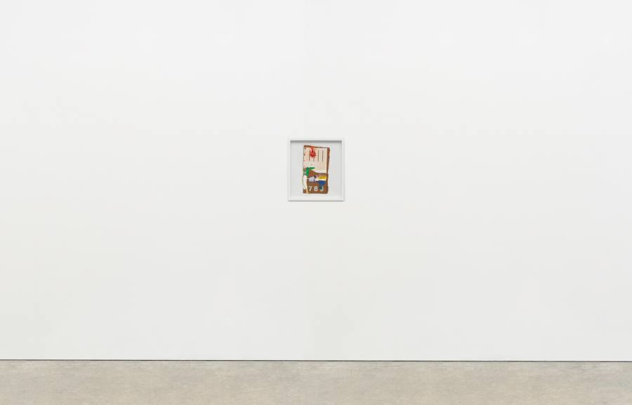
Cady Noland
(Not Yet Titled), 1996
Cardboard, lacquer-based sanding sealer, and aluminum enamel spray paint
56 × 54 inches; 142 × 137 cm
Unique edition of 60, AP VI/XV
CN-96-001
Cady Noland
(Not Yet Titled), 1996
Cardboard, lacquer-based sanding sealer, and aluminum enamel spray paint
56 × 54 inches; 142 × 137 cm
Unique edition of 60, AP VI/XV
CN-96-001
Cady Noland
Untitled, 1997-1998
Aluminium pipe and whitewall tire
48 × 30 × 30 inches; 122 × 76 × 76 cm
Edition of 30
CN-98-001
Cady Noland
Untitled, 1997-1998
Aluminium pipe and whitewall tire
48 × 30 × 30 inches; 122 × 76 × 76 cm
Edition of 30
CN-98-001
Woody De Othello
Downward Gaze, 2019
Ceramic and glaze
36 × 21 × 14 inches; 92 × 53 × 36 cm
WDO-19-024
Woody De Othello
Downward Gaze, 2019
Ceramic and glaze
36 × 21 × 14 inches; 92 × 53 × 36 cm
WDO-19-024
Woody De Othello
Dispersed, 2020
Ceramics, underglaze and glaze, clock hands, clock motor, and battery
20 × 15 1⁄2 × 3 inches; 51 × 40 × 8 cm
WDO-20-006
Woody De Othello
Dispersed, 2020
Ceramics, underglaze and glaze, clock hands, clock motor, and battery
20 × 15 1⁄2 × 3 inches; 51 × 40 × 8 cm
WDO-20-006
Woody De Othello
Plenty Empty, 2020
Ceramics, underglaze and glaze
13 × 12 × 11 inches; 33 × 30 1⁄2 × 28 cm
WDO-20-005
Woody De Othello
Plenty Empty, 2020
Ceramics, underglaze and glaze
13 × 12 × 11 inches; 33 × 30 1⁄2 × 28 cm
WDO-20-005
Woody De othello
Jack, 2020
Ceramics, underglaze and glaze
6 × 4 × 1 1⁄2 inches; 15 × 10 × 4 cm
WDO-20-003
Woody De othello
Jack, 2020
Ceramics, underglaze and glaze
6 × 4 × 1 1⁄2 inches; 15 × 10 × 4 cm
WDO-20-003
Steven Parrino
Untitled, 1983
Enamel on linen
14 × 14 inches; 35 1⁄2 × 35 1⁄2 cm
SP-83-001
Steven Parrino
Untitled, 1983
Enamel on linen
14 × 14 inches; 35 1⁄2 × 35 1⁄2 cm
SP-83-001
Steven Parrino
Untitled, 1986
Graphite on vellum
7 1⁄4 × 4 1⁄4 inches; 18 × 11 cm (unframed)
14 × 10 1⁄2 inches; 35 1⁄2 × 27 cm (framed)
SP-86-001
Steven Parrino
Untitled, 1986
Graphite on vellum
7 1⁄4 × 4 1⁄4 inches; 18 × 11 cm (unframed)
14 × 10 1⁄2 inches; 35 1⁄2 × 27 cm (framed)
SP-86-001
Nicolas Party
Face, 2019
Soft pastel on pastel card
11 × 8 inches; 28 × 20 cm (unframed)
12 3⁄8 × 9 1⁄4 inches; 31 × 23 1⁄2 cm (framed)
NP-19-015
Nicolas Party
Face, 2019
Soft pastel on pastel card
11 × 8 inches; 28 × 20 cm (unframed)
12 3⁄8 × 9 1⁄4 inches; 31 × 23 1⁄2 cm (framed)
NP-19-015
Mungo Thomson
December 21, 1998 (Will They Really Do it?), 2020
Enamel on low-iron mirror, poplar and aluminum
74 × 56 × 2 1⁄2 inches; 188 × 142 × 6 cm
MT-20-013
Mungo Thomson
December 21, 1998 (Will They Really Do it?), 2020
Enamel on low-iron mirror, poplar and aluminum
74 × 56 × 2 1⁄2 inches; 188 × 142 × 6 cm
MT-20-013
Mungo Thomson
SNOWMAN, 2020
Painted bronze
32 5⁄8 × 18 1⁄8 × 18 1⁄8 inches; 83 × 47 × 47 cm
MT-20-010
Mungo Thomson
SNOWMAN, 2020
Painted bronze
32 5⁄8 × 18 1⁄8 × 18 1⁄8 inches; 83 × 47 × 47 cm
MT-20-010
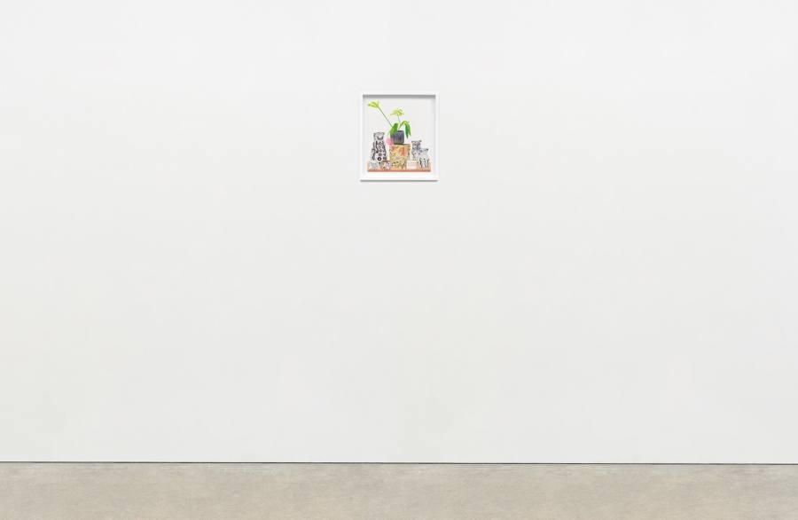
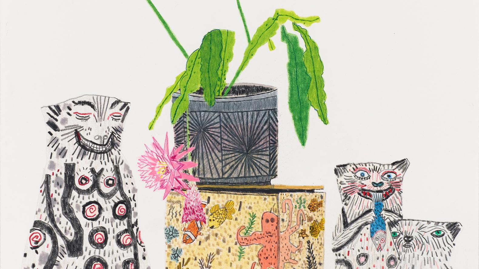
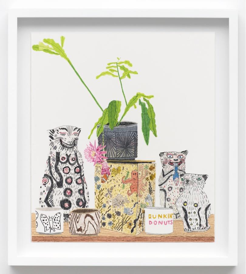
Jonas Wood
Kusaka, Takamori, Frimkess and Cressey Still Life, 2020
Colored pencil on paper
13 7⁄8 × 12 1⁄8 inches; 35 × 31 cm (unframed)
17 3⁄8 × 15 5⁄8 inches; 44 × 40 cm (framed)
JW-20-002
Jonas Wood
Kusaka, Takamori, Frimkess and Cressey Still Life, 2020
Colored pencil on paper
13 7⁄8 × 12 1⁄8 inches; 35 × 31 cm (unframed)
17 3⁄8 × 15 5⁄8 inches; 44 × 40 cm (framed)
JW-20-002