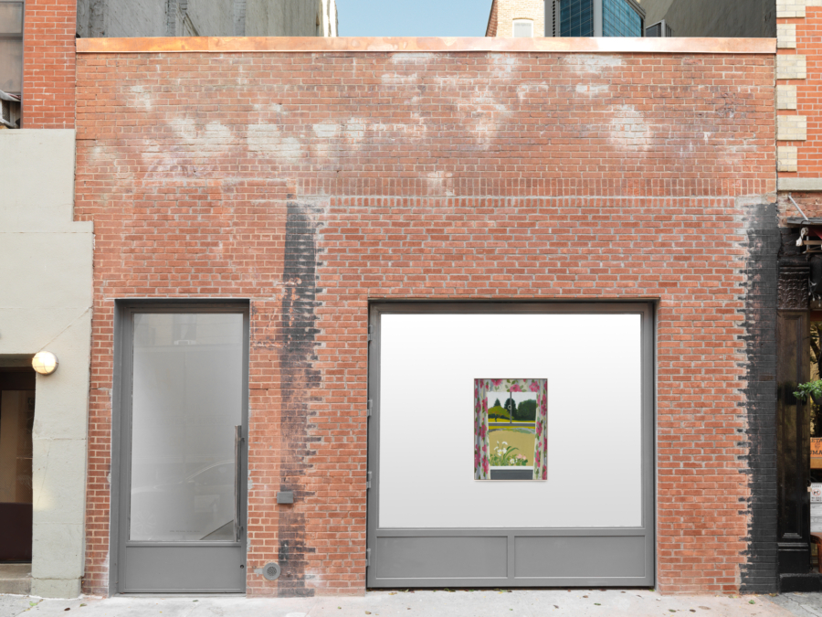
Mark Grotjahn
Sign Exchange 1993–98
January 9–February 7, 2016
39 Great Jones Street
New York, NY 10012
Mark Grotjahn
Sign Exchange 1993–98
January 9–February 7, 2016
39 Great Jones Street
New York, NY 10012
Signs 1993–1998 Rough Draft and Notes January 8, 2016.
I had a penthouse studio in San Francisco, this was 1992–93. In addition to the 2,000-square-foot studio, we had 8,000 square feet of rooftop. I paid $200 a month for that, 360-degree view of the city. Lloyds was a bar across the street or down the street. It was close by. It had handmade signs outside: HOT DOG $1.25, A SHOT & GLASS OF BEER $1.50. Good deal, but I didn’t drink during the day. Sign gave off the impression that they might have a decent hot dog, but I went in there and it was four or five nightmare dogs in a glass heat box. I never ate one. Wish I had so I could say that I did.
When I got to grad school I decided to stop painting the figure. I was unhappy with my painting and I wanted to change. The paintings looked like Baselitz or Basquiat, plaster, chicken wire. They had some political ideas that one could just barely tap into given their titles. No way was anybody going to get to any of the specific ideas from the work unless they talked to me or the gallerist. Looking back, that actually is an acceptable way to disseminate information. It wasn’t enough for me then. Too coded, too much talking.
So I started to look at people who used painting and drawing to communicate effectively and I thought again about all the signs I’d been looking at that I loved. I painted my first few from photos I had taken of the signs at Lloyds. Then I painted a few more before I put them up in my studio and I contemplated them. I kind of thought they were bitchin’, but I knew somehow that the originals were better than mine and I figured that the reason that theirs were better was that they had the audience. They knew who their audience was and they knew what they wanted to say. Their signs were functioning. I figured in order to get my sign to be as good as their signs I needed to get my sign in their store. And that’s what led me to the trade or exchange. So I decided to take my sign to them and see if I could get them to put it up.
It’s hard to know exactly how it started or with what sign but the point was, I made a copy of the sign I saw and brought it to the store owner. I told the store owner I wanted to trade my sign for their sign. I told them I was an artist and this was my art. It’s a weird thing, the exchange, and I wanted to be open about my intention. No shenanigans. There didn’t need to be any extra confusion. Should be simple and straightforward, garner me a little trust and increase my odds of a successful exchange. I might make the signs a little brighter and bump up the material. I also allowed myself to correct any spelling mistakes I noticed. I have my own spelling “differences” so not always successful. I’d say I was at least 90% successful in terms of getting the trade done. Success being measured by me getting their sign and getting to install my sign. I brought tape, scissors, paper, pens, etc., in case I needed to make any adjustments. If my measurements were off, or if prices had changed, I was ready.
It’s hard for me to recall how to exactly the trades went down. How the people responded… people being people it was always different. Often, after presenting my proposition for the exchange, I’d get asked, “Why do this?” Answer, “I’m an artist, this is what I do etc.” “You waste time and money?” So I’d shrug my shoulder indicating yeah, okay, that’s a valid way of looking at it. Usually it was a yes and hurry up—I want your sign because it’s cleaner, but lets get this over with and get out. That’s my assessment of what was often being thought but who knows. I’m no mind reader.
At K&H Liquor there were so many signs that I was there at least a couple of hours. They showed me the safe. Showed me the gun that they kept in the cut-off milk carton taped to the counter next to the register. Out of sight, easy access. Of course I lived for shit like that. Function. Secrets.
I traded a butcher for huge signs drawn on white butcher paper, hung high in the store near the top windows. Maybe ten, all with different amounts of fading. When I got them back to the studio I hung them from darkest to lightest, with the darkest on top. Later, I taped them together and pinned them at the top. Long, tall work, the paper folded, rolled inward toward the bottom. Nice fade, minimal, dark to light. This work survived my move to Los Angeles, but it seems to be gone now?
As a young artist I knew that art could be whatever you wanted it to be. That there weren’t any rules, and I believed that. Having said this, it’s one thing to know something intellectually, and it is something different to know it emotionally, to actually experience that idea. Perhaps heavy-handed, the exchange did that for me. That perfect space of the exchange, the time in the store, the clarity changed my life and perspective forever.
Here are some notes I’ve written and grabbed from a short talk I did with Brendan while looking at the show. As follows…
The deeper I got into the sign work, the deeper I got into the ways the specific signs, and specific kinds of signs, worked. I’m “naturally” drawn to pornography, porno mags. I’ve always been excited: since I was a kid and not allowed, still now, and of course in my twenties too. Pornography and money, pretty much the one place in the store where the owners feel comfortable using sarcasm. Porno sign says, “This is not a library.” or “You look you buy!” or “No browsing.” Discipline and shame. “In God we trust. You pay cash.” It’s just a fuck you, don’t even ask, you know? And so that was exciting to me. Two places, money/porno, where they will discipline you, shame you. They are selling the thing and then, at the same time, they will shame you for being interested in it. And of course, they want to protect their merchandize. Everything else is fairly direct, helpful, and maybe even friendly.
I also got interested in signs that come from the distributors. These signs are mass-produced, hot off the press, right? The companies ship them to stores all over, but there is room to individualize them to the need of the specific store. Like the one here, the one that’s in the show, Miller, that says 6.99, 12 PACK CANS, and then some advertising, right? Now, it is there to captivate the audience, it’s very graphic. And the neon green paper and the black. It’s simple. There is also an economy to that. It’s the color of the paper and then one color print. But it comes “Miller 88.88,” like a digital alarm clock. Then it has 88 PACK CANS and you can see underneath it’s got something about bottles. So you can change the sign, there’s room for individualization, you decide how much the thing is going to cost. As the store owner, it could be up to $99.99 and this is 6.99 and it’s a 12-pack, it’s not an 18-pack. You fill in the parts of the eight to make the numbers you want. And you do that by coloring-in some of those segmented parts. So you were allowed, requested actually, to participate. You participate. You individualize it, but those don’t even look individualized, because they still look standard. They still look planned, they still look printed from a distance so they have a certain kind of efficiency.
The company more or less controls the whole image. Anyway, it’s just exciting to me that they ask for a certain kind of participation and it allows for a certain kind of augmentation. With the smaller one like Miller High Life, the Classic American Beer, it’s a black on orange visual with the dollar sign printed. Here, right here by the dollar sign, with the blank space they signify: this is where you can write the price and whatever it is you’re selling. This is where you get to individualize it. This part is up to you. They are providing a service because guess what, the person does sell Miller, so they are providing the service and this is the place where you can do whatever it is that you need to do to communicate whatever it is that you’re going to communicate within basically the parameters of, it’s about Miller. And so here it is, it’s $1.25 for 32 ounces or $5.99 for a 12-pack of cans and then you get a dollar sign, whatever it is, you know. And so it’s there… that’s nice. And here with the Magnum, you could see that the person kind of went for some design elements and got into their own… their own formal kind of, whatever.
With the Augsburger sign you’ve got this illustration of a woman with the 6-pack, it’s retro. Looks like a woman drawn in the 50s. It’s nostalgic. It’s the real deal. It’s from Europe, right? This is the image that they want. They’ve got the room, they’ve got this blank space for you to individualize it. So this is kind of everything, they understand that a drawing works different then a photograph.
I personally prefer the signs with the real women. I would rather go for the fantasy with the specific woman, than some kind of cartoon fantasy of an illustrated woman, because I don’t know where to take that. With the hotdog, I would prefer the illustration. But that’s, you know, that’s on me, that’s on me.
And it’s worth talking about. How in these examples, in these situations, how do the drawings and paintings work? Why is it that an illustration of a hotdog, a hamburger, fish soup is different? When you see the illustration of it as opposed to a photo of the same. With the photo of the hotdog, the soup, one tends to imagine that specific food pictured. Perhaps not so appetizing (I think of menus with all their different dishes pictured). It’s my feeling that with the drawing you are encouraged to use your imagination, to imagine the perfect hotdog, your ideal hotdog, the perfect soup, whatever.


